Pick a chord, get a palette. Every advertising idea in this gallery starts from a musical chord — its notes translated into color by PCS-1.0, a pitch-to-color mapping. Complementary color itself is centuries old; what’s new here is the bridge: a musical tritone and a complementary pair are the same relationship, so a chord you can play becomes a palette you can brief.
PCS-1.0 created by Jeffrey Mahajan for Genius of the World89 photographs · 17 chords · scenes, products & brand marks · palettes at both ends of their range, plus the deep muted register
Markup mode is on. Give every picture a verdict — KEEP, FIX or REMOVE — tap NOTE or tap the picture itself to draw right on it and say what to change. Your marks save on this device as you go.
1 · Hear it
A chord is three or four notes that belong together — B minor sounds moody and premium before you ever see a color.
2 · See it
PCS-1.0 gives every pitch one fixed color. The chord’s notes become the palette — no guessing, no mood-board roulette.
3 · Sell with it
Each palette below is shown in real scenes — a taco stand, a diner, a perfume bottle — and on real products and brand marks, at both the light end and the dark end of its range.
PCS-1.0 — The twelve tones
Minor · The noir chordB minor
B #AAFF00D #008FFFF♯ #A80000
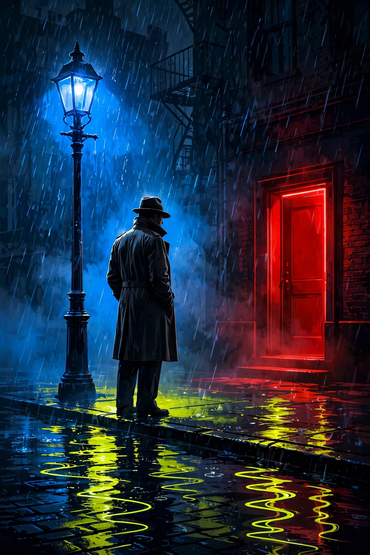
Electric yellow-green, deep blue, blood red. In music B minor broods; in color it glows in the rain — the blue does the atmosphere, the red gives it danger, and the yellow-green only needs a reflection to steal the frame.
Best for
Film, streaming & entertainment key art
Fashion and streetwear with an edge
Watches, instruments, nightlife, spirits
Any brand that wants mystery over cheer
The angle
Lead with blue, threaten with red, let yellow-green appear only as light — a lamp, a reflection, a lining. Restraint is what makes it feel expensive instead of loud. At the light end it turns summery and strange; at the dark end it’s pure noir.
★ Jeff’s favorite
Noir poster — the rain does the palette
Blue lamplight, a red door you shouldn’t open, and B’s yellow-green living only in the wet pavement. Jeff called this the best of the whole session — proof the palette works hardest when one color is barely there.
Use for: thriller key art, book covers, late-night brands
★ Jeff’s favorite
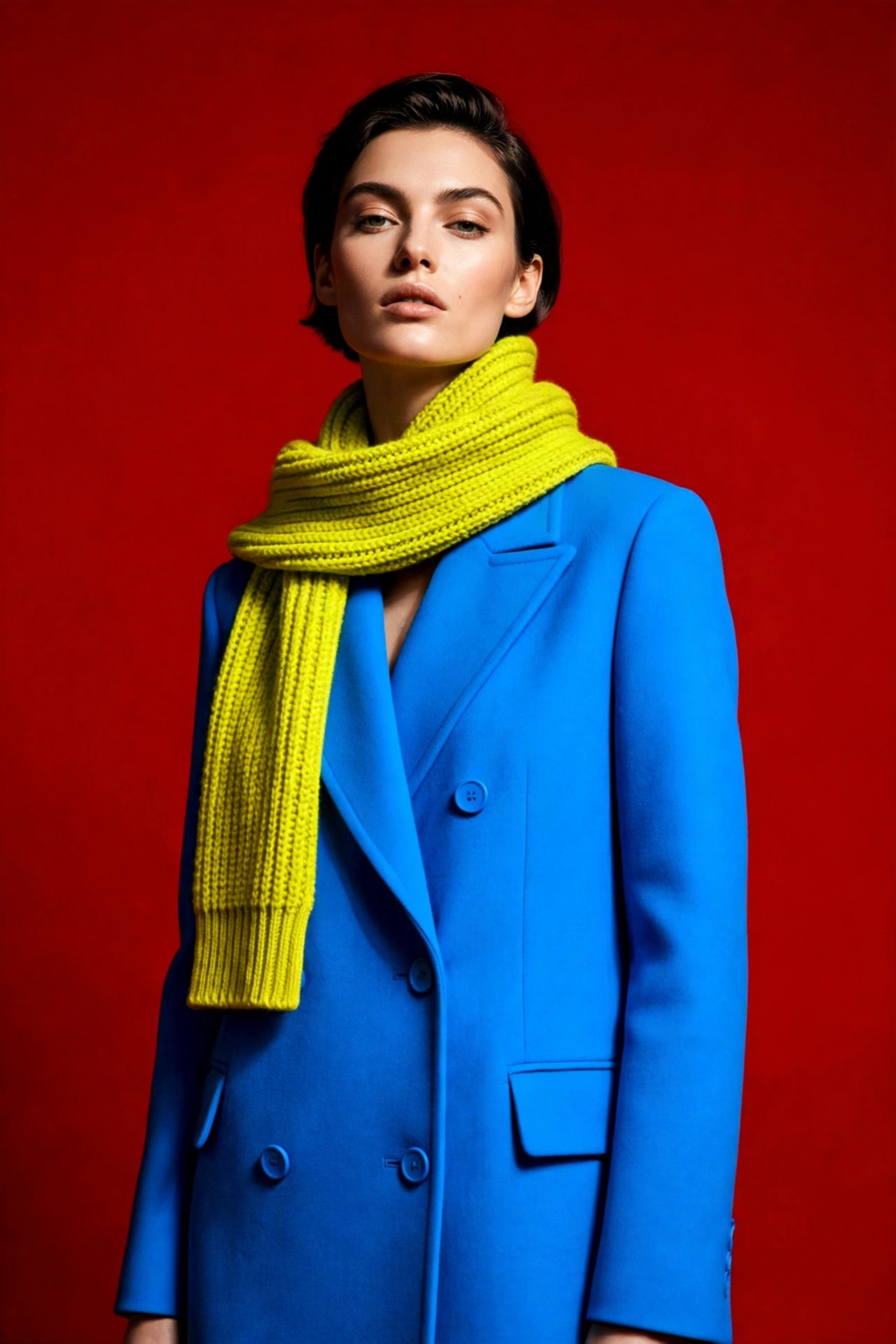
Fashion — the quiet favorite
Blue coat, yellow-green scarf, deep red backdrop. Nothing shouts; the tension between the three does all the work. This is B minor dressed up.
Use for: fashion editorial, fragrance, premium retail
Realism check ✓
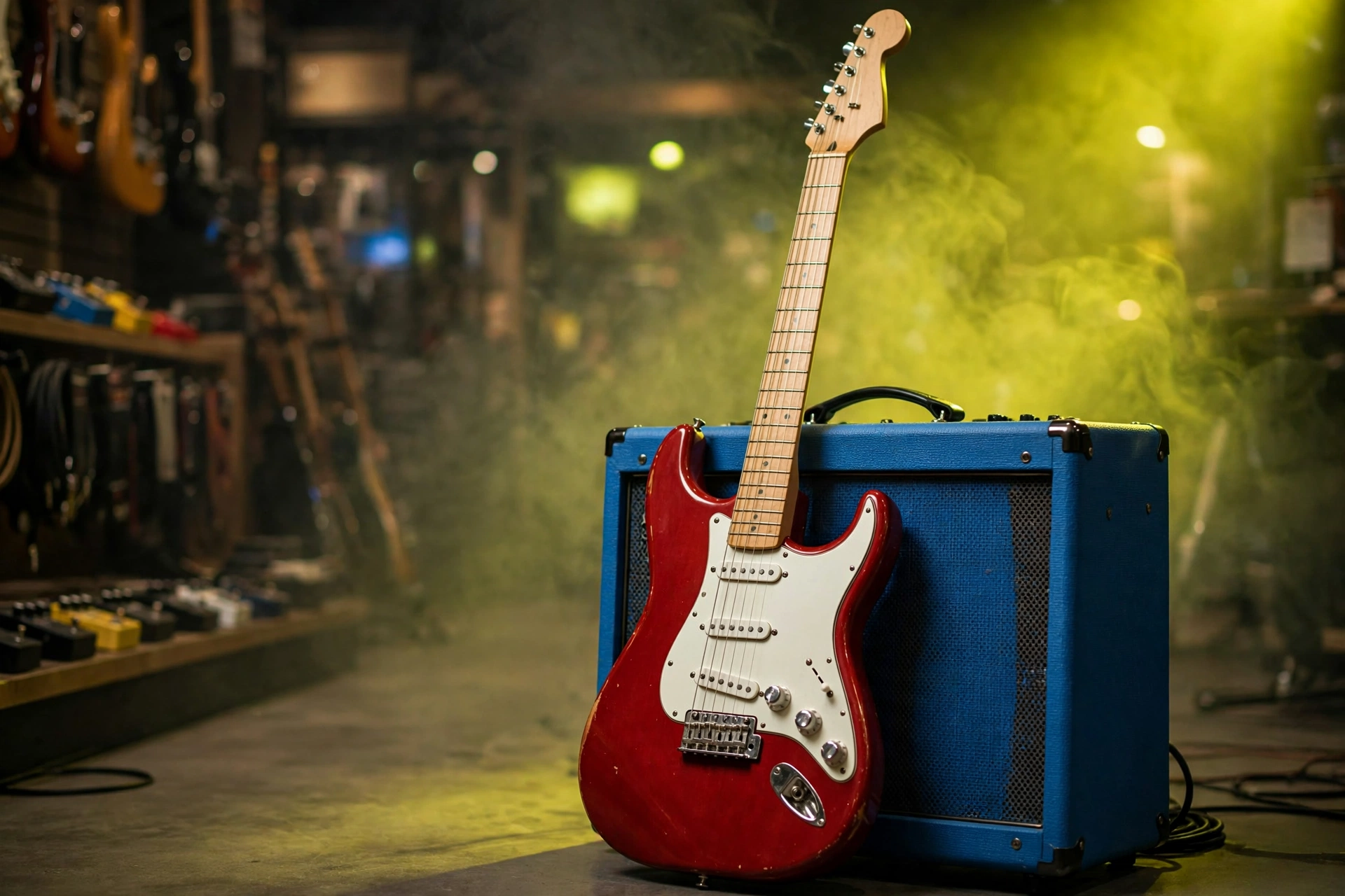
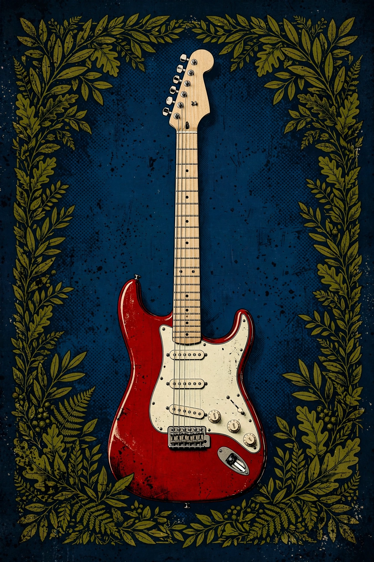
The guitar, as it actually exists
Red Strat, white pickguard, maple neck — the way one really sits in a shop. The trio still carries it: deep red body, blue amp, yellow-green haze. If the product isn’t believable, the palette can’t save it.
Use for: music retail, instrument brands, lessons
Product · Dark end
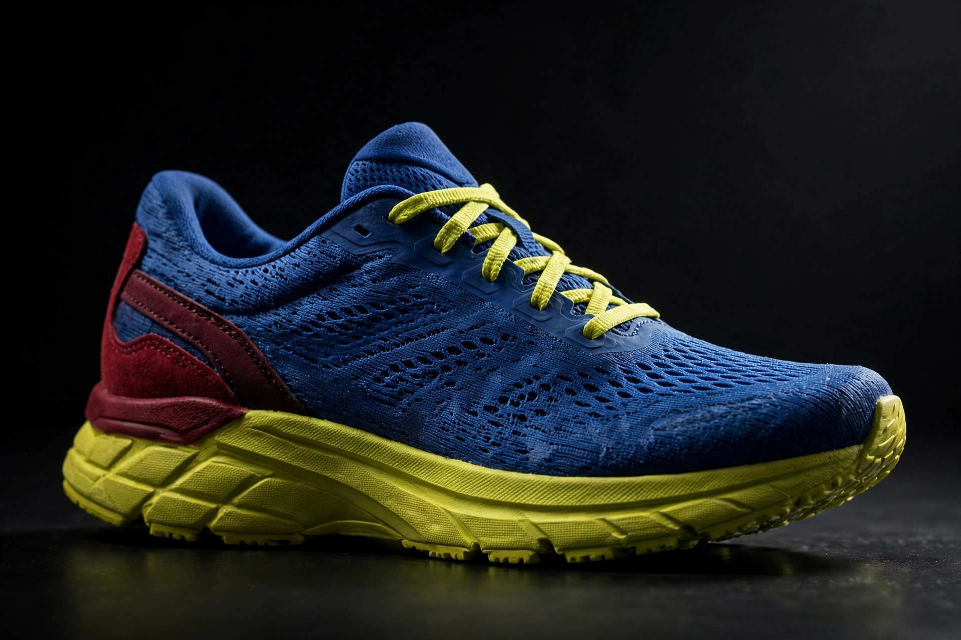
Runner — the chord you can wear
A deep-blue trainer with a yellow-green sole and laces and a blood-red heel counter, shot on black. Not an all-one-color shoe — a real runner, color-blocked by the chord itself.
Use for: footwear, sportswear, streetwear
Logo · Light end
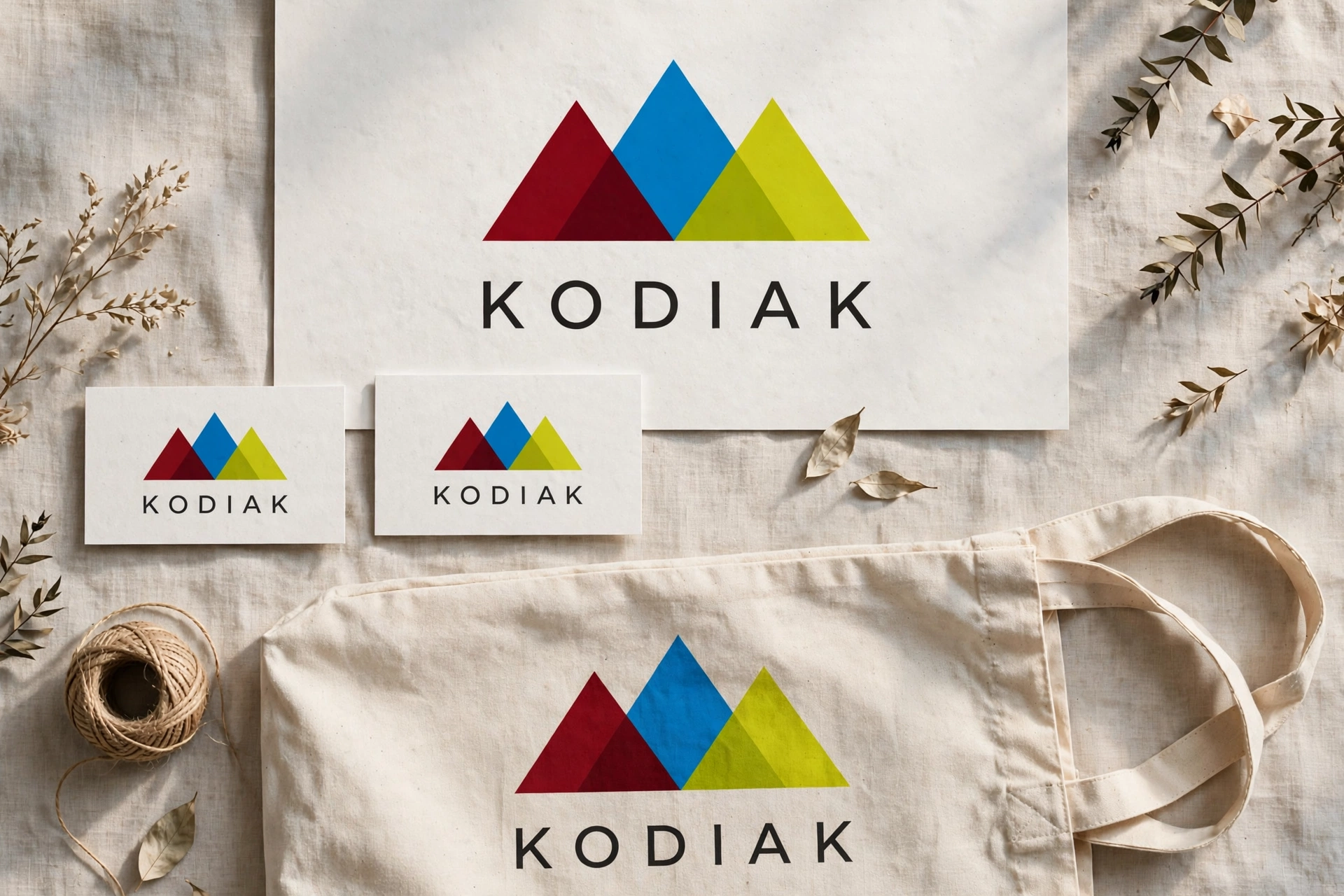
KODIAK — three peaks, three notes
Three overlapping peaks in deep red, blue and yellow-green over the KODIAK wordmark, repeated across cards and a tote. The mark is the palette, simplified to geometry — an identity that redraws itself from the chord.
Use for: outdoor brands, apparel, identity systems
★ Jeff’s favorite
Catalog shot — the quiet one
Dark olive jacket, navy underneath, and the red backpack does the talking — F♯’s red kept at its true #A80000 while the green and blue go dark around it. The quietest frame of the set, and the proof the palette works at plain catalog scale, not just in posters.
Use for: apparel catalogs, luggage & bags, outdoor retail
★ Jeff’s favorite
Band poster — red at full strength
The dark variant as a gig poster: B’s yellow-green and D’s blue taken down into the dark, the F♯ red left true and untouched. The tritone does the shouting; the other two notes hold the night around it.
Use for: concert posters, venues, music merch
★ Jeff’s favorite
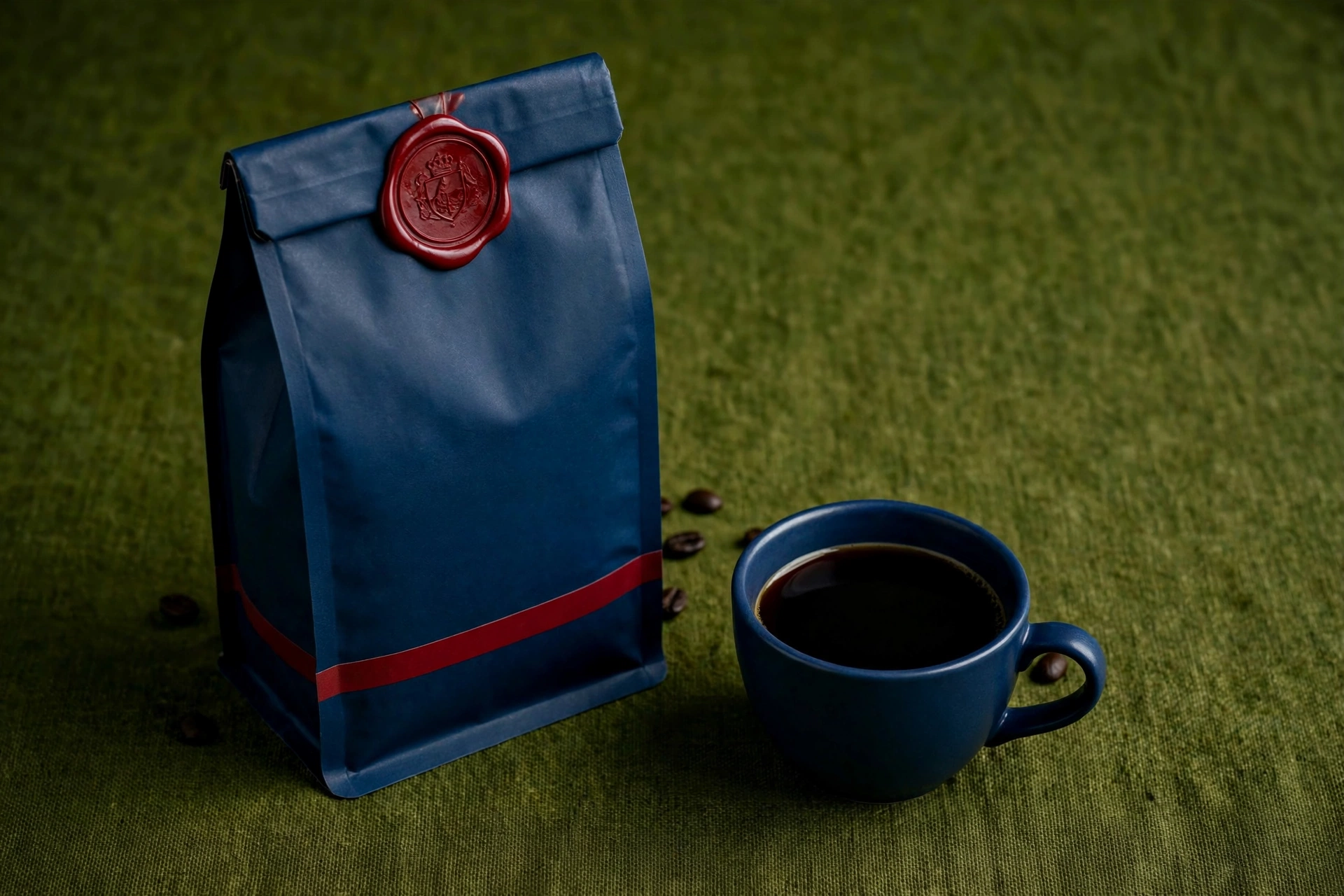
Coffee packaging — the chord on the shelf
Coffee bags in deep navy and dark olive, the true red reserved for the mark. Shelf presence built from two quiet colors and one honest one — nothing loud except the note that matters.
Use for: coffee & food packaging, retail, cafés
★ Jeff’s favorite · One product
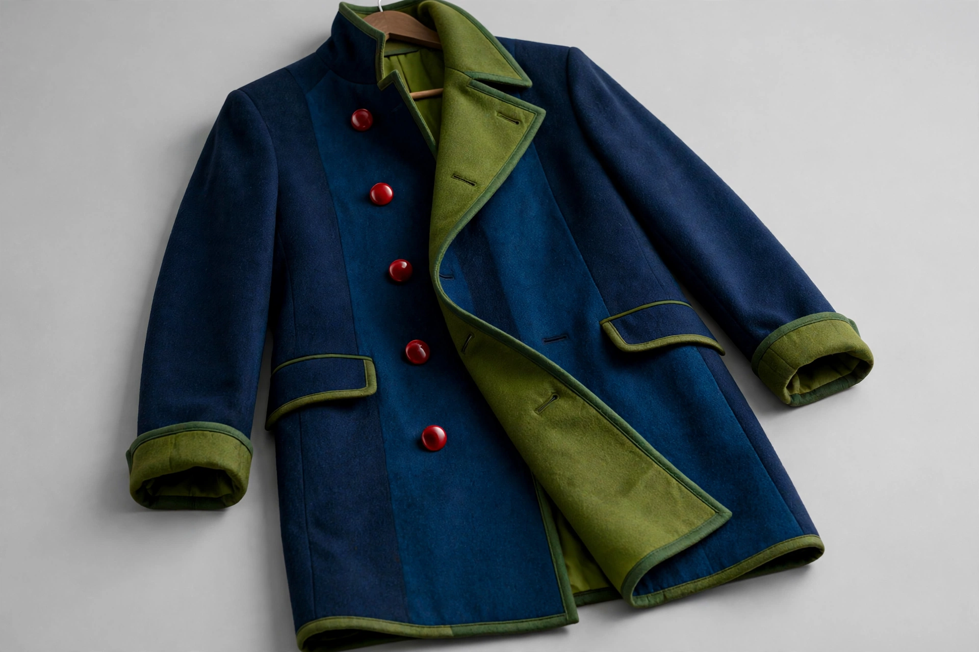
The coat — the red is only the buttons
Two shades of navy wool, olive lapel, cuffs and lining — and the red exists nowhere but the buttons, where it reads from across the room. All three colors live inside one garment; the background does nothing at all.
Use for: fashion, outerwear, premium retail
★ Jeff’s favorite · One product
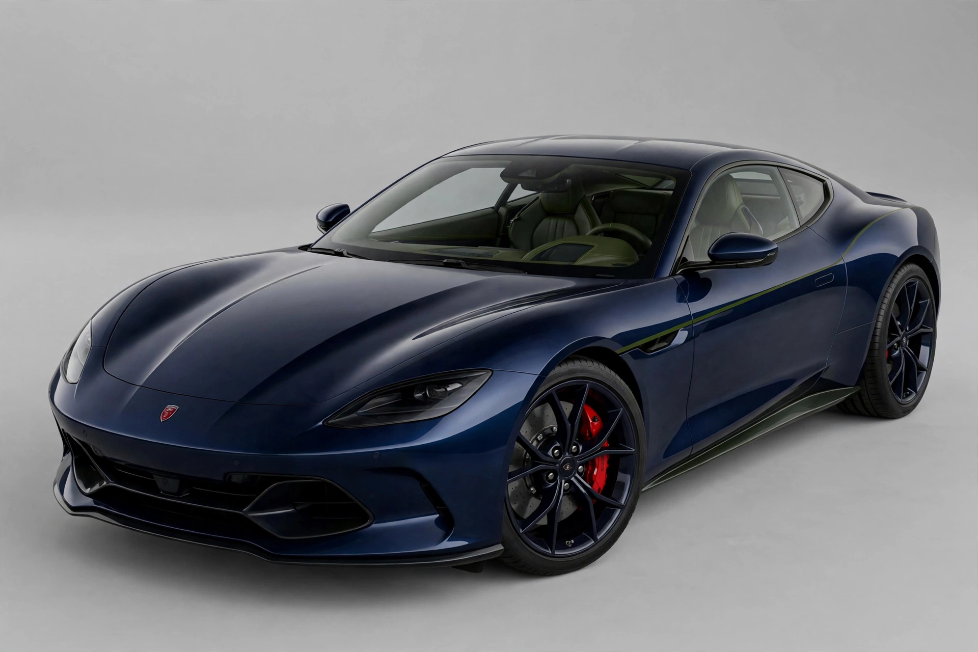
The car — the original, in muted green
Navy paint, a dark olive pinstripe and matching interior, red saved for the emblem and the brake calipers. This is the original version, with B’s yellow-green muted down to olive — the one that stands. The true color is the reference point; the shade is the design.
Use for: automotive, luxury goods, product colorways
★ Jeff’s favorite · One product
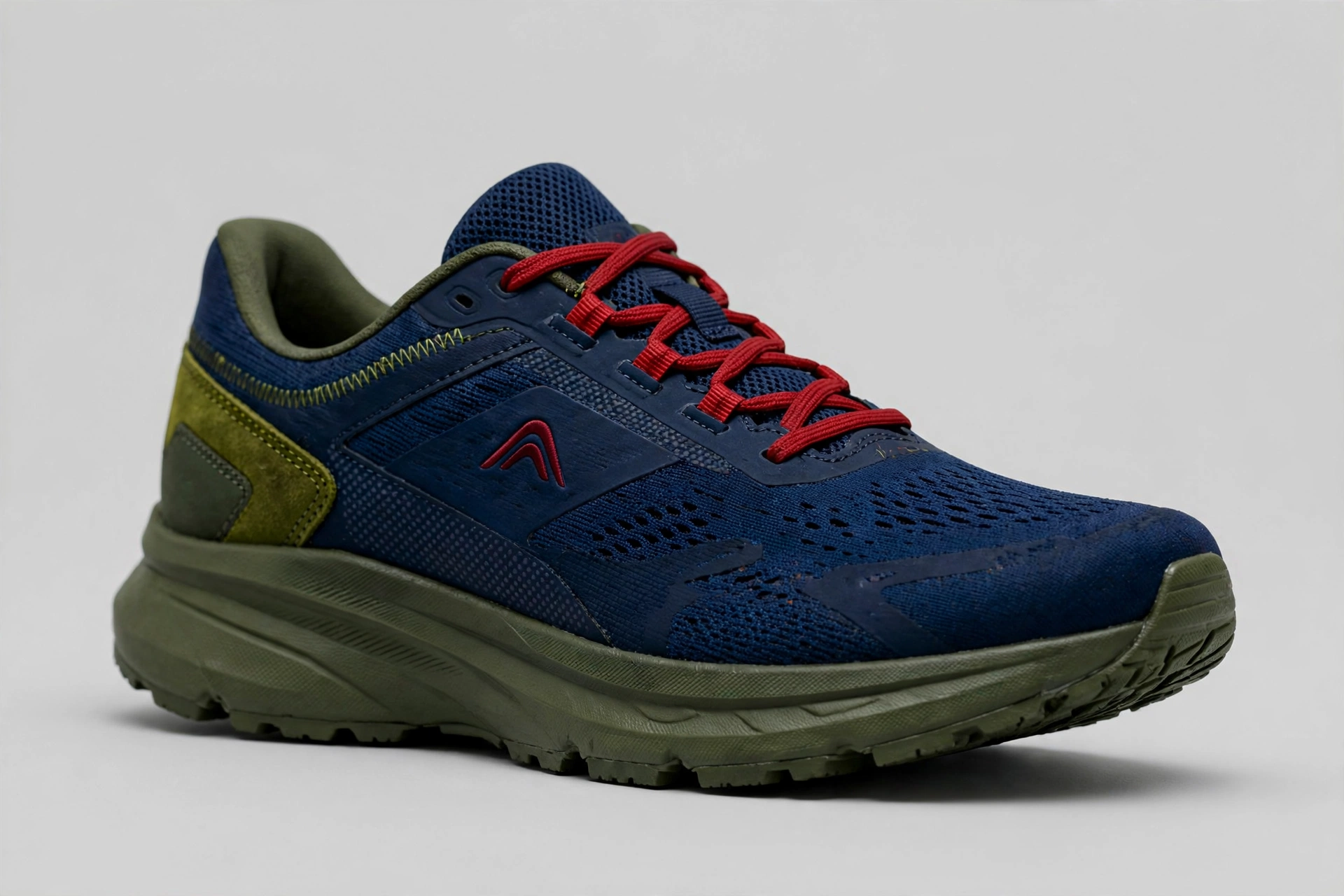
The sneaker — a colorway that could ship
Navy upper in layered shades, olive sole and heel, red only in the logo and the laces. Not a concept shoe — a colorway a real brand could put on a shelf tomorrow.
Use for: footwear, sportswear, streetwear
★ Jeff’s favorite · One product
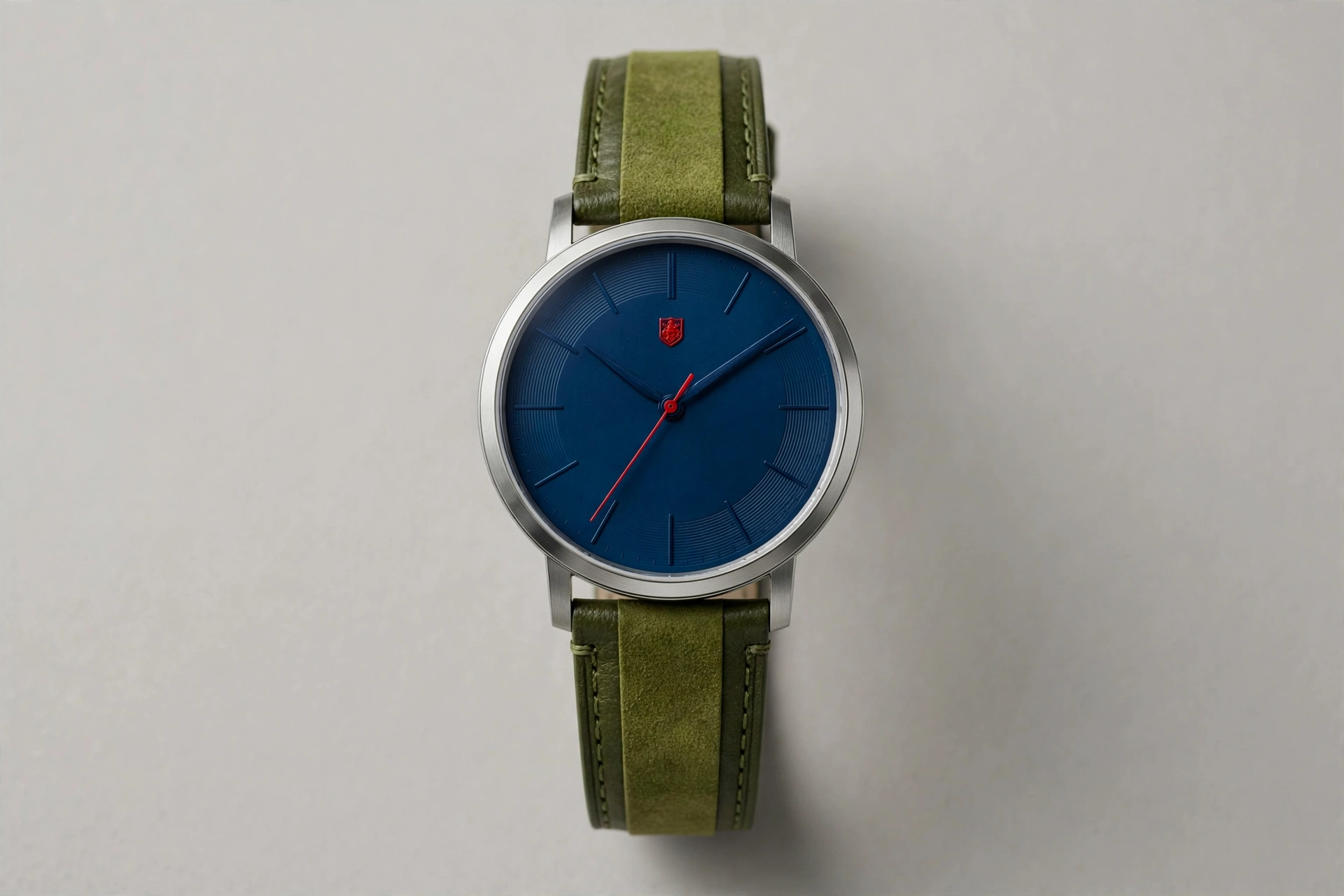
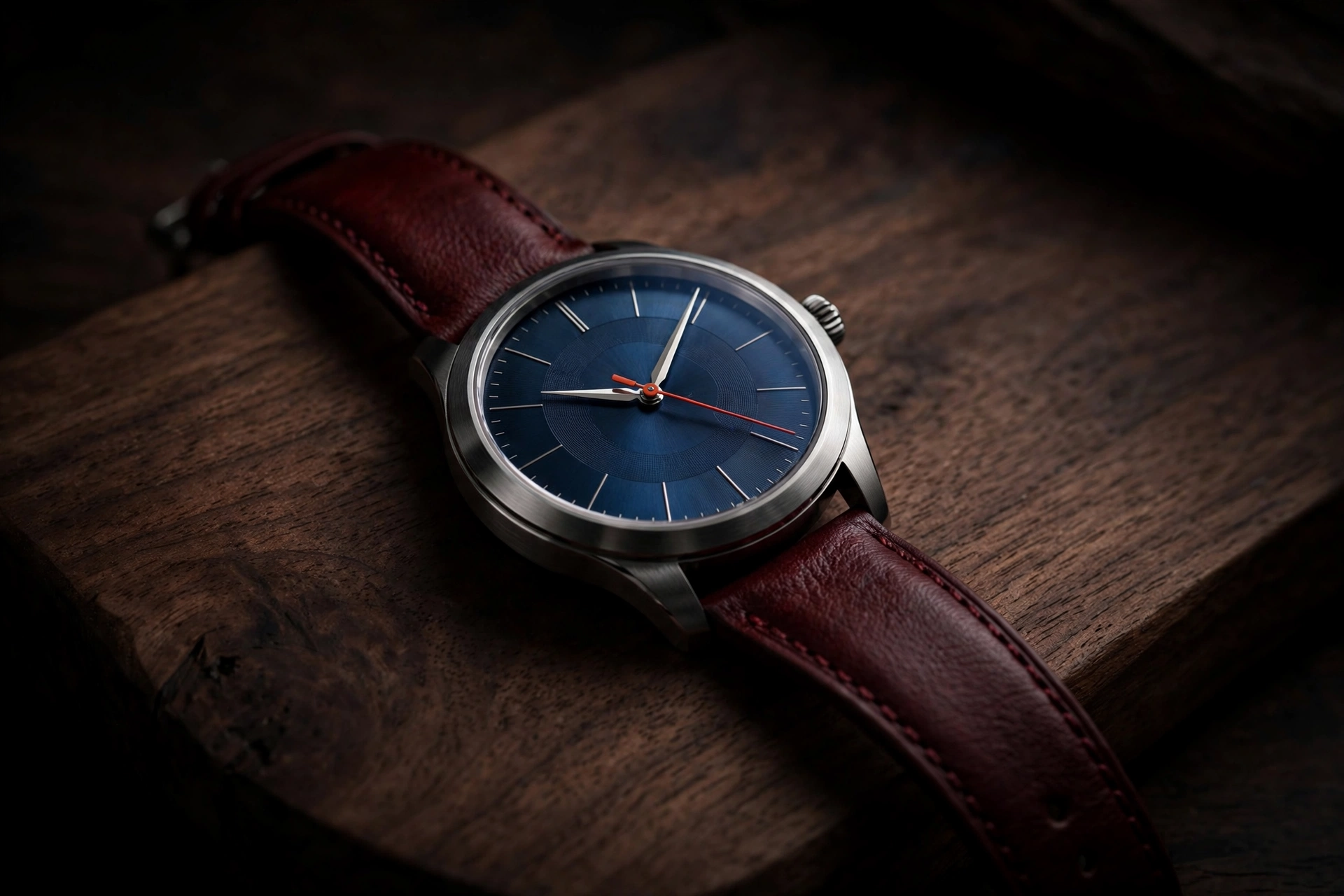
The watch — the smallest red pops hardest
Navy dial, two-tone olive strap, and the red is just the second hand and the little shield at 12. The smallest red of the four single-product pieces — and it pops the hardest. The chord colors build the product; the brightest note gets the smallest, sharpest job.
Use for: watches, accessories, luxury goods
Minor · The romantic chordD minor
D #008FFFF #820097A #FF7800
Ocean blue, deep violet, ember orange. D minor is the saddest of keys in the old lore — and the most romantic palette here: cool blue and violet hold back while orange burns in the middle, like a coal in a perfume bottle.
Best for
Fragrance, beauty & luxury goods
Travel, hotels, airlines with soul
Classical music, wine & evening brands
Anything sold at dusk
The angle
Let A-orange be the single warm thing — a bottle, a sunset, a cocktail glow — inside a blue-violet world. One warm object in a cool scene is the oldest attention trick there is, and D minor gives it to you by construction.
★ Jeff’s favorite
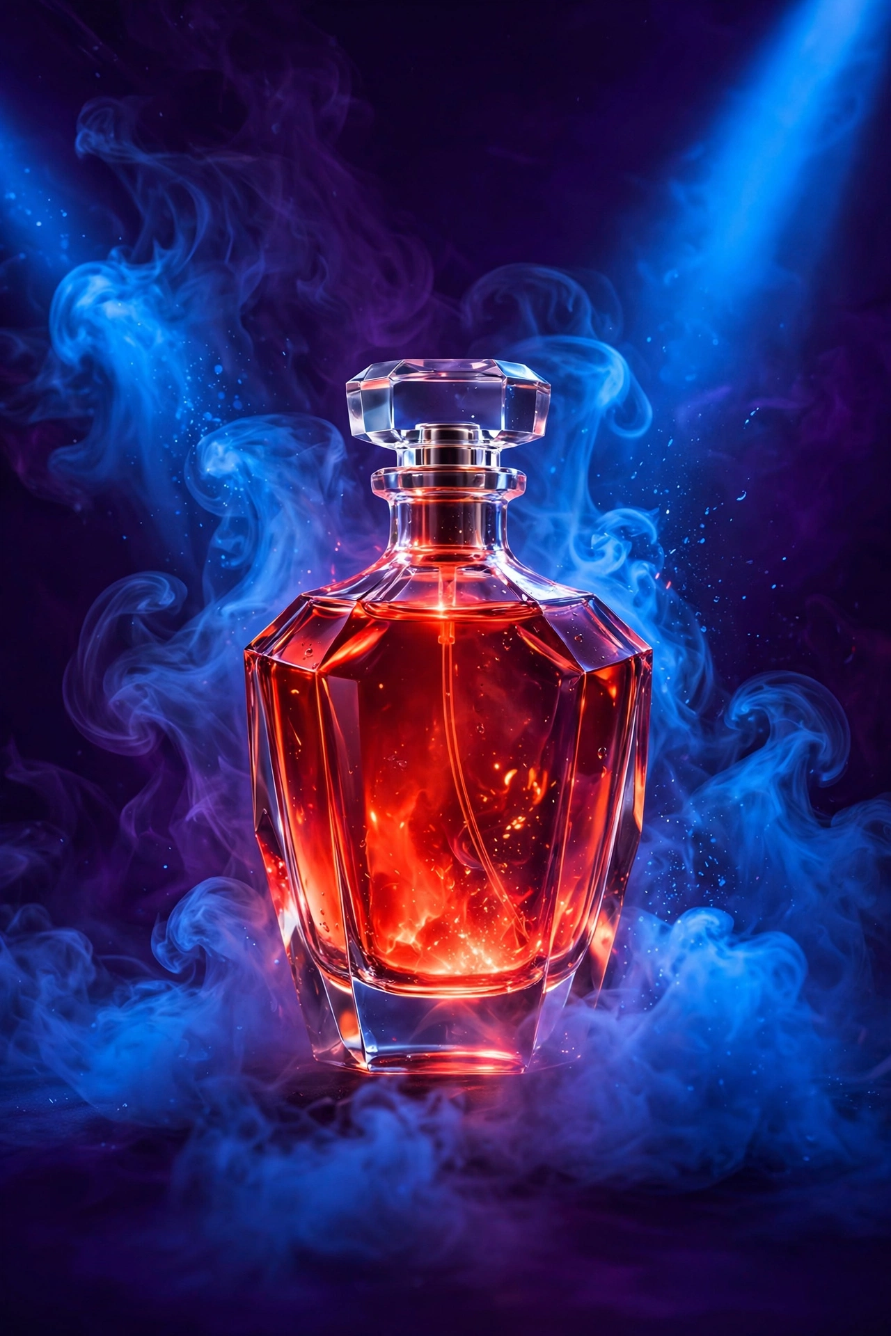
Perfume — glowing like a coal
D minor at its most romantic. The bottle burns orange from inside blue-violet smoke. Fragrance ads live or die on atmosphere, and this chord is atmosphere.
Use for: fragrance, beauty launches, evening products
★ Jeff’s favorite
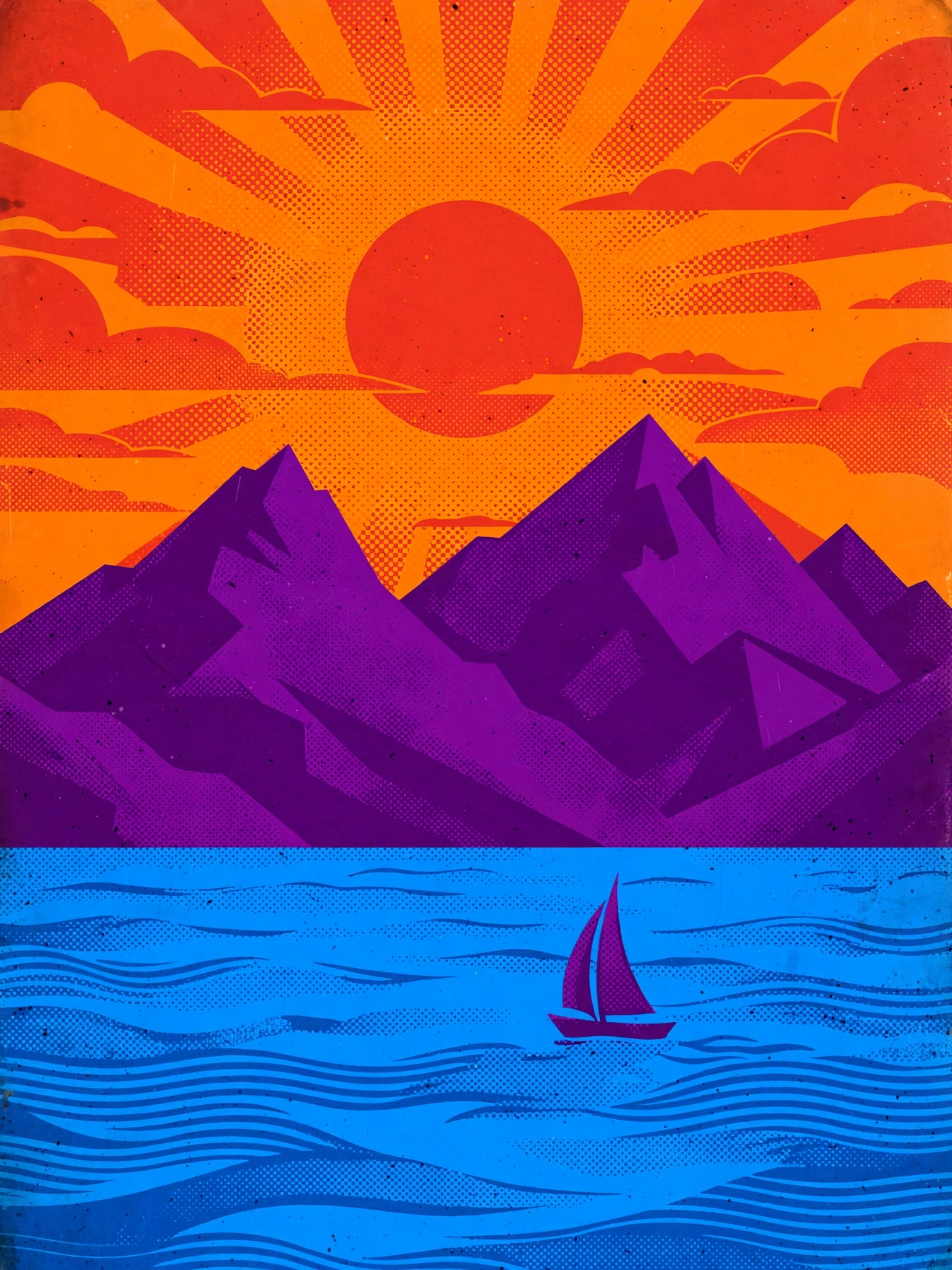
Travel poster — go where it’s dusk
Blue hour is the most photographed hour for a reason. D minor is blue hour as a palette: violet sky, blue shadow, one warm window or sunset to travel toward.
Use for: tourism, airlines, hotels, rail
Classy
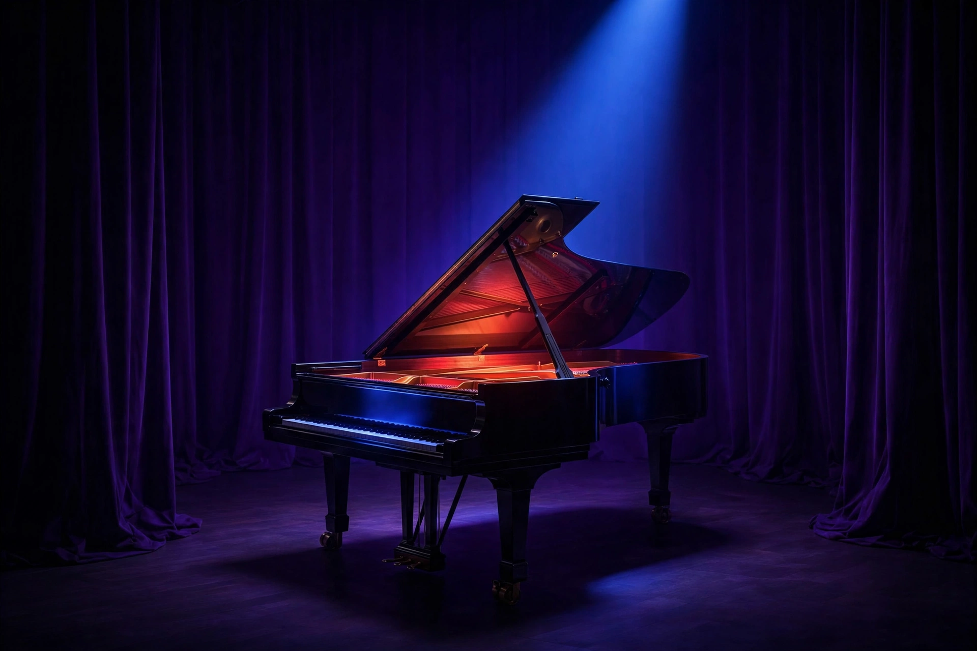
Concert grand — the classy brief
The replacement for the cheesy headphones, and a lesson in itself: classy beats loud. A grand piano, a blue spotlight, a warm glow — D minor without a single gimmick.
Use for: arts venues, education, premium audio
Evening
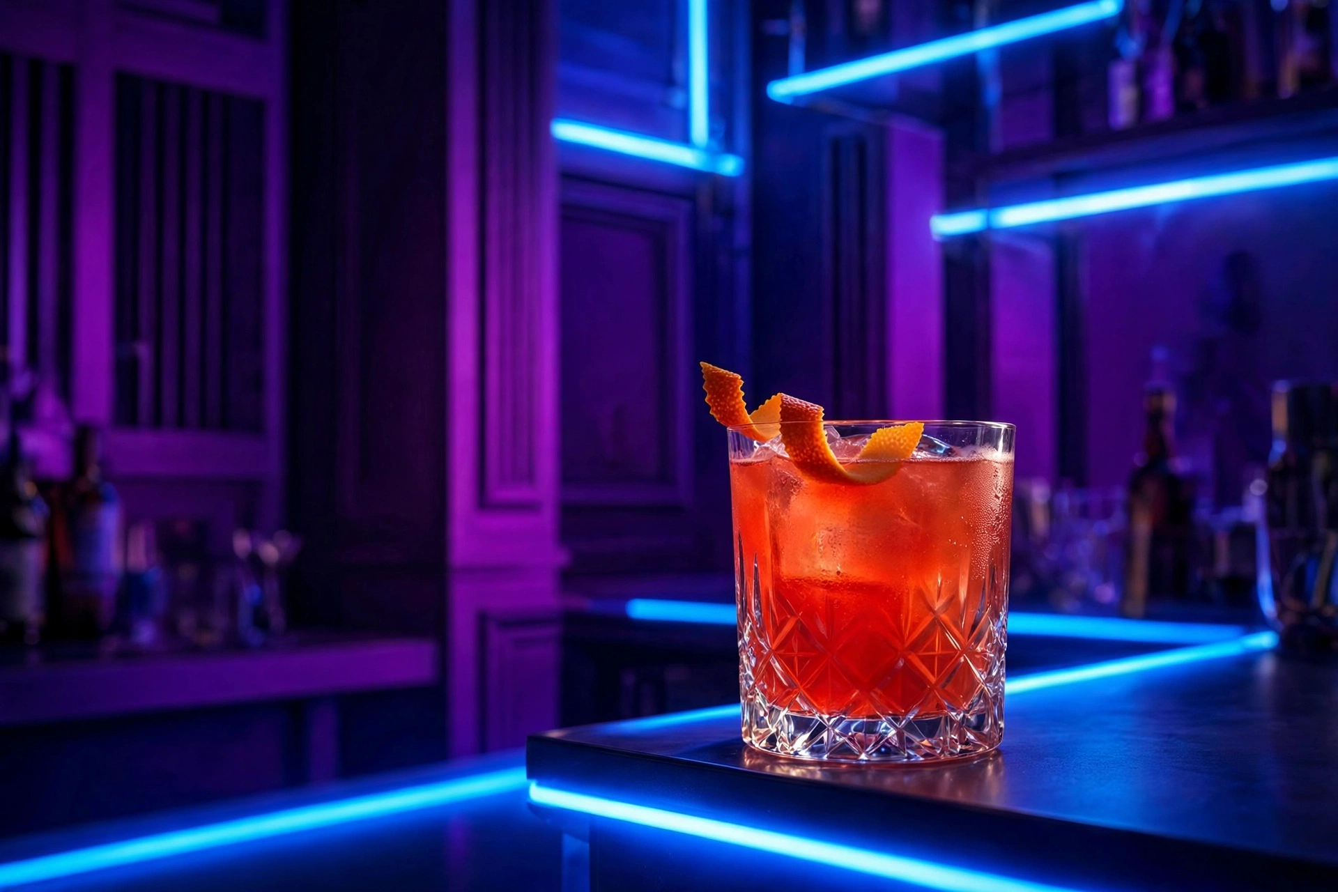
Cocktail — one warm glass
The orange drink is the only warm thing in a blue-violet bar. Your eye has nowhere else to go — which is the entire point.
Use for: spirits, bars, hospitality
Light end
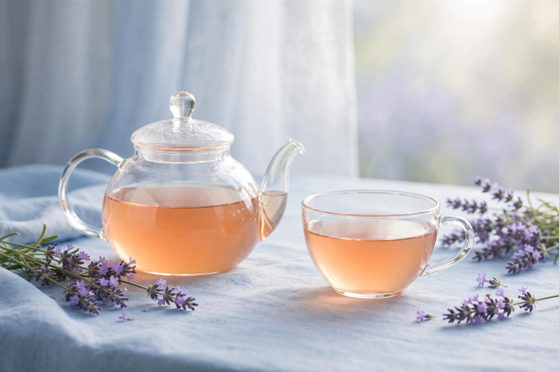
Tea — light end
Morning instead of midnight: the violet softens to lavender, the blue opens up, the orange becomes apricot. Same chord, opposite end of the day.
Use for: tea & wellness, skincare, cafés
Product · Dark end
Perfume, bottled — the ember as a product
The glowing bottle from the scene, shot as a product: warm orange glass standing in a blue-violet world. This is how the coal becomes something you can actually buy.
Use for: fragrance, beauty, gifting
Deep muted · p–mp · Soft–Muted
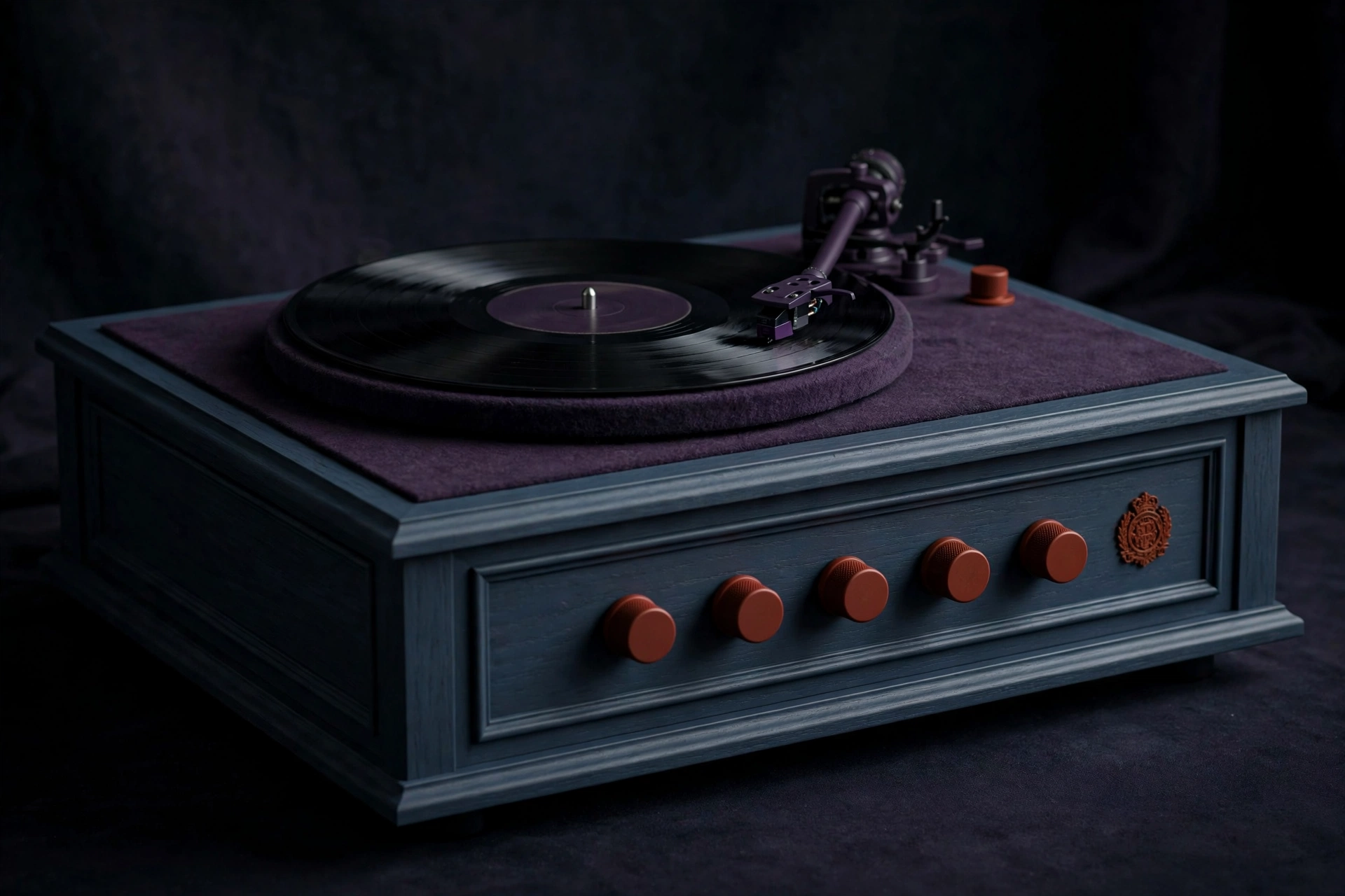
Turntable console — rust on the knobs
D minor through the shade control: the blue down to slate navy, the violet to dark plum, and A’s orange muted to rust — which survives only on the knobs and the emblem, so it’s the first thing your eye, then your hand, goes looking for.
Use for: audio equipment, hi-fi, furniture
Deep muted · p–mp · Soft–Muted
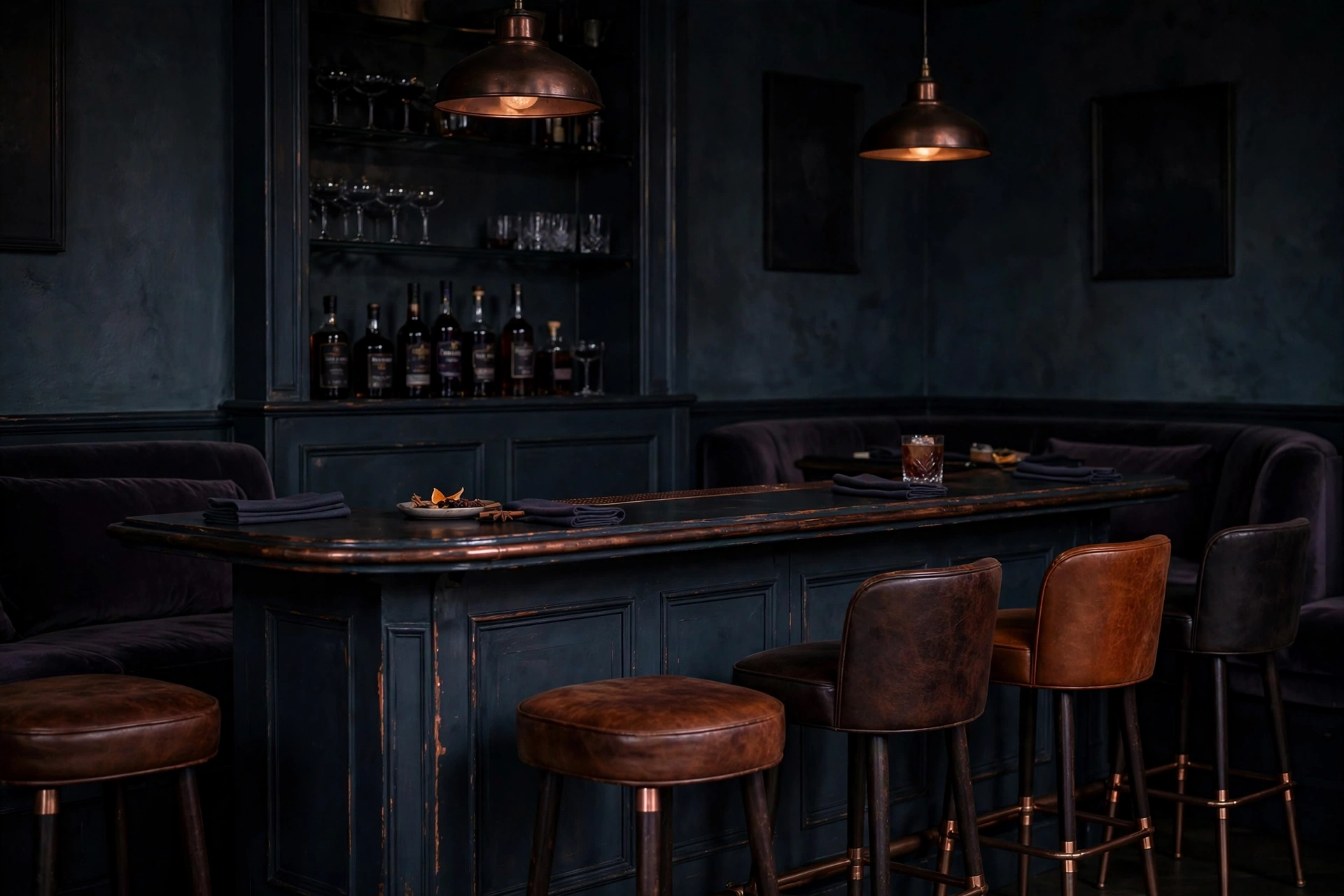
Cocktail bar — the ember, at speaking volume
The glowing-coal idea grown into a room, then turned down: slate-navy bar, plum shadow, and the warmth carried by rust — the drinks, the brass, the lamplight. D minor at p: the romance stays, the glare goes.
Use for: bars, spirits, hospitality, audio lounges
Cut from this gallery at Jeff’s call: the glowing-headphones ad — “kind of cheesy.” Realism and restraint are house rules here.
Minor · The street chordG minor
G #D80000B♭ #FFEF00D #008FFF
Signal red, taxi yellow, true blue — the primaries, with a minor ache underneath. G minor is the most everyday palette in the gallery: it’s already on your street, which is exactly why it converts. Nobody has to imagine it.
Best for
Fast food, diners & casual chains
City services, transit, delivery
Coffee, music venues, local retail
Brands that need instant, friendly recognition
The angle
Don’t invent props — find the palette where it already lives. A red awning, yellow umbrellas, a blue tile counter. When the scene could be photographed on a real block, the chord stops being a concept and becomes recognition.
★ Favorite — “done well”
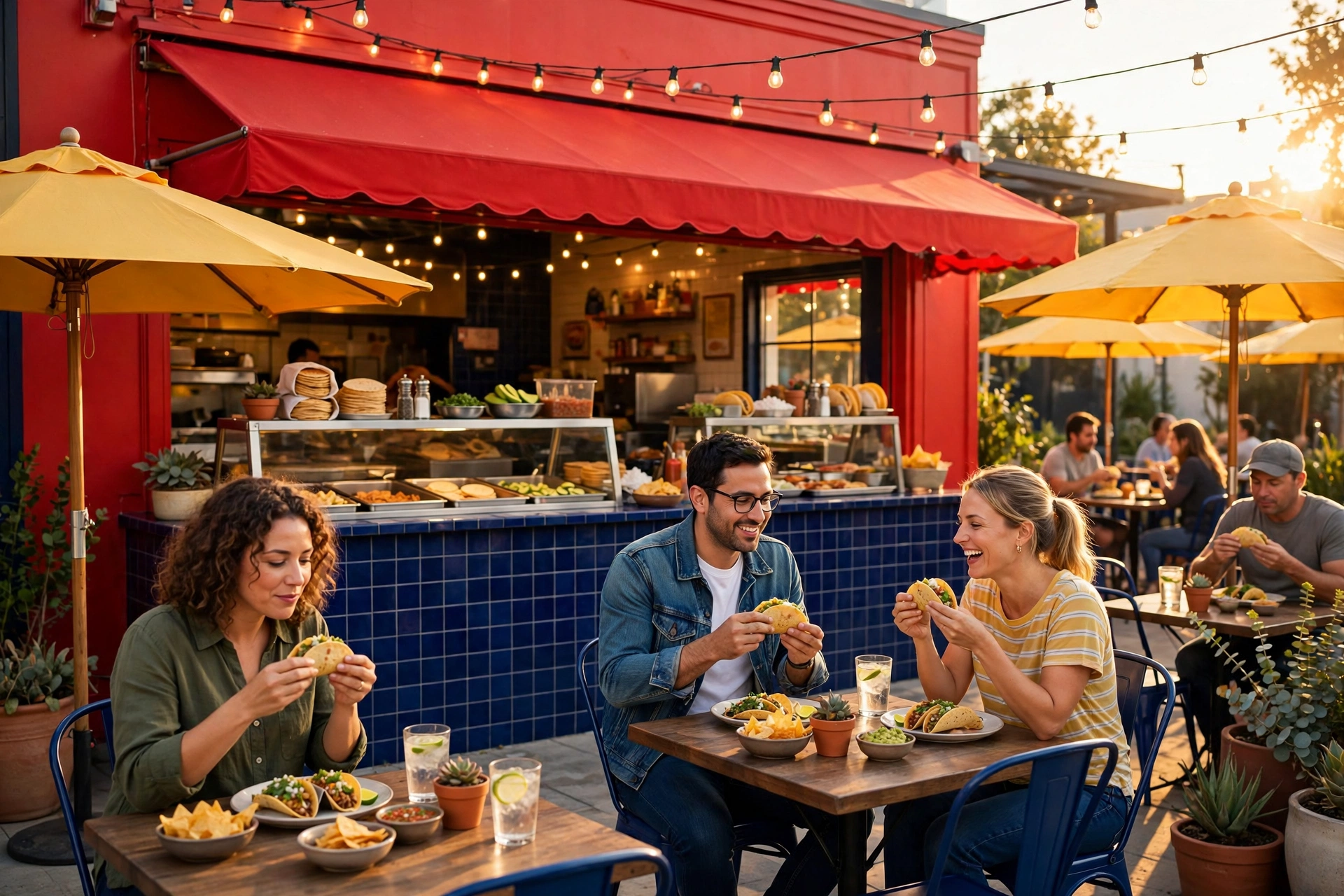
Taco chain — done well
The test case. Red storefront and awning, yellow umbrellas, blue tile counter and chairs — nothing in frame you couldn’t walk past on a real street. This is the standard every other example is held to.
Use for: restaurant chains, franchises, local food
★ Jeff’s favorite
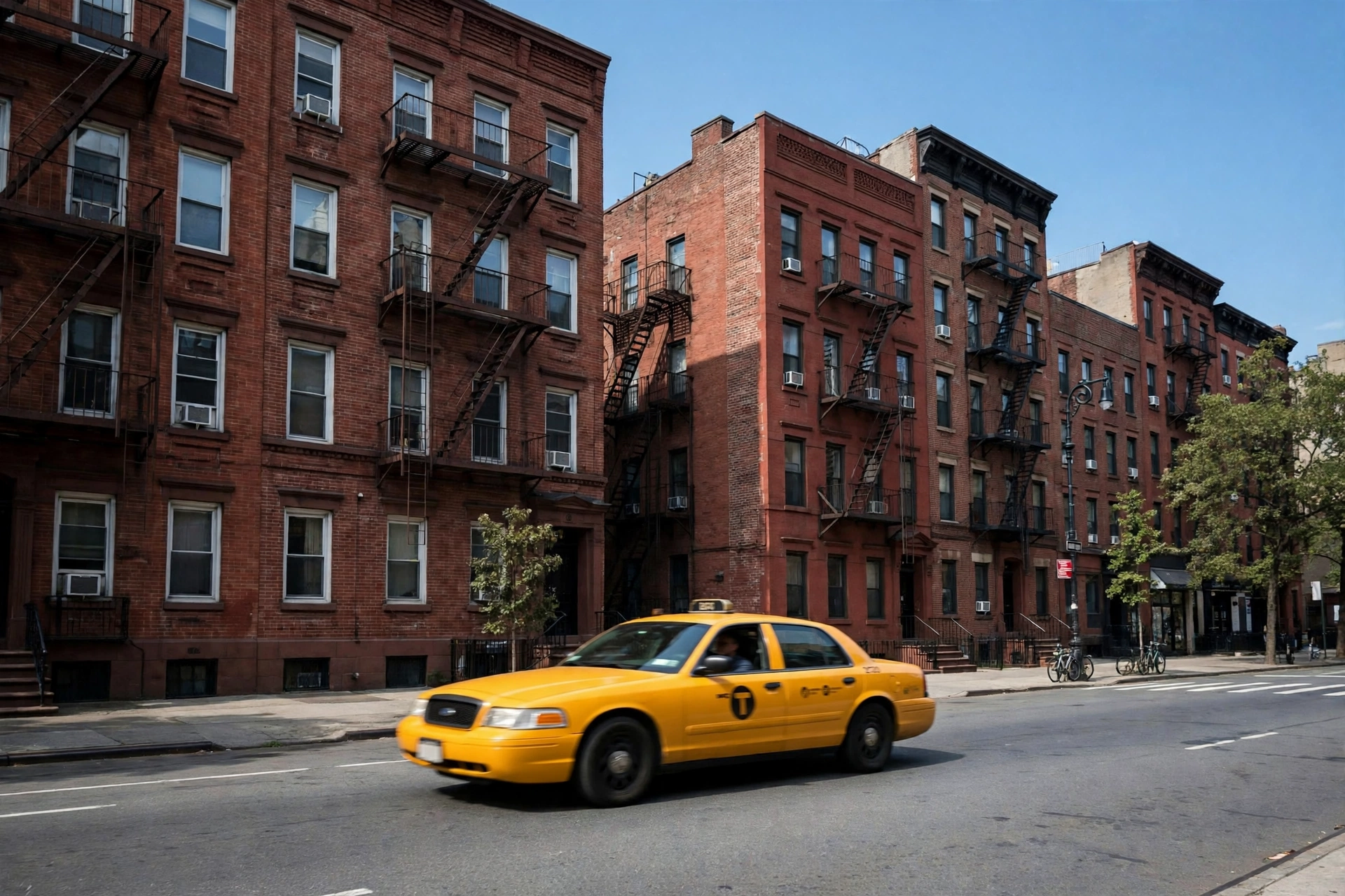
NYC street — the palette already exists
Yellow cab, red brick, blue sky. G minor isn’t a design decision here; it’s a photograph of Tuesday. The strongest proof in the gallery that chord palettes are found, not forced.
Use for: city brands, transit, delivery, news
★ Jeff’s favorite
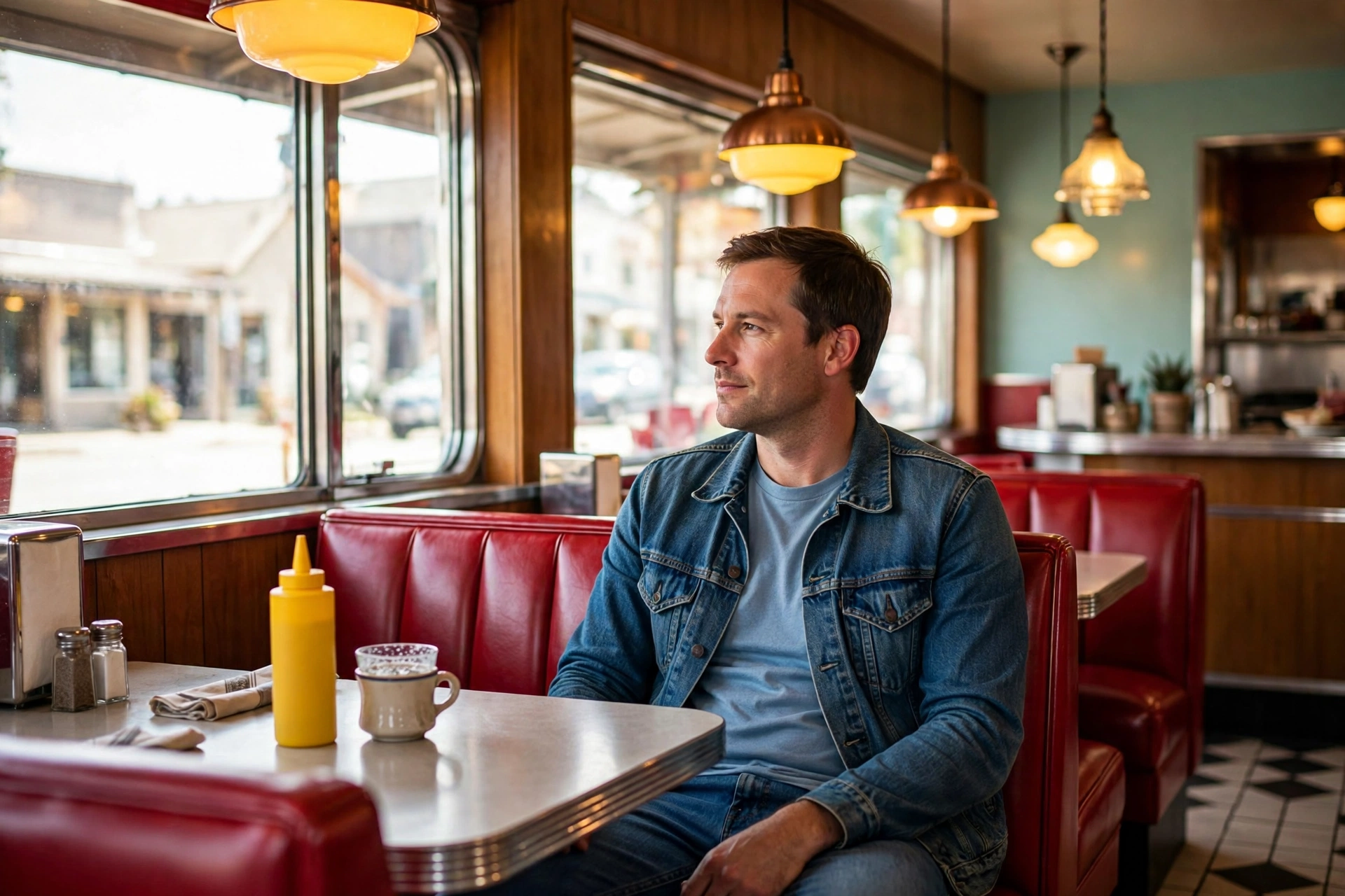
Diner — red booths, yellow light, blue jeans
Booths, mustard-yellow light, denim. Three colors every American diner already owns, named at last as a chord.
Use for: diners, Americana, comfort food
★ Jeff’s favorite
Coffee — morning primaries
Red, yellow and blue at breakfast brightness. Friendly, fast, unmistakable from across the street — everything a coffee brand wants to be.
Use for: coffee shops, bakeries, morning brands
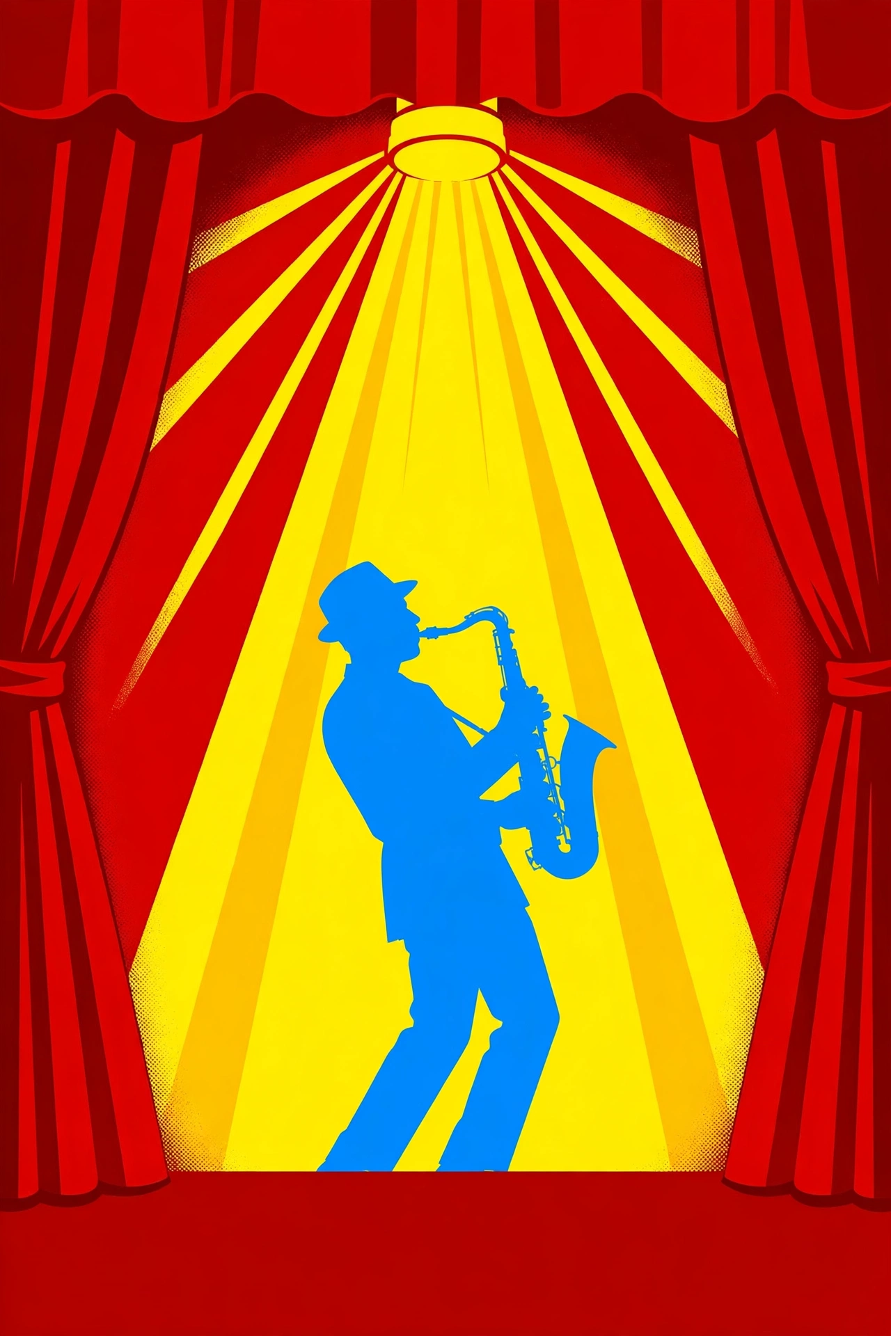
Jazz poster — the music comes home
A palette derived from music, advertising music. Primary and bold on a poster wall, with the minor third keeping it from turning into a circus.
Use for: venues, festivals, record stores
Dark end · Classy
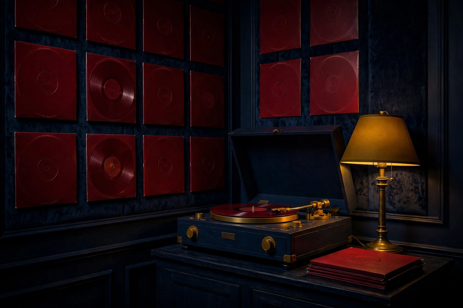
Vinyl at night — dark end
Deepened, the street primaries turn into a record-store evening: oxblood red, brass yellow, midnight blue. Same chord, after hours.
Use for: music retail, hi-fi, bars
Product · Light end
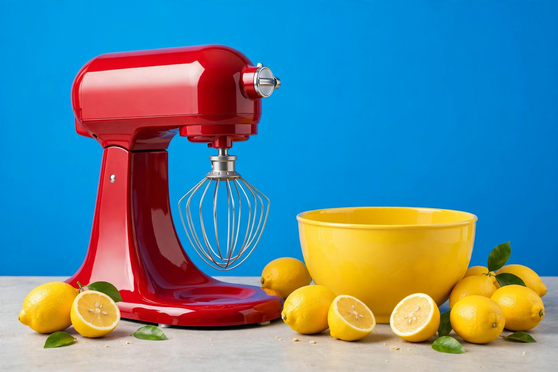
Stand mixer — primaries in the kitchen
An appliance ad built from the street palette: red, yellow and blue where a kitchen can use them. Everyday products are where G minor converts — nobody has to imagine owning this.
Use for: appliances, kitchen brands, retail
Logo · Light end
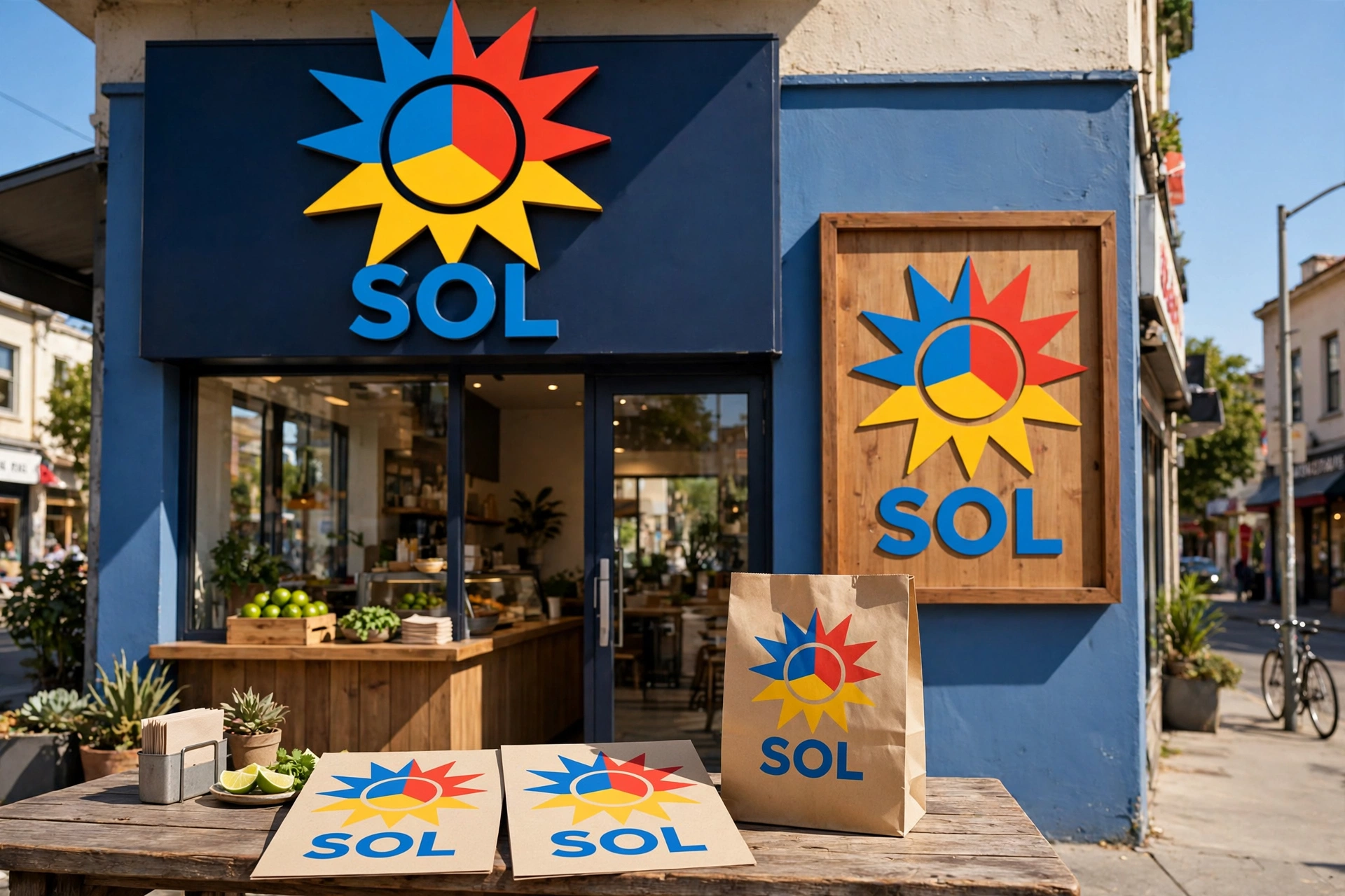
SOL — the taco storefront, signed
A real corner taqueria: a sun logo split into blue, red and yellow over the door, repeated on the wall sign, the menus and the takeout bag. The palette as signage — recognition from half a block away.
Use for: restaurant chains, franchises, signage
Also cut at Jeff’s call: an all-yellow sneaker ad and an all-red motorcycle — “no one has” those. If a product couldn’t exist, it doesn’t run.
Minor · The first chordA minor
A #FF7800C #3AFF00E #7900EA
Ember orange, vivid green, violet. A minor is the first chord most guitarists ever learn — plain-spoken, no sharps, no flats — and its palette is just as direct: the orange of ripe produce and amber drinks, green doing the growing, violet arriving as eggplant, dusk, and velvet shadow.
Best for
Grocery, farmers markets & farm-to-table brands
Hotels, lounges & evening hospitality
Garden, grocery-delivery & natural food brands
Anything honest, earthy, and warm
The angle
Play the orange against the green and let violet be the depth — a cabbage, a shadow, a dusk sky. At the light end it’s a market morning; at the dark end, the same grocery list becomes a cocktail lounge. Few palettes travel further on one chord.
Light end
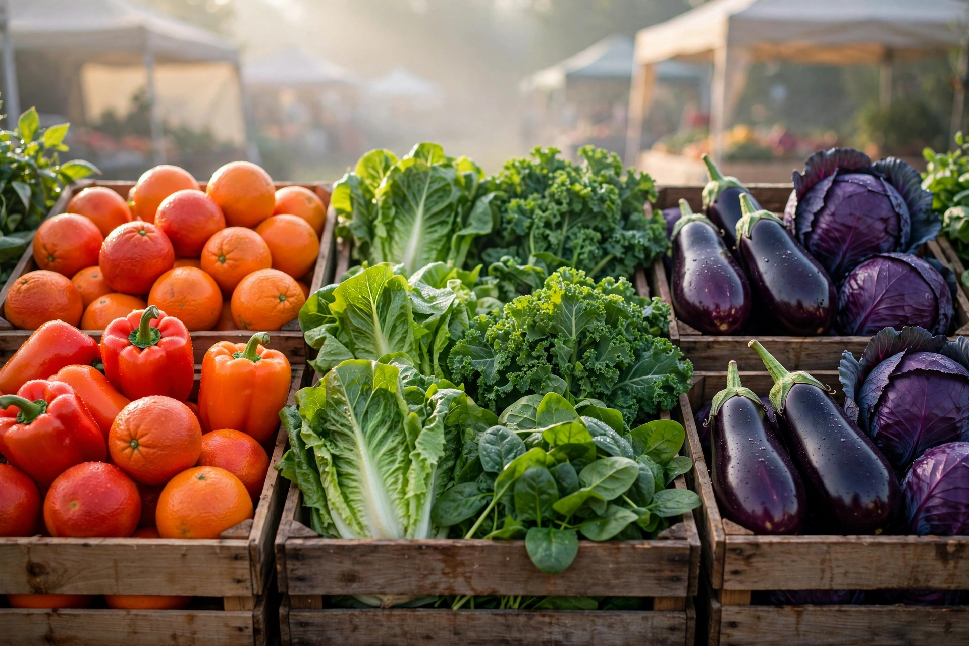
Farmers market — the palette, already harvested
Oranges and peppers for A, lettuce and kale for C, eggplant and red cabbage for E. A produce crate is an A minor chord you can eat — no art direction required, just a camera at opening time.
Use for: grocery, markets, farm brands, delivery
Dark end · Classy
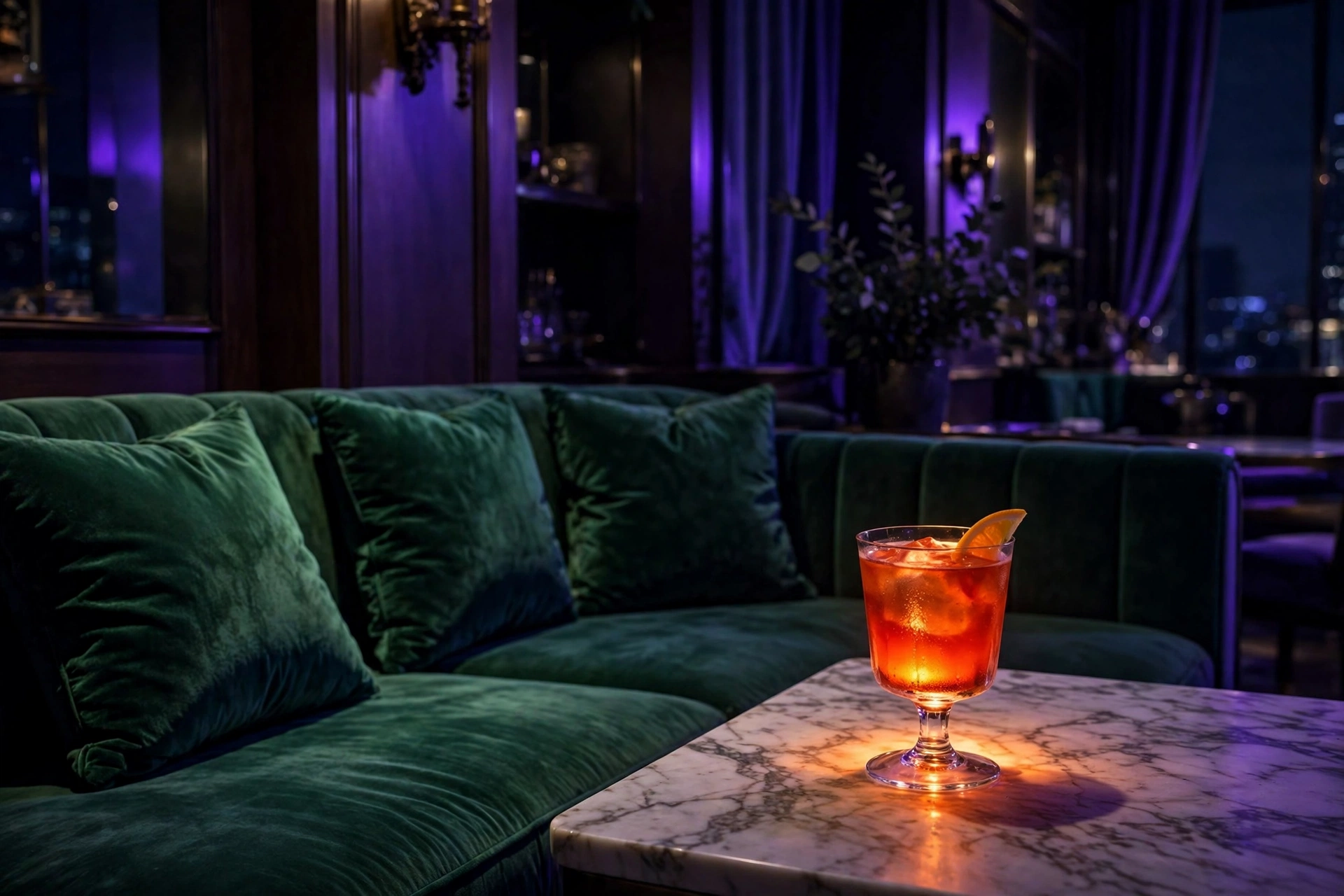
Lounge — one amber drink in a violet room
The market, after hours. Green velvet takes C’s place, violet dusk fills the room, and A survives as one glowing cocktail — the warmest, smallest thing in frame, and therefore the only thing you look at.
Use for: hotels, lounges, spirits, furniture
Product · Dark end
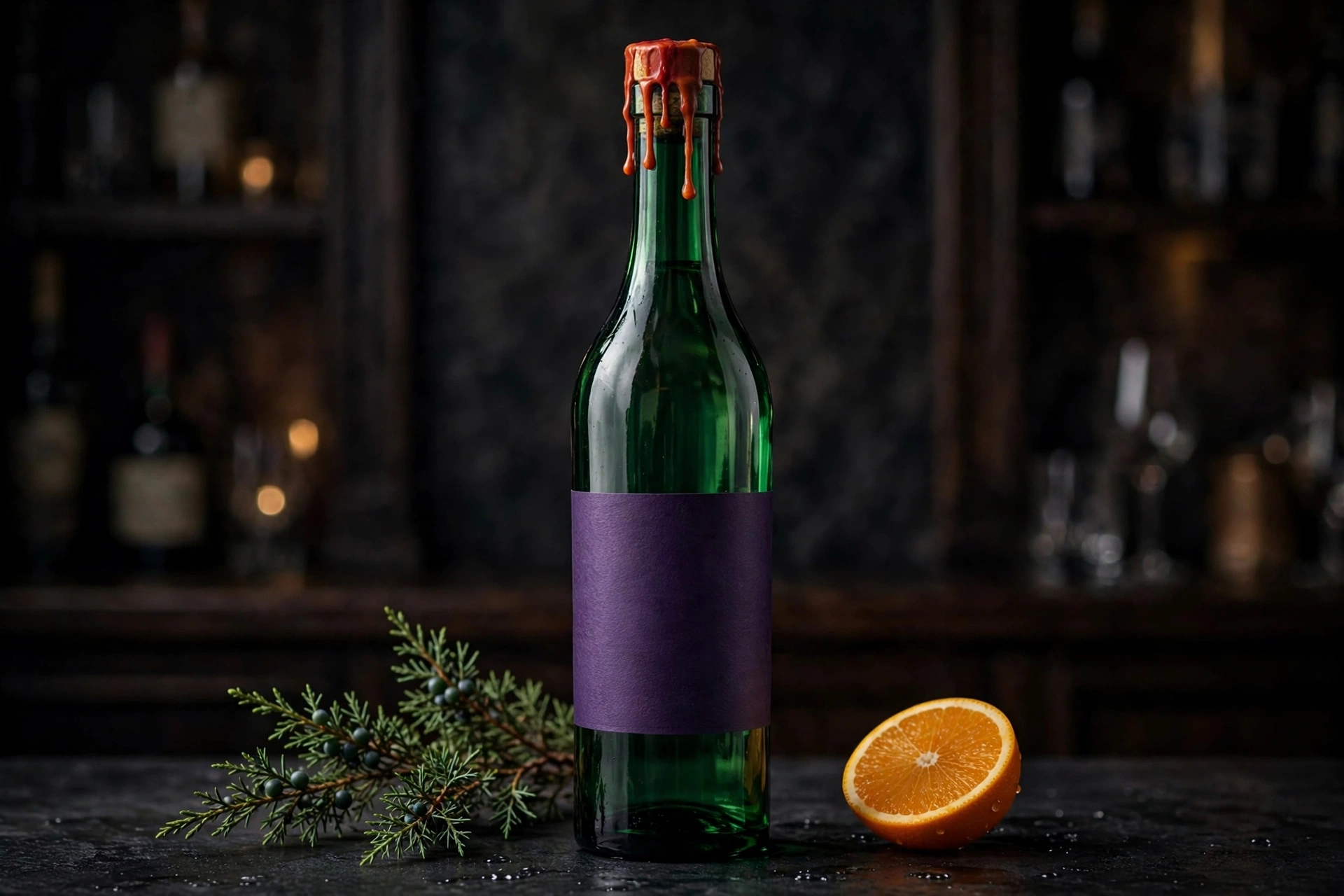
Gin — the lounge, bottled
A dark gin bottle carrying the chord: orange warmth, green depth, violet shadow. The cocktail from the lounge scene, given a label and a shelf to sit on.
Use for: spirits, bars, premium grocery
Logo · Light end
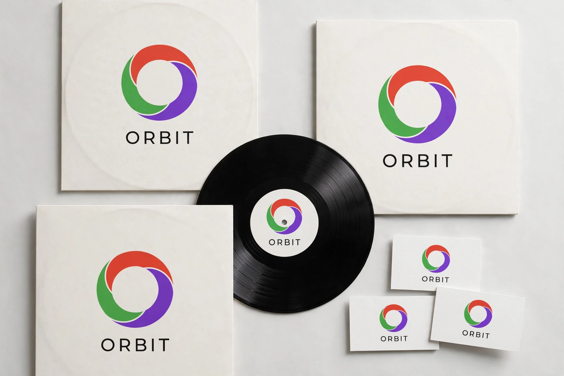
ORBIT — the brand board
ORBIT’s identity board runs the A minor trio — ember orange, vivid green, violet — across the mark and its applications. A space-age name on an earthy chord: the tension is the brand.
Use for: tech, beverages, identity
Deep muted · p–mp · Soft–Muted
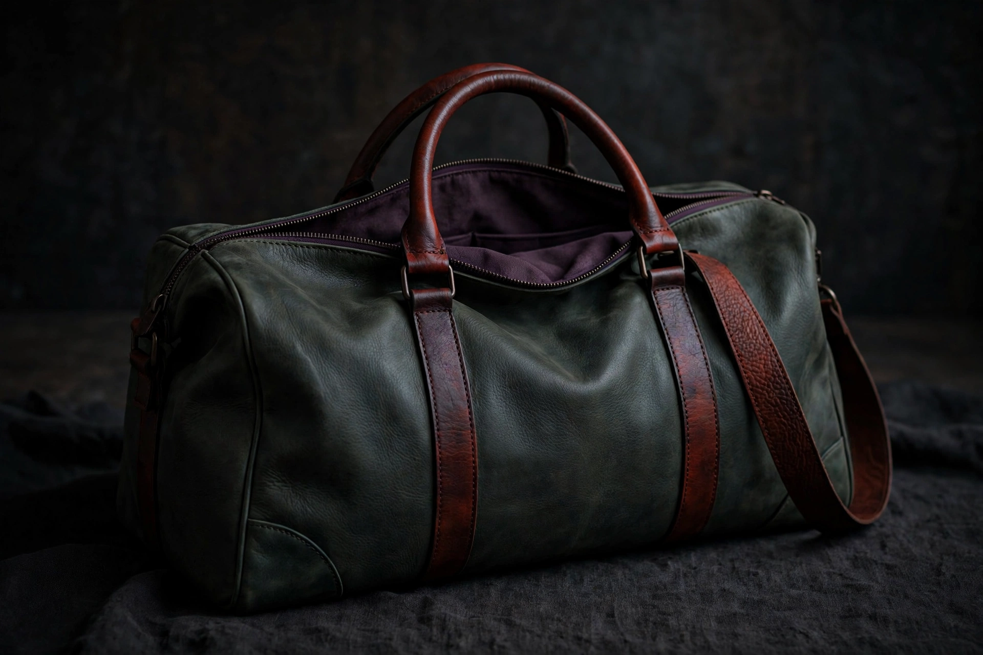
Leather duffel — all three colors in the bag
A minor muted deep: A’s ember orange becomes rust leather, C’s green deepens to forest, E’s violet goes plum — and all three are in the bag itself, body, panels and trim. Nothing borrowed from the background; the product carries the whole chord.
Use for: luggage, leather goods, travel retail
Deep muted · p–mp · Soft–Muted
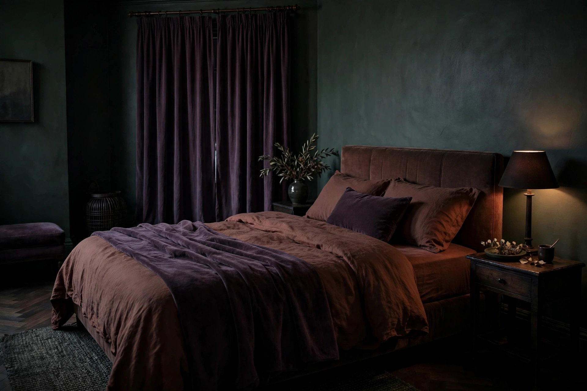
Hotel bedroom — the market, checked in
Plum walls, forest-green bedding, rust in the leather headboard and the lamplight. A minor’s farmers-market trio at p–mp reads as a boutique hotel room — the same chord, now selling a night’s sleep instead of a morning’s produce.
Use for: hotels, bedding & home, hospitality
Minor · The folk chordE minor
E #7900EAG #D80000B #AAFF00
Violet, signal red, yellow-green. E minor is the open-string folk chord — campfires, gardens, songs everybody knows — and its palette lives outdoors: red arriving as a rose or a geranium rather than a logo, yellow-green as foliage, violet as the light at the end of the day.
Best for
Florists, garden centers & nurseries
Weddings & outdoor entertaining
Garden restaurants & countryside hospitality
Natural, handmade & heritage brands
The angle
Don’t paint anything — plant it. E minor is the rare palette a florist already stocks and a garden already grows. Shoot it at two hours of the same day and you get both ends of the range for free.
Light end
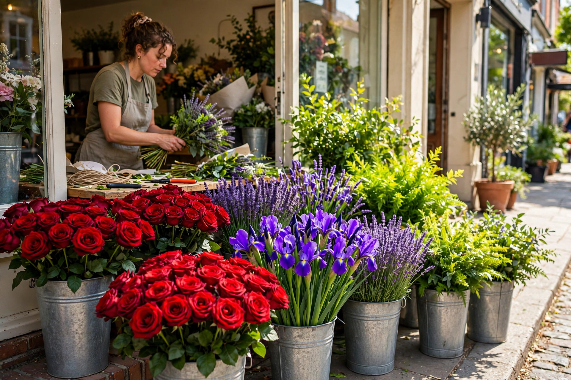
Flower shop — the palette, in buckets
Red roses doing G’s work, irises carrying E’s violet, foliage supplying B’s yellow-green. A florist’s morning delivery is this chord, wrapped in paper.
Use for: florists, weddings, garden retail
Dark end
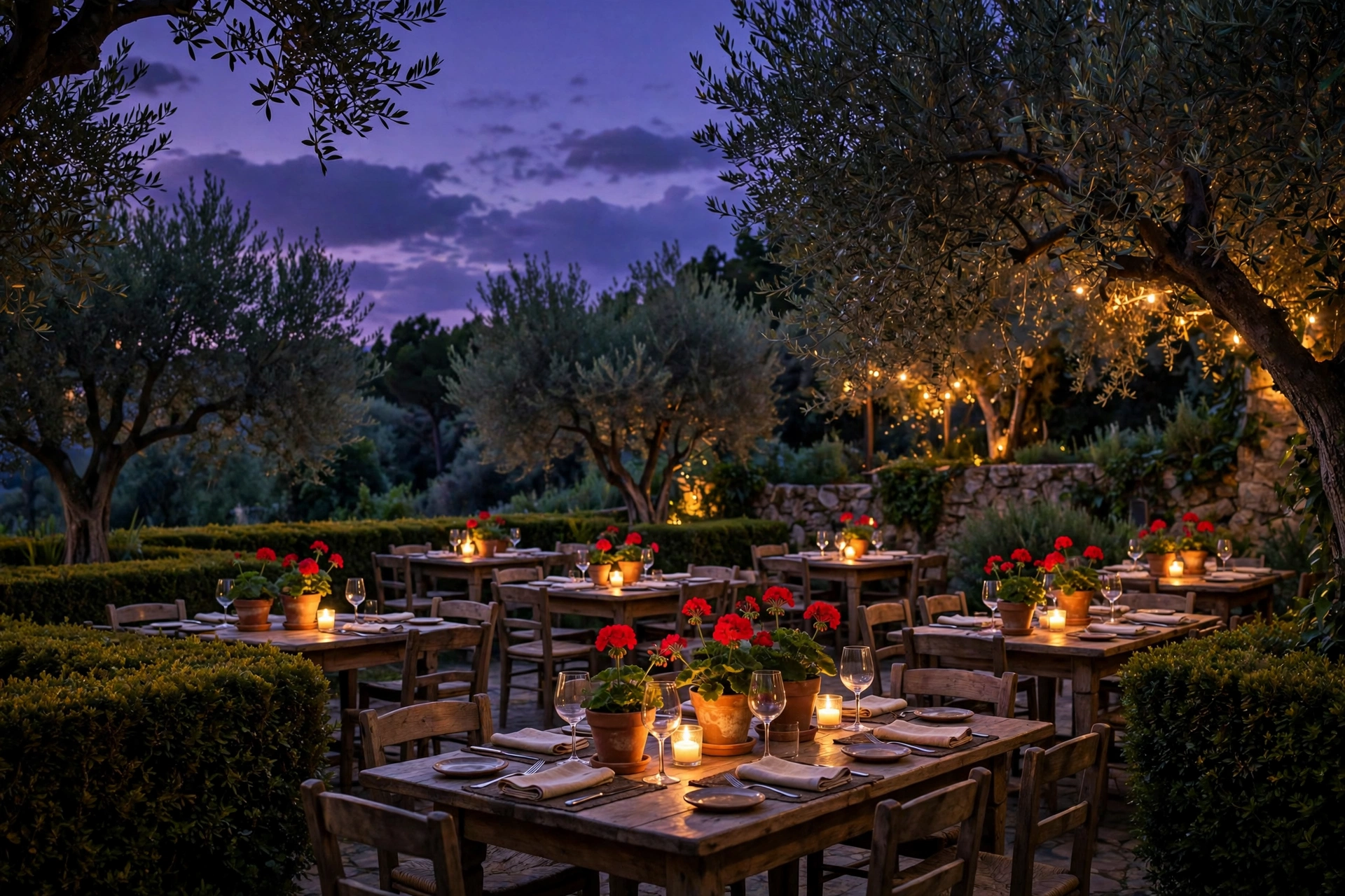
Garden restaurant — dusk does the mixing
Same three notes, an hour later. Violet stops being a flower and becomes the sky itself, while the reds and greens deepen underneath it. E minor darkens gracefully — a good sign for evening and outdoor brands.
Use for: garden dining, nurseries, outdoor living
Product · Light end
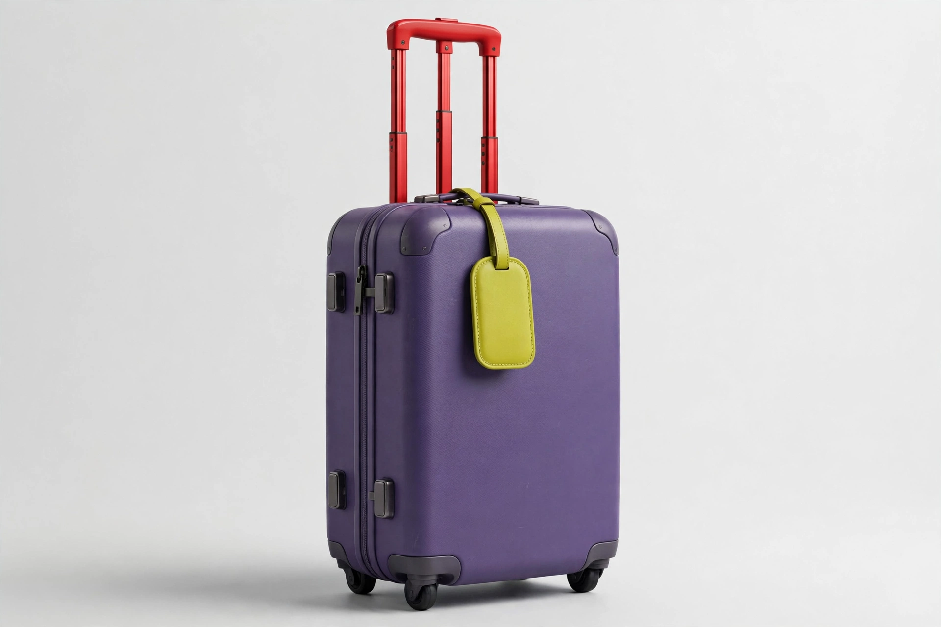
Suitcase — travel in three notes
A suitcase shot at the light end in violet, red and yellow-green. E minor leaves the garden and goes on the road — the palette packs well.
Use for: luggage, travel retail, airlines
Logo · Dark end
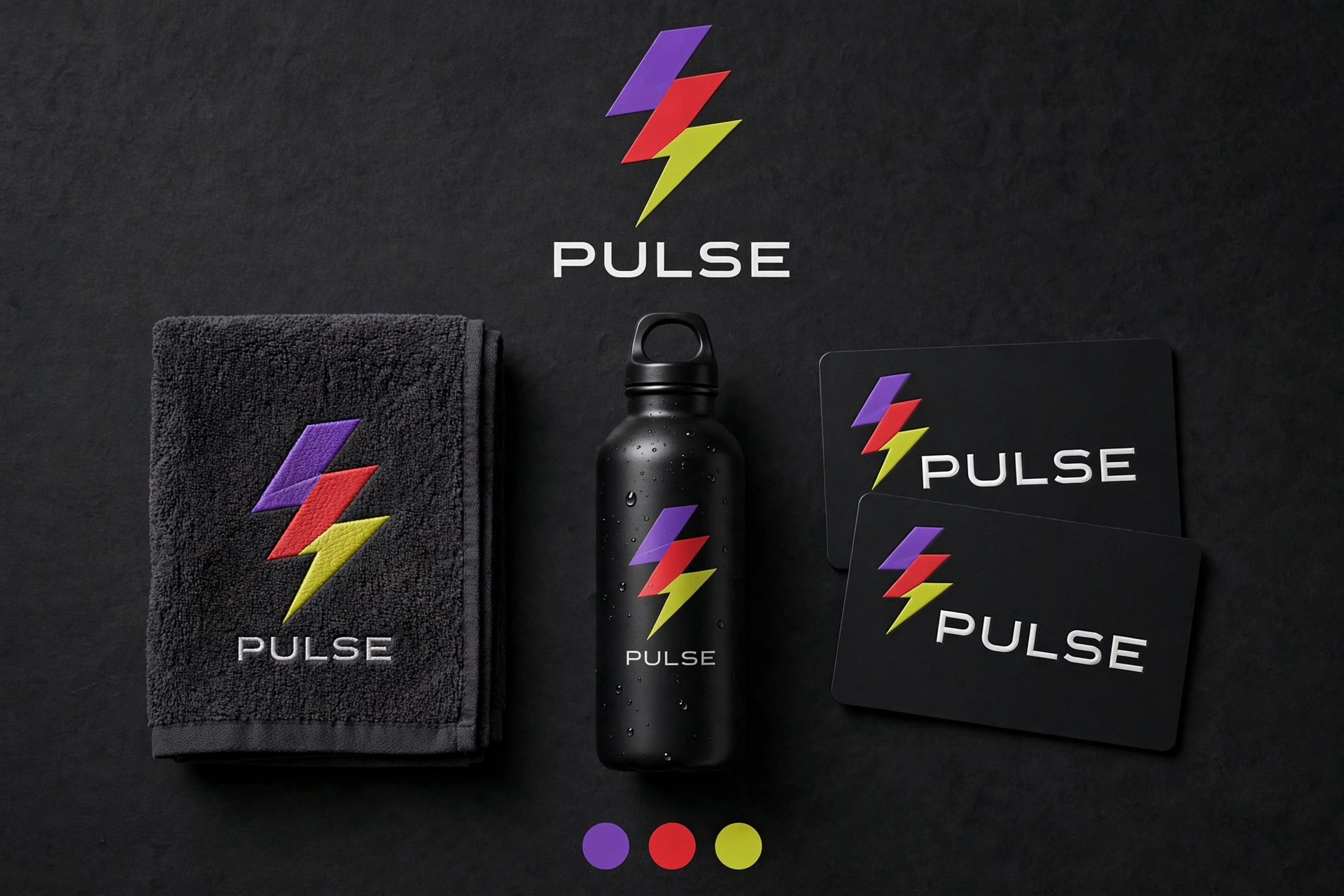
PULSE — after-dark identity
A dark brand board for PULSE: mark and applications in violet, signal red and yellow-green. The folk chord, electrified — a heartbeat identity for a night-time brand.
Use for: audio, fitness, nightlife, identity
Deep muted · p–mp · Soft–Muted
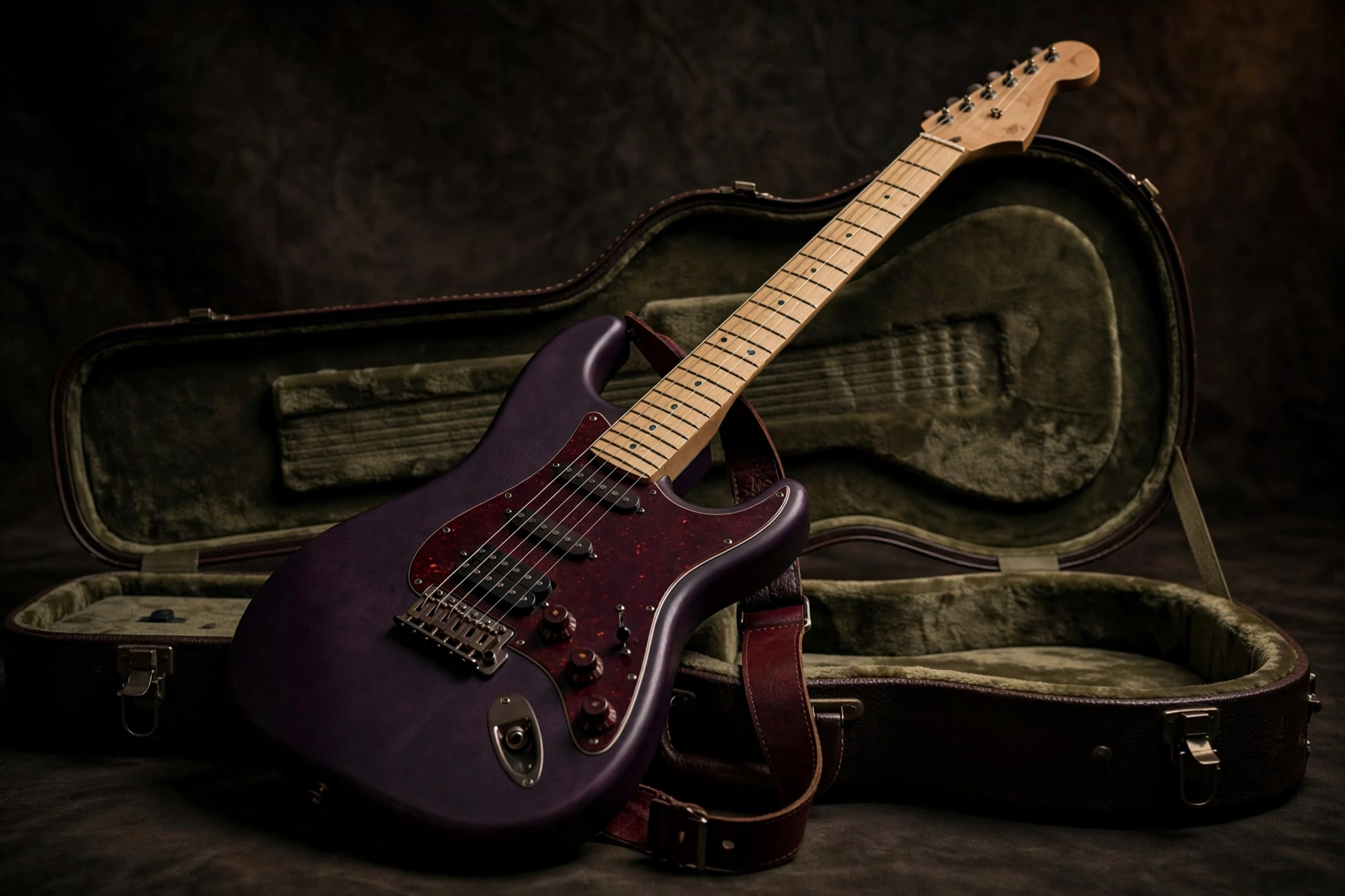
The guitar — plum, oxblood, olive
E minor at p–mp, Soft to Muted: the violet becomes eggplant on the body, the red becomes an oxblood tortoiseshell pickguard and strap, the yellow-green becomes the olive lining of the case. This is the register where the system stops looking like a color wheel and starts looking like a mood.
Use for: music retail, instruments, lessons
Deep muted · p–mp · Soft–Muted
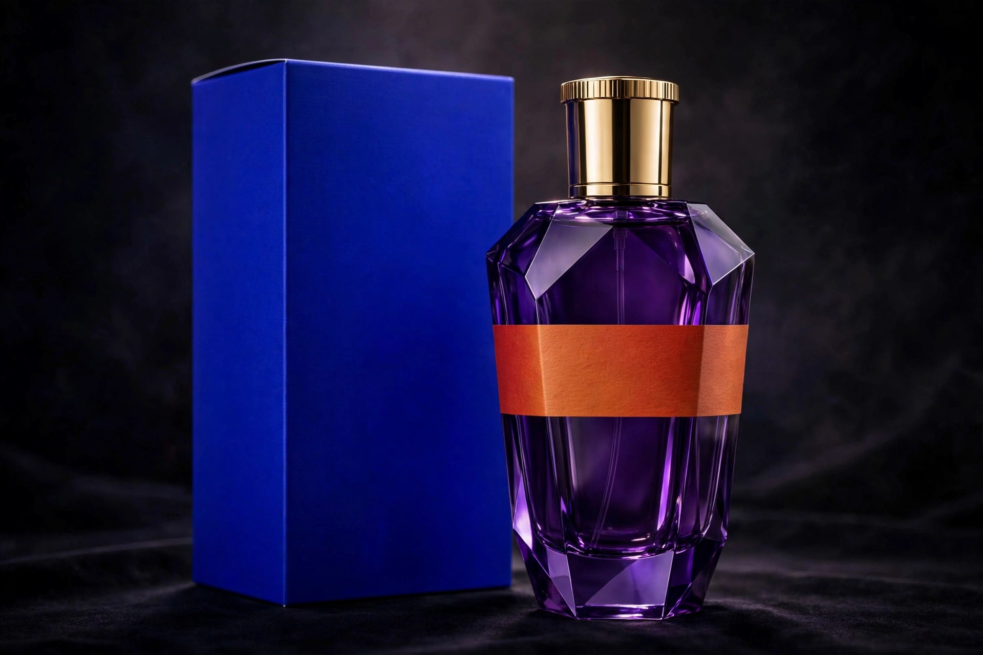
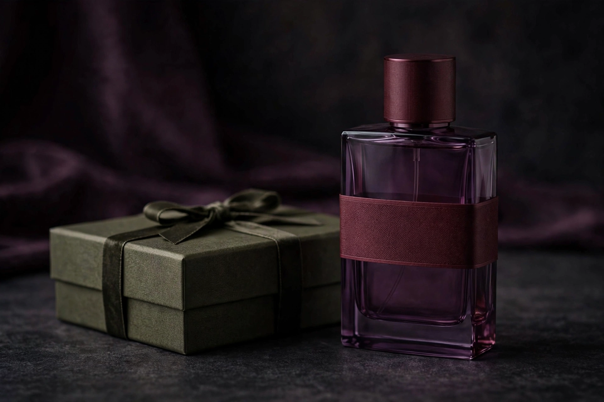
Perfume — plum glass, oxblood band
Plum glass, an oxblood cap and band, and the olive box it sleeps in. All three colors live in the product itself — nothing in the scene is decoration, and nothing is at full brightness.
Use for: fragrance, beauty, gifting
Deep muted · p–mp · Soft–Muted
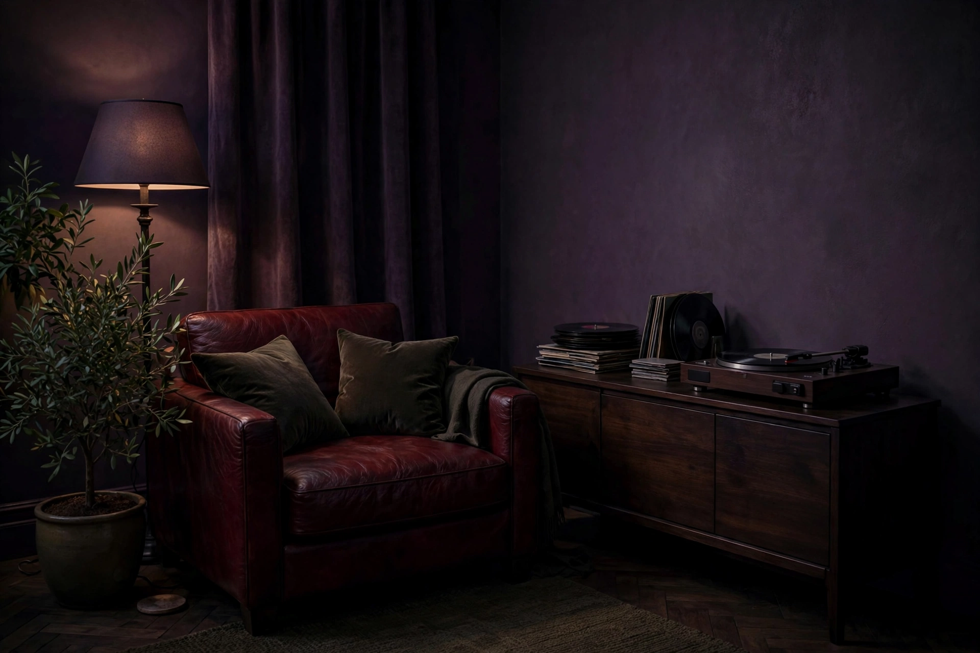
Listening room — lamplight only
Plum walls, oxblood leather, olive velvet and the plant in the corner. E minor’s garden chord brought indoors and turned down — a room built for listening, lit like the last hour of the day.
Use for: audio & hi-fi, furniture, hotels, interiors
Minor · The theatrical chordC minor
C #3AFF00E♭ #1000FFG #D80000
Green, deep indigo, signal red. C minor is the most theatrical of the minors — Beethoven’s key — and its palette behaves like stage design: a saturated indigo that reads as a painted door by day and shadow by night, red in the awning and the leather, green in the shutters and the basil.
Best for
Cafés, bistros & Mediterranean restaurants
Travel & old-town hospitality
Wine, opera & winter brands
Any brand with an old-world address
The angle
Architecture carries this one: paint the door indigo, hang the red awning, pot the green. C minor rewards places over products — shoot a real street corner and the chord is already there, waiting for a table.
Light end
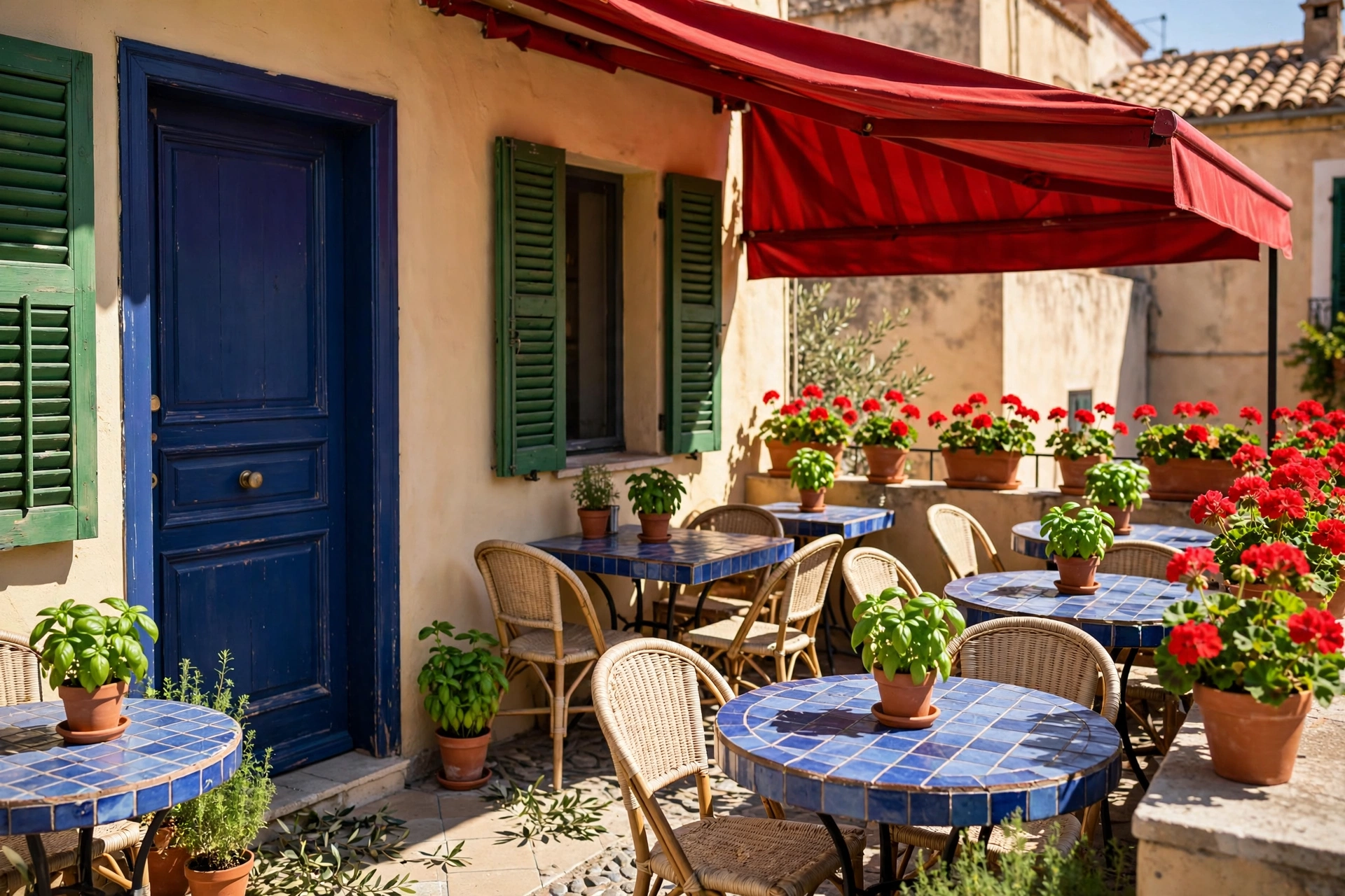
Mediterranean café — a door you can’t miss
The indigo door is the whole advertisement. Around it, green shutters and basil, a red awning and geraniums — a corner café that has been running C minor for a century without knowing it.
Use for: cafés, travel, Mediterranean food
Dark end
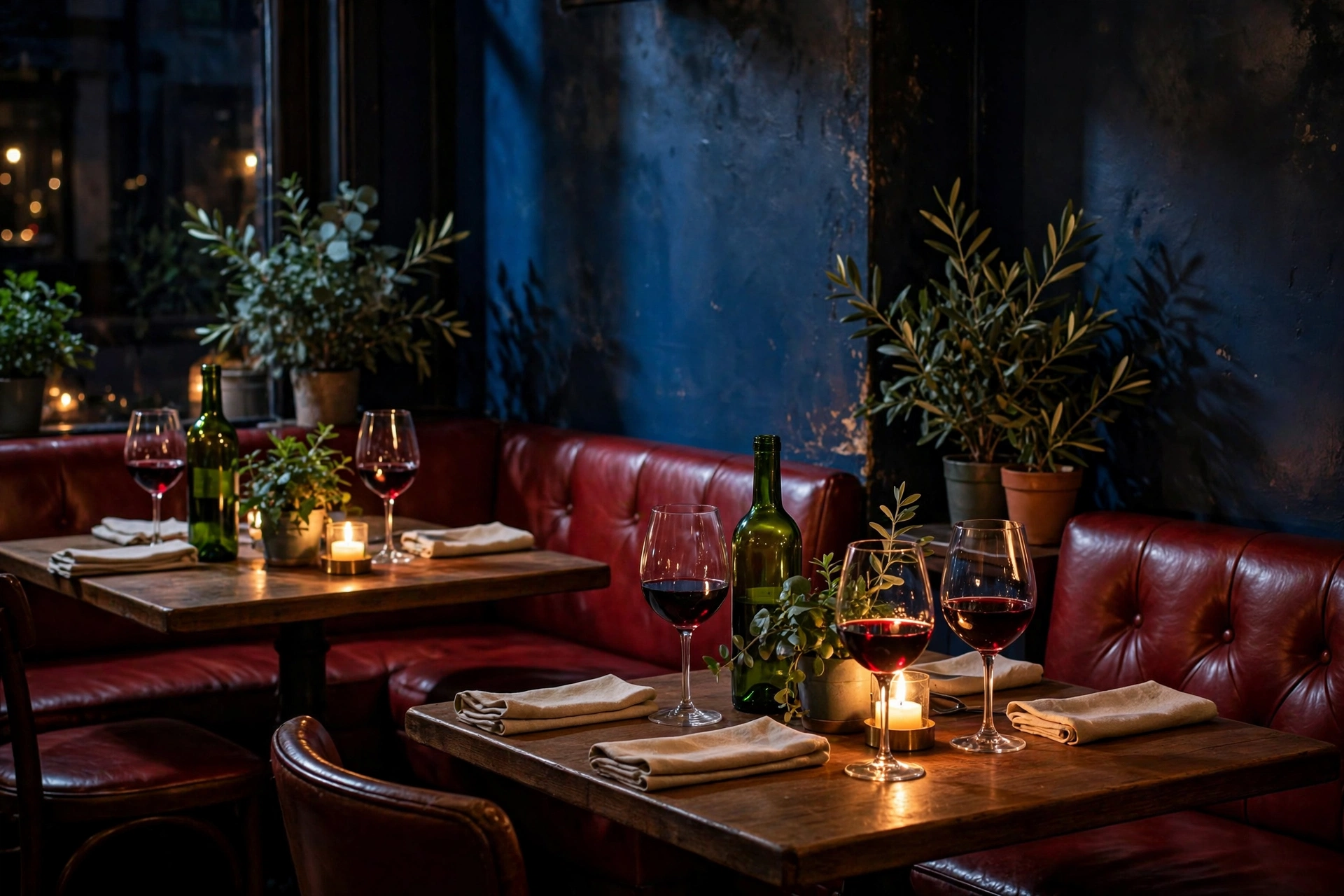
Bistro at night — candlelight and red leather
Darkened, the indigo becomes shadow and the green goes bottle-dark; the red leather and candle glow take the melody. C minor at night is every romantic bistro interior ever photographed.
Use for: bistros, wine bars, date-night brands
Product · Dark end
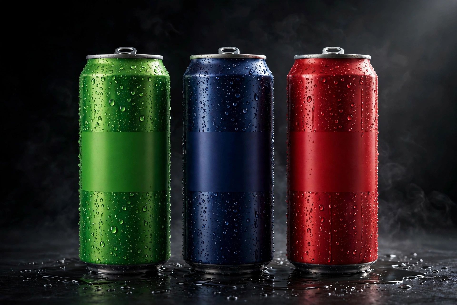
Soda — indigo goes pop
A soda shot at the dark end: deep indigo, signal red and green, with theater in it. C minor’s stage colors, carbonated.
Use for: beverages, concessions, youth brands
Logo · Light end
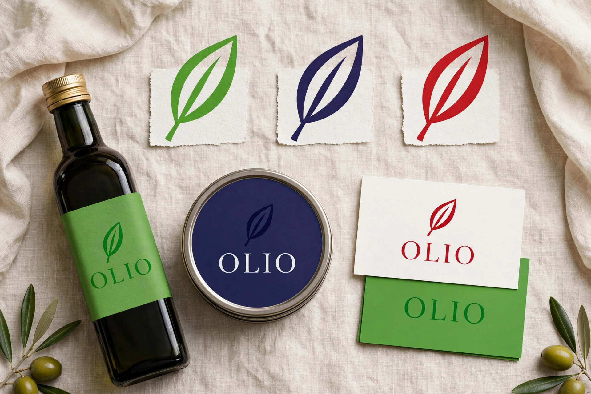
OLIO — pantry branding
A brand board for OLIO in green, indigo and red: an old-world pantry name wearing a theatrical palette. Shelf presence that reads from the end of the aisle.
Use for: food brands, delicatessens, identity
Minor · The passionate chordF minor
F #820097A♭ #FF2000C #3AFF00
Deep violet, scarlet, vivid green. F minor is the heavy one — four flats, all passion — and its palette is a flower market at noon and a jazz singer at midnight: scarlet doing the feeling, violet doing the depth, green keeping both honest.
Best for
Florists & flower markets
Jazz clubs, cabaret & live music
Spirits & dramatic retail
Brands that lead with feeling
The angle
Let scarlet be a person or a flower, never a background. F minor’s drama comes from one hot note against violet depth — a dress, a poppy, a stage light — with green as the stems and shadows that make it believable.
Light end
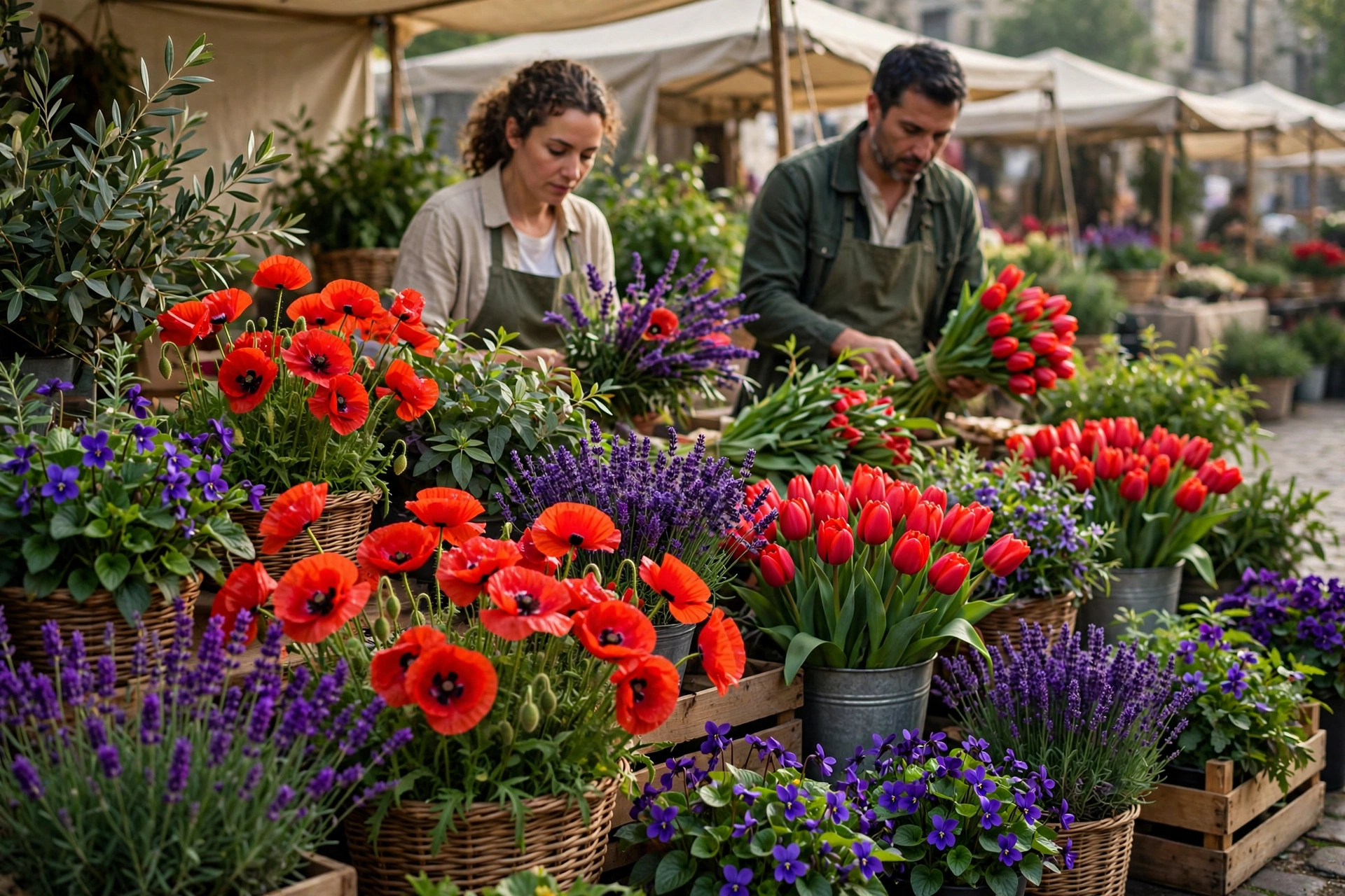
Flower market — scarlet by the bunch
Poppies and tulips carry the A♭, lavender the F, and every stem votes green for C. Daylight F minor is abundance — the passionate chord with its sleeves rolled up.
Use for: florists, markets, spring campaigns
Dark end · Classy
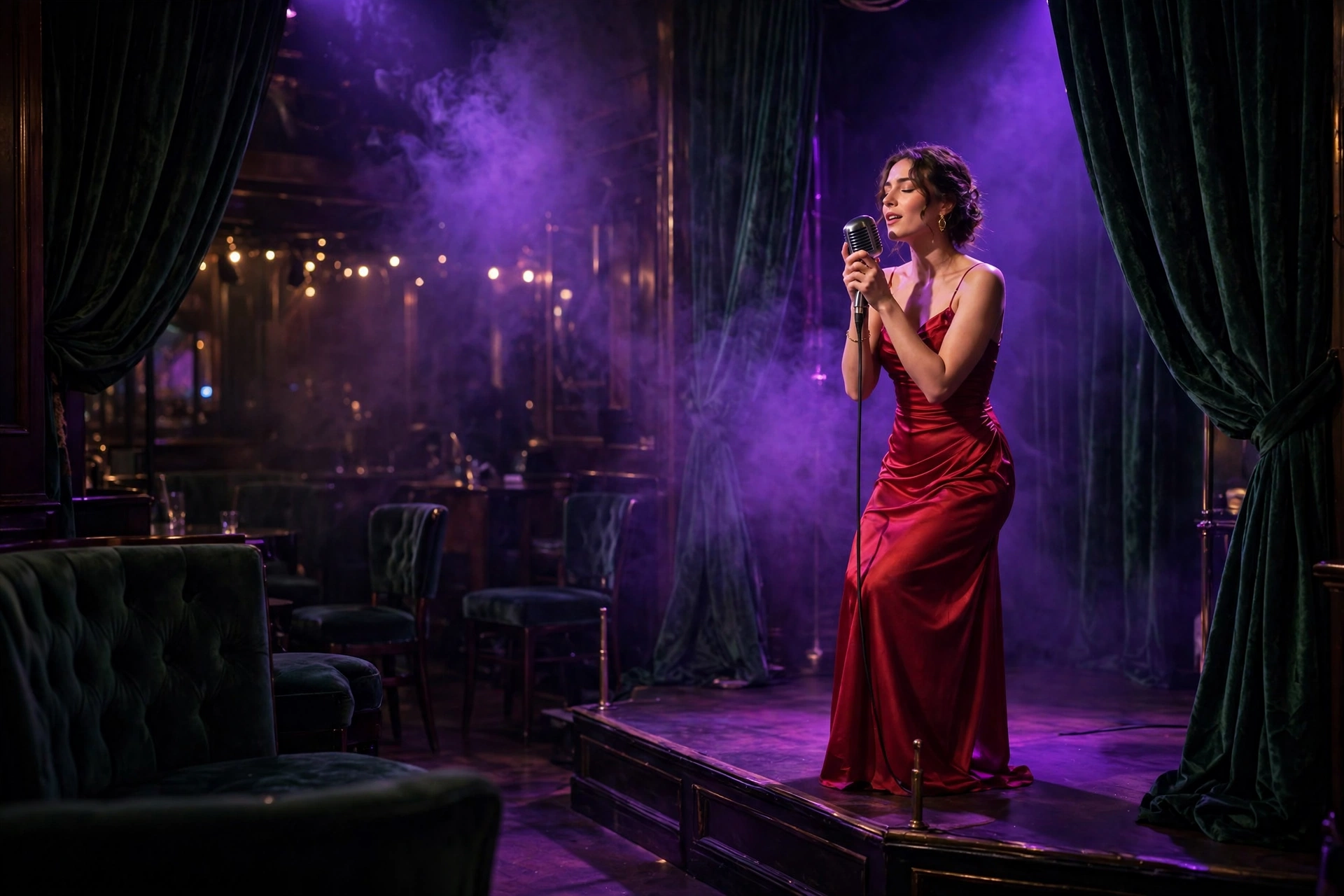
Jazz club — the singer is the scarlet
Violet haze, green velvet, and one woman in a scarlet gown holding the whole chord together. This is F minor’s center of gravity: desire, staged simply, believed completely.
Use for: music venues, spirits, evening wear
Product · Dark end
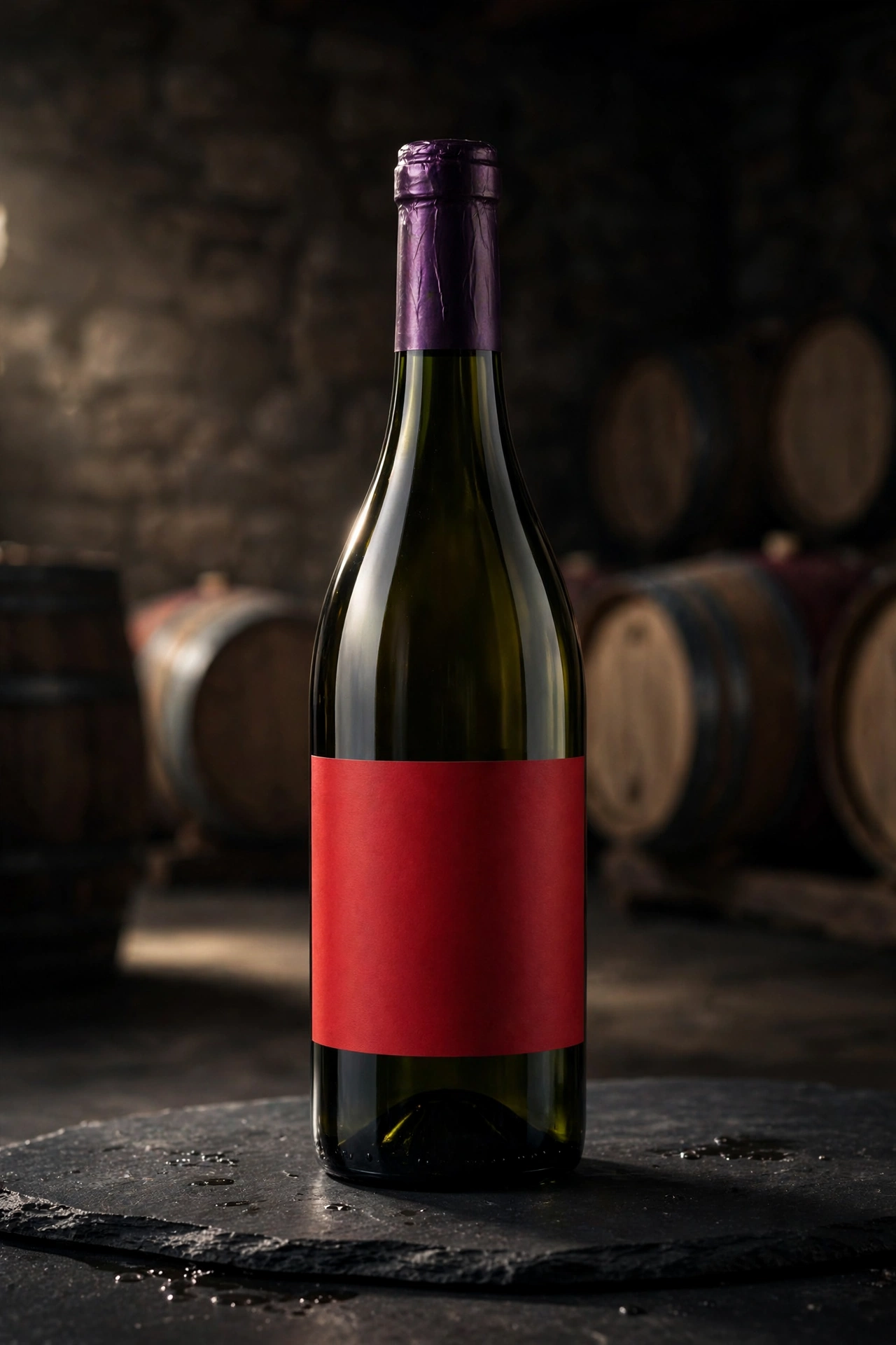
Wine — the scarlet, poured
A wine bottle at the dark end: scarlet against violet depth and green glass. The jazz singer’s gown, cellared — F minor you can order by the bottle.
Use for: wine, restaurants, gifting
Logo · Light end
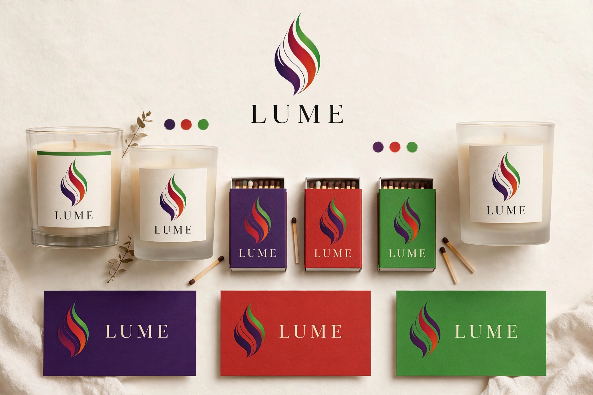
LUME — light, branded
A light brand board for LUME: deep violet, scarlet and vivid green across the mark and applications. A candle-and-stage-light name on the most passionate chord in the set.
Use for: lighting, beauty, hospitality, identity
Major · The everyman chordC major
C #3AFF00E #7900EAG #D80000
Green, violet, red — the same three notes as C minor with the middle one lifted, and the mood lifts with it. C major is the plainest chord in music and its palette is just as plain-spoken: tomatoes, lavender, leaves. Lunch outside, then dinner on the same terrace.
Best for
Family restaurants & garden dining
Food brands, olive oil & wine
Home, garden & outdoor living
Friendly, unpretentious everything
The angle
C major vs. C minor is the cleanest demo in this gallery: swap indigo for violet, keep the red and green, and theater becomes lunch. Use the pair to show a client exactly what one note does to a brand’s mood.
Light end
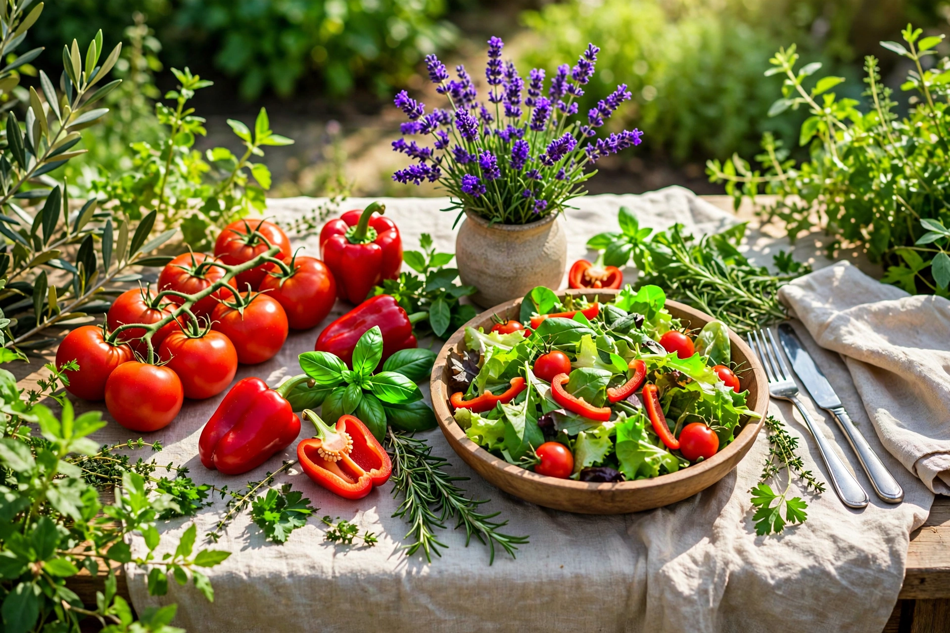
Garden lunch — tomatoes and lavender
The everyman chord at the table: red tomatoes, green everything, violet as lavender in a jar. Nothing styled within an inch of its life — that’s the point, and the appeal.
Use for: food brands, family dining, garden retail
Dark end
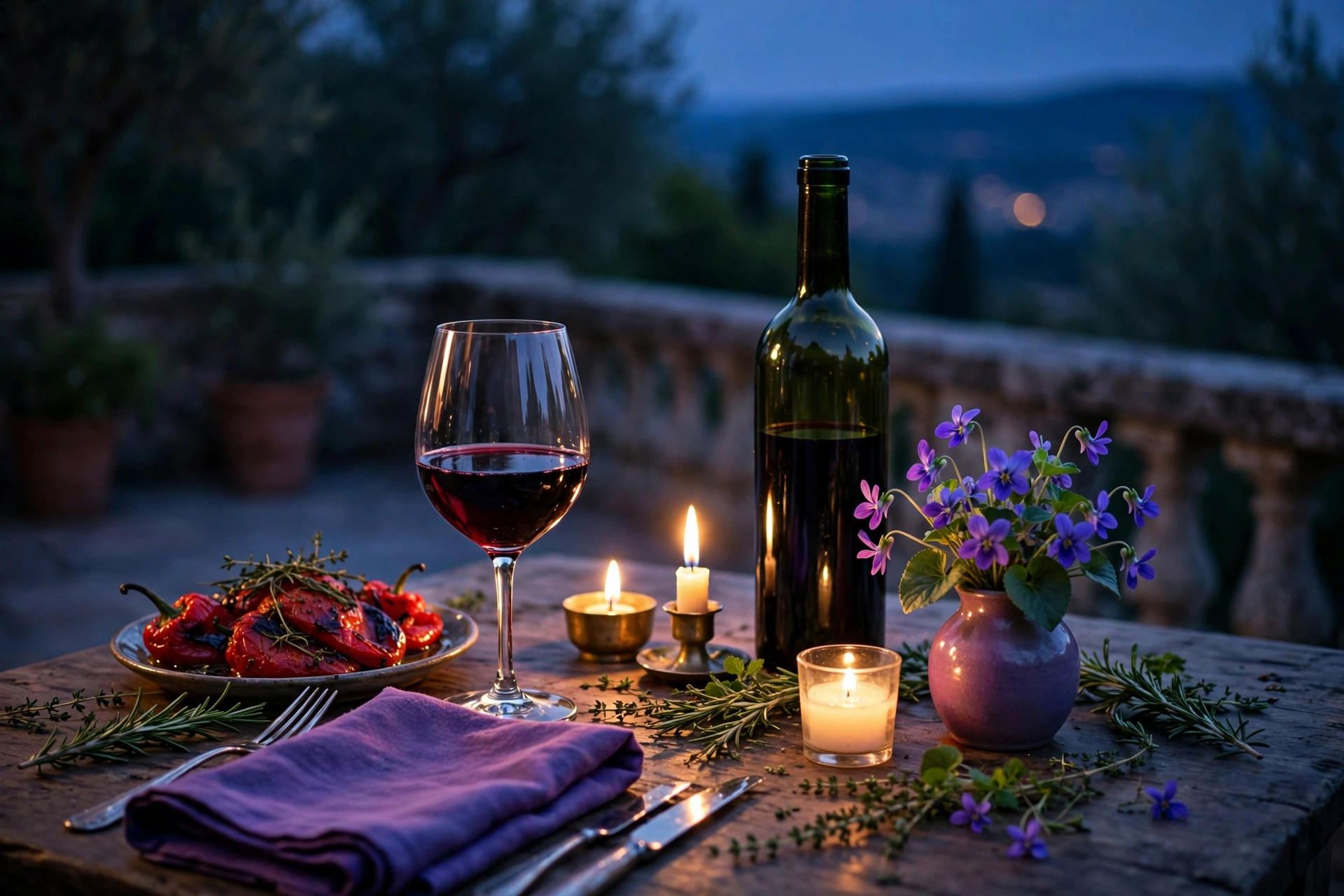
Terrace dinner — same table, dusk
Evening softens C major without saddening it: wine takes the red, violets take the light, the green goes deep. Proof a major palette can do dinner without borrowing a minor’s clothes.
Use for: wine, restaurants, outdoor living
Product · Light end
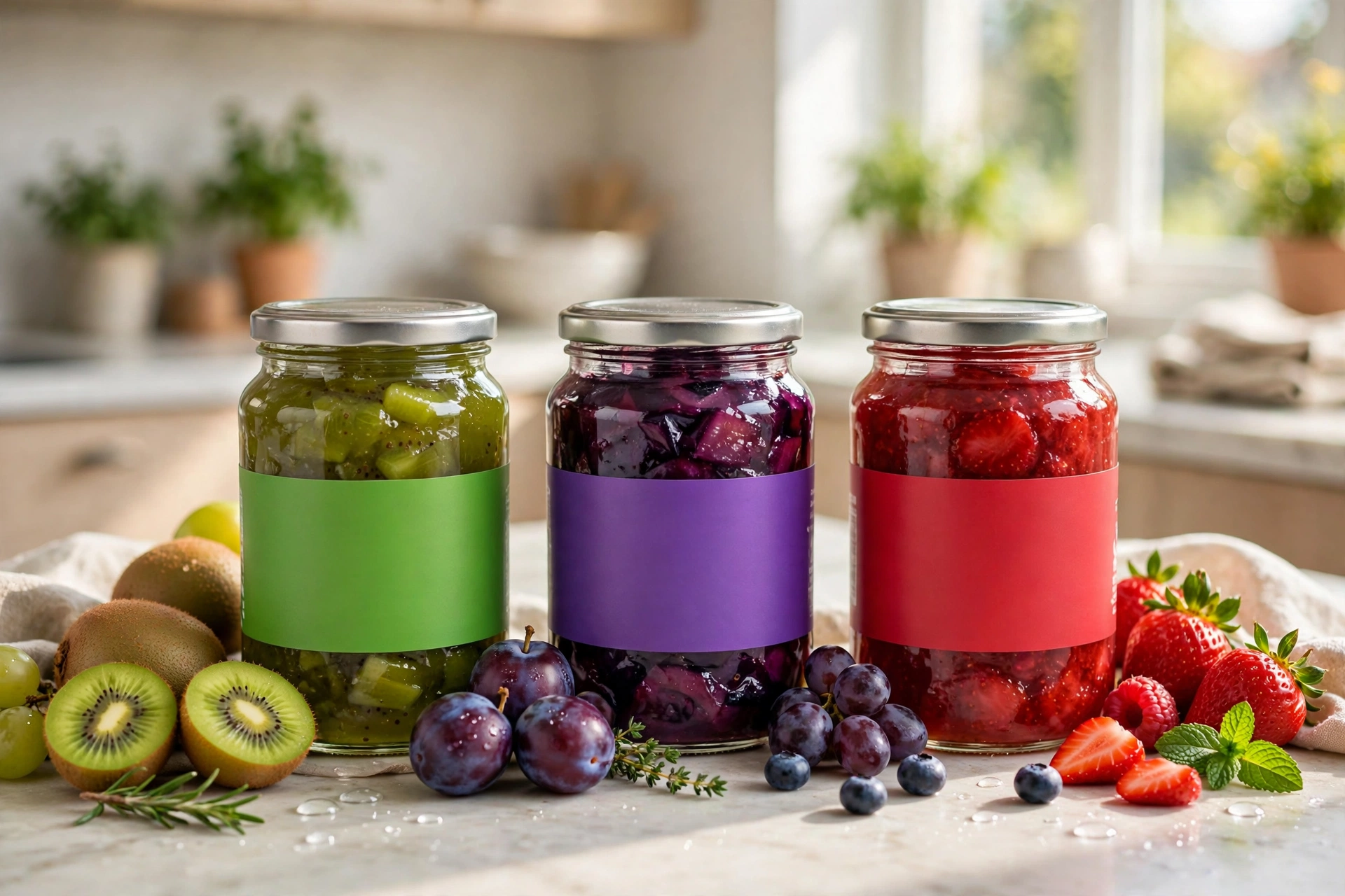
Preserves — the garden lunch, jarred
Jars of preserves at the light end: red fruit, green herbs, violet labels. The everyman chord as a product line — the garden lunch you can take home.
Use for: food brands, delis, farm shops
Logo · Light end
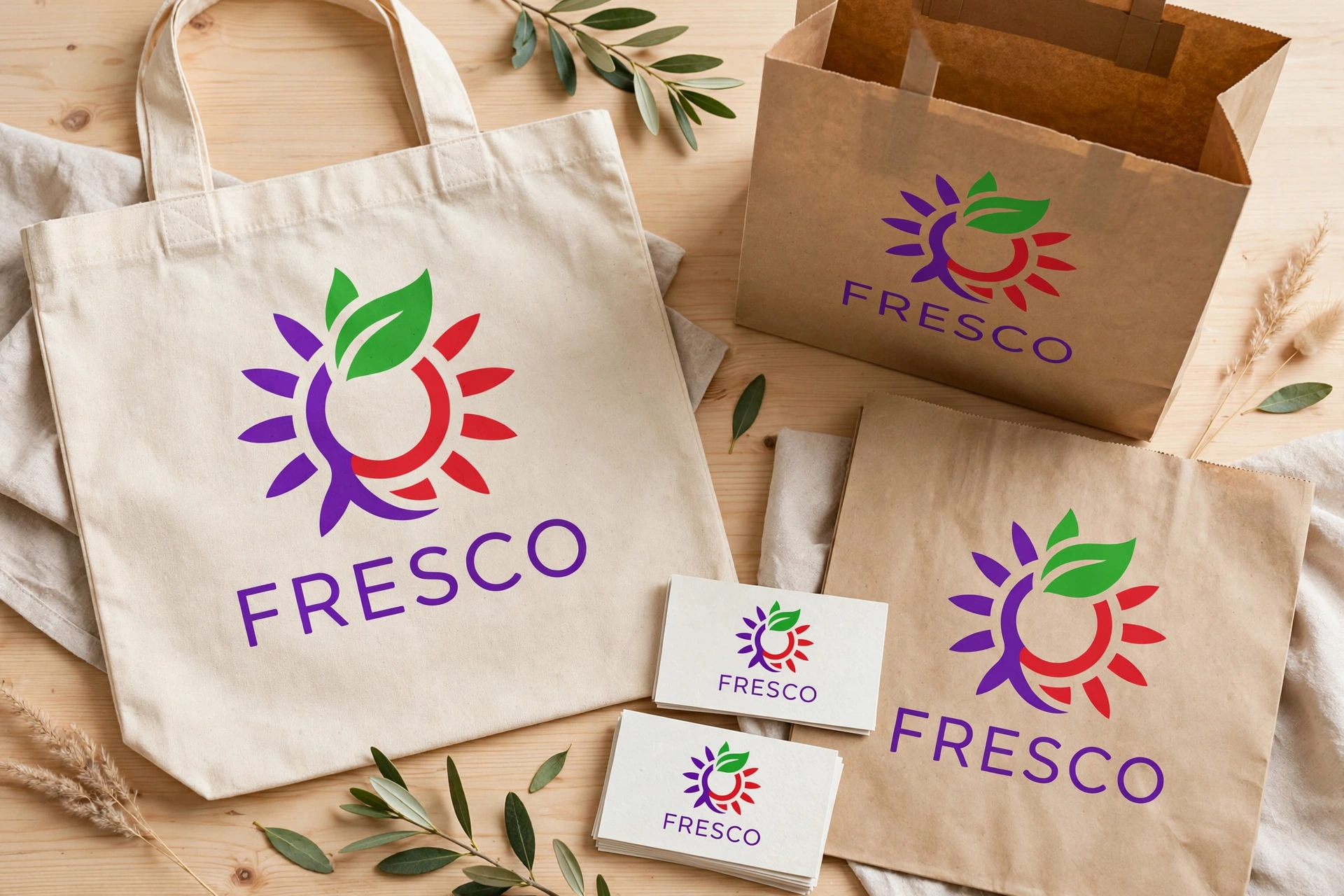
FRESCO — fresh, by design
A brand board for FRESCO in green, violet and red: Italian-fresh naming on the plainest chord in music — and all the more trustworthy for it.
Use for: food brands, restaurants, identity
Major · The campfire chordG major
G #D80000B #AAFF00D #008FFF
Signal red, yellow-green, true blue — G minor’s palette with the ache removed. G major is the campfire and road-trip chord, and its colors are the colors of being outside: a red umbrella or a red pickup, lime-bright gear, and all that blue sky doing the heavy lifting.
Best for
Beach, outdoor & recreation brands
Road trips, trucks & Americana
Folk, country & feel-good retail
Tourism that smells like sunscreen
The angle
Compare it with G minor on this page: identical notes except one, and the street becomes a holiday. G major is the daylight setting of the same dial — schedule it for anything sold between May and September.
Light end
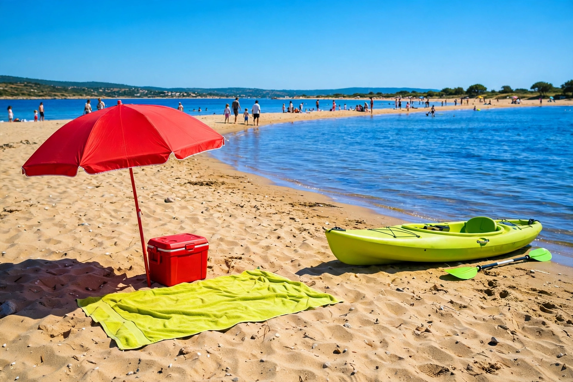
Beach day — umbrella, kayak, sky
Red umbrella, lime kayak, blue everything else. G major at the light end is the most photographable palette in the set — a beach hands it to you pre-mixed.
Use for: beach brands, tourism, outdoor retail
Dark end
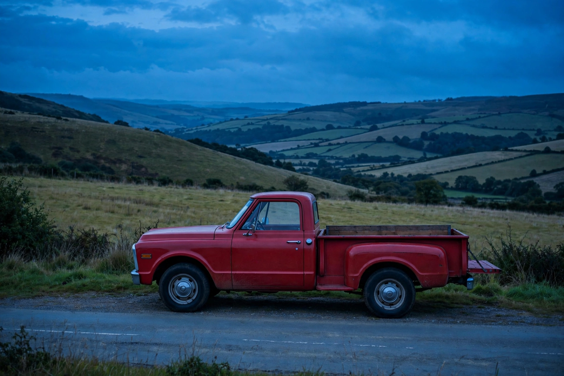
Road trip — the blue hour run
A red pickup under a deepening blue sky, the fields gone olive with the light. G major darkens into nostalgia — the drive home with the windows down.
Use for: automotive, travel, country brands
Product · Light end
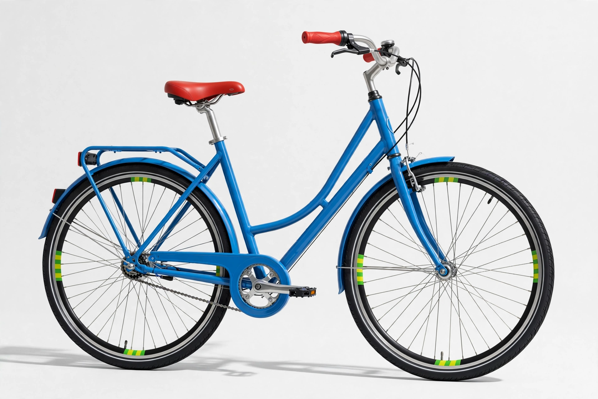
Bicycle — the road trip, downsized
A blue city bike at the light end — D’s blue does the frame, G’s red takes the saddle and grips, and B’s yellow-green flashes small on the tires: the campfire chord on two wheels.
Use for: cycling, outdoor retail, tourism
Logo · Light end
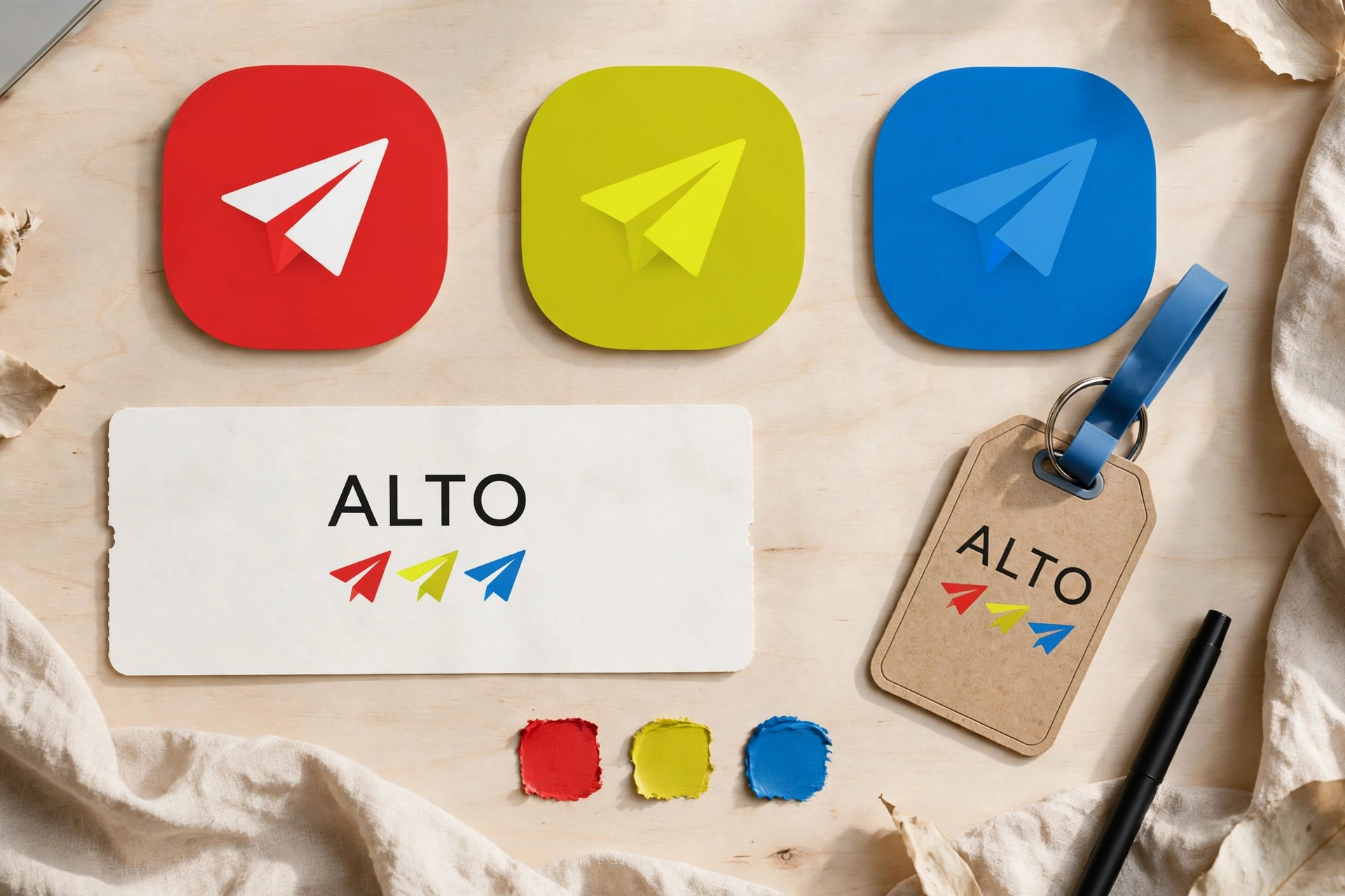
ALTO — the brand board
ALTO’s board runs the G major trio across logo and applications — red, yellow-green, blue, no shadows. A high, clear name for the brightest chord in the set.
Use for: outdoor brands, audio, identity
Major · The heartland chordD major
D #008FFFF♯ #A80000A #FF7800
True blue, deep red, ember orange. D major shares its notes with D minor but swaps violet for deep red — and turns romance into backbone. It’s the heartland palette: barn red, pumpkin orange, big-sky blue, with a working harbor waiting at the dark end.
Best for
Farm, harvest & rural brands
Sport, trucks & Americana
Coastal & working-waterfront tourism
Anything honest and built by hand
The angle
Blue does the sky, orange does the harvest, red does the barn and the boat hull. D major is D minor’s daylight sibling — put the two sections side by side in a pitch and the client will feel the difference before you explain it.
Light end
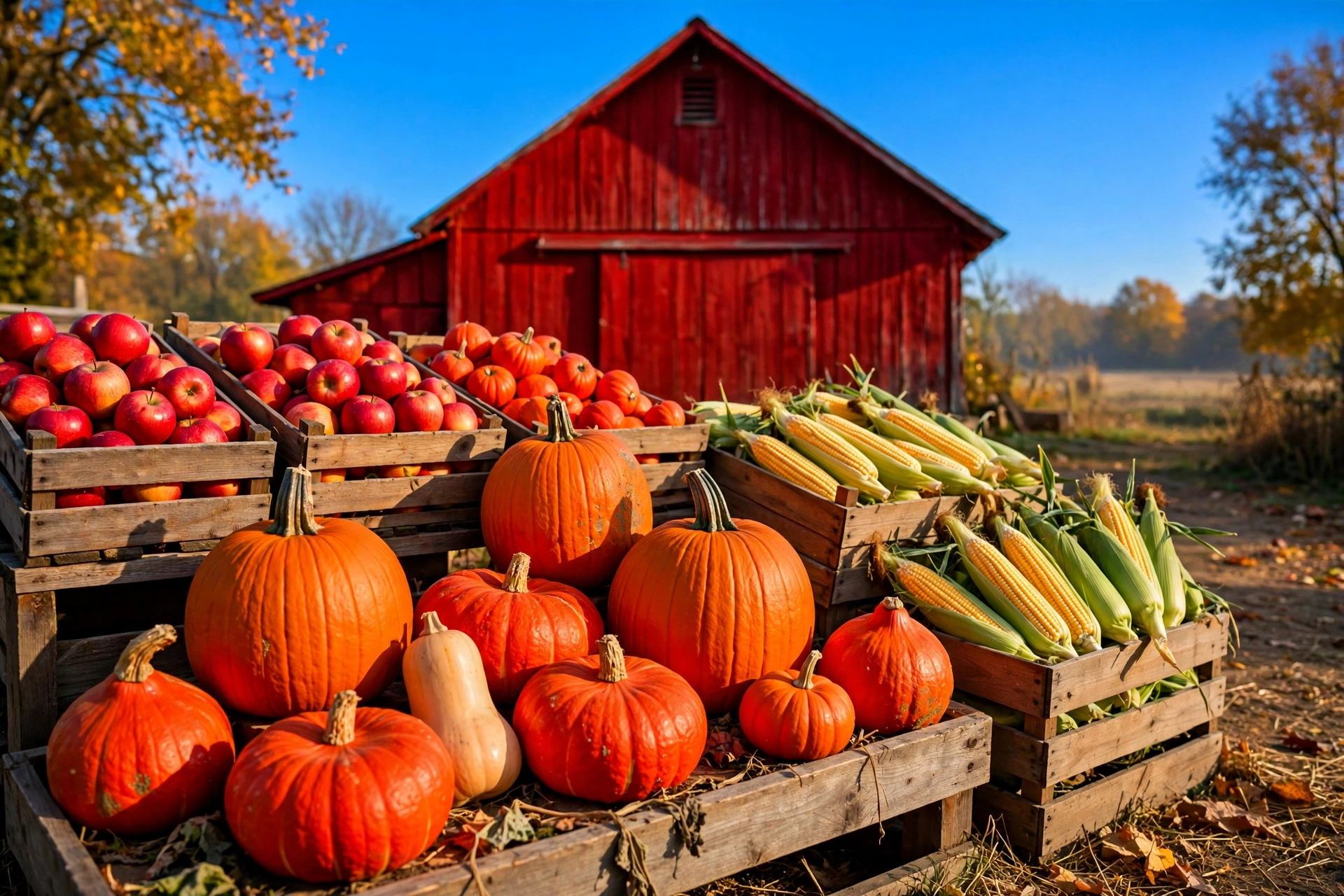
Farm stand — pumpkins, barn, sky
The heartland chord at full brightness. Every element is a real thing on a real farm — D major doesn’t need styling, it needs October.
Use for: farm brands, harvest, grocery, rural tourism
Dark end
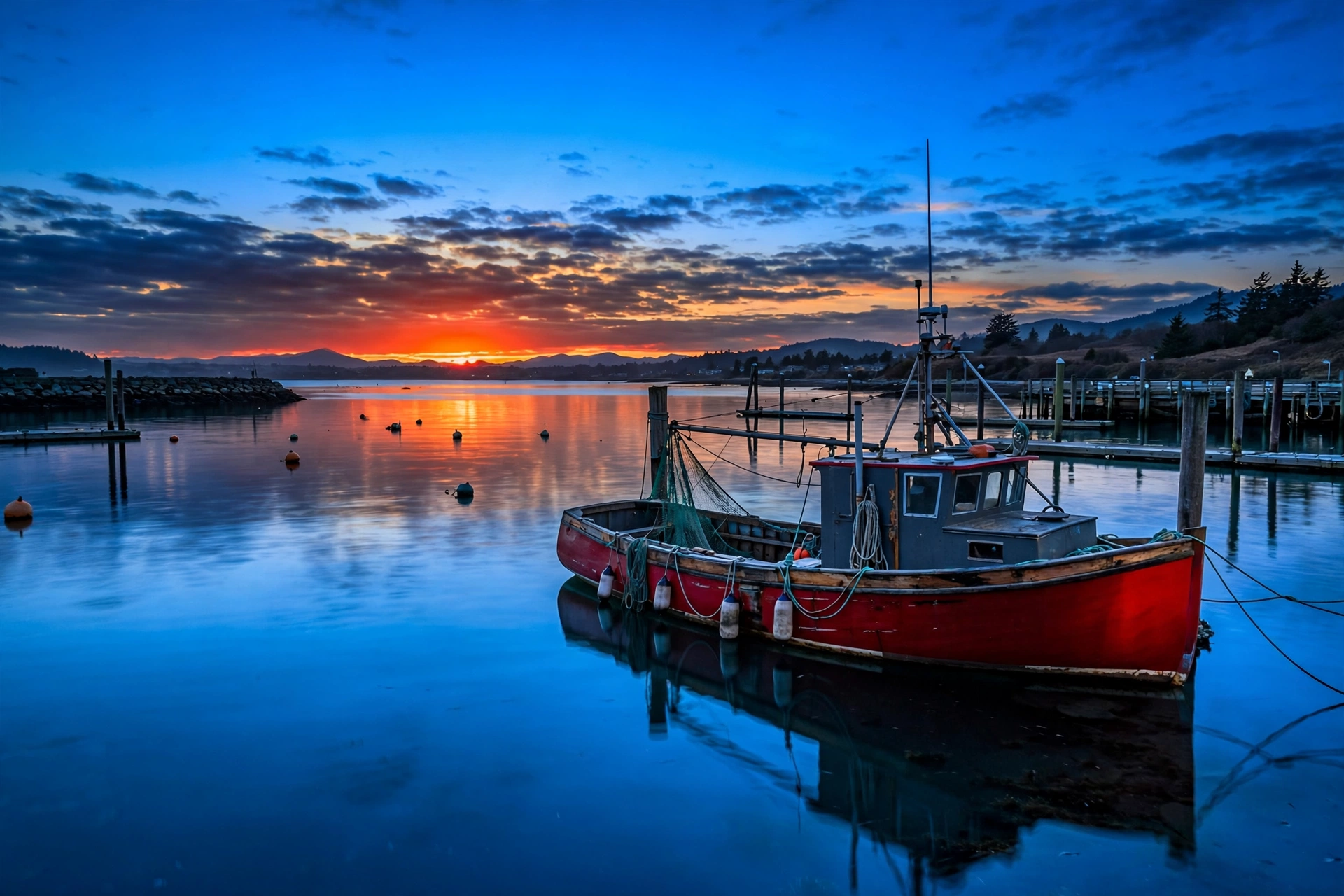
Harbor dusk — the red hull at sunset
Day’s end on the water: the blue deepens, the orange concentrates into the sky, and the red hull holds the frame. D major’s dark end is a postcard that still smells of diesel and salt.
Use for: coastal tourism, seafood, marine brands
Product · Dark end
Watch — heartland, on the wrist
A watch shot at the dark end in blue, deep red and ember orange: D major’s barn-and-harbor colors made precise. Backbone you can wear.
Use for: watches, accessories, gifting
Logo · Dark end
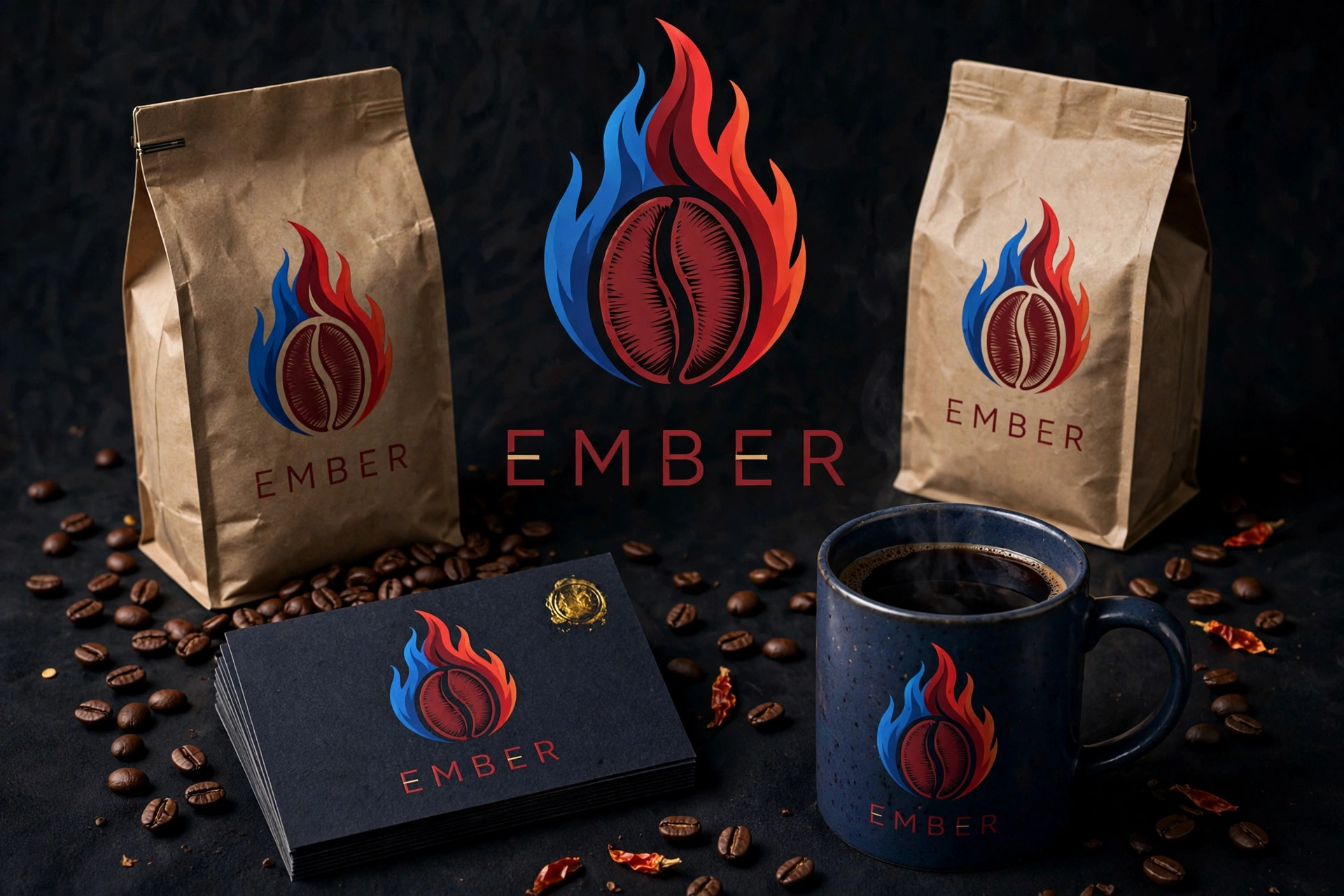
EMBER — the dark board
A dark brand board for EMBER: the word “ember” is literally one of D major’s colors — its orange note — set against blue and deep red. Naming and palette in unison.
Use for: outdoor brands, spirits, identity
Major · The loudest chordA major
A #FF7800C♯ #00FFECE #7900EA
Ember orange, electric cyan, violet. A major is the extrovert of the majors — tropical water, citrus, bougainvillea — a palette that reads as a resort before a single word of copy. At dusk it turns into neon-era Miami: a turquoise hotel against a violet sky.
Best for
Resorts, pools & tropical travel
Tech, gaming & youth brands
Beverages & summer launches
Anything that must be seen from the highway
The angle
Cyan is the rarest note in natural scenes, which is why A major feels designed even when it isn’t — pool water and Deco stucco supply it honestly. Spend the orange on the furniture and the people, and let violet arrive with the evening.
Light end
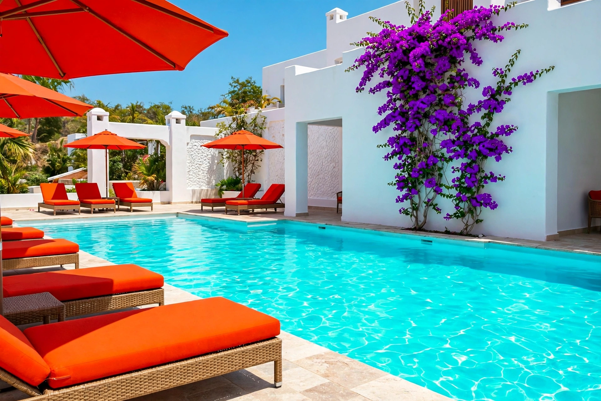
Resort pool — cyan water, orange loungers
The loudest major at full volume: a cyan pool, orange loungers, violet bougainvillea climbing the wall. A travel ad that books the trip before the headline loads.
Use for: resorts, travel, swim & summer brands
Dark end · Classy
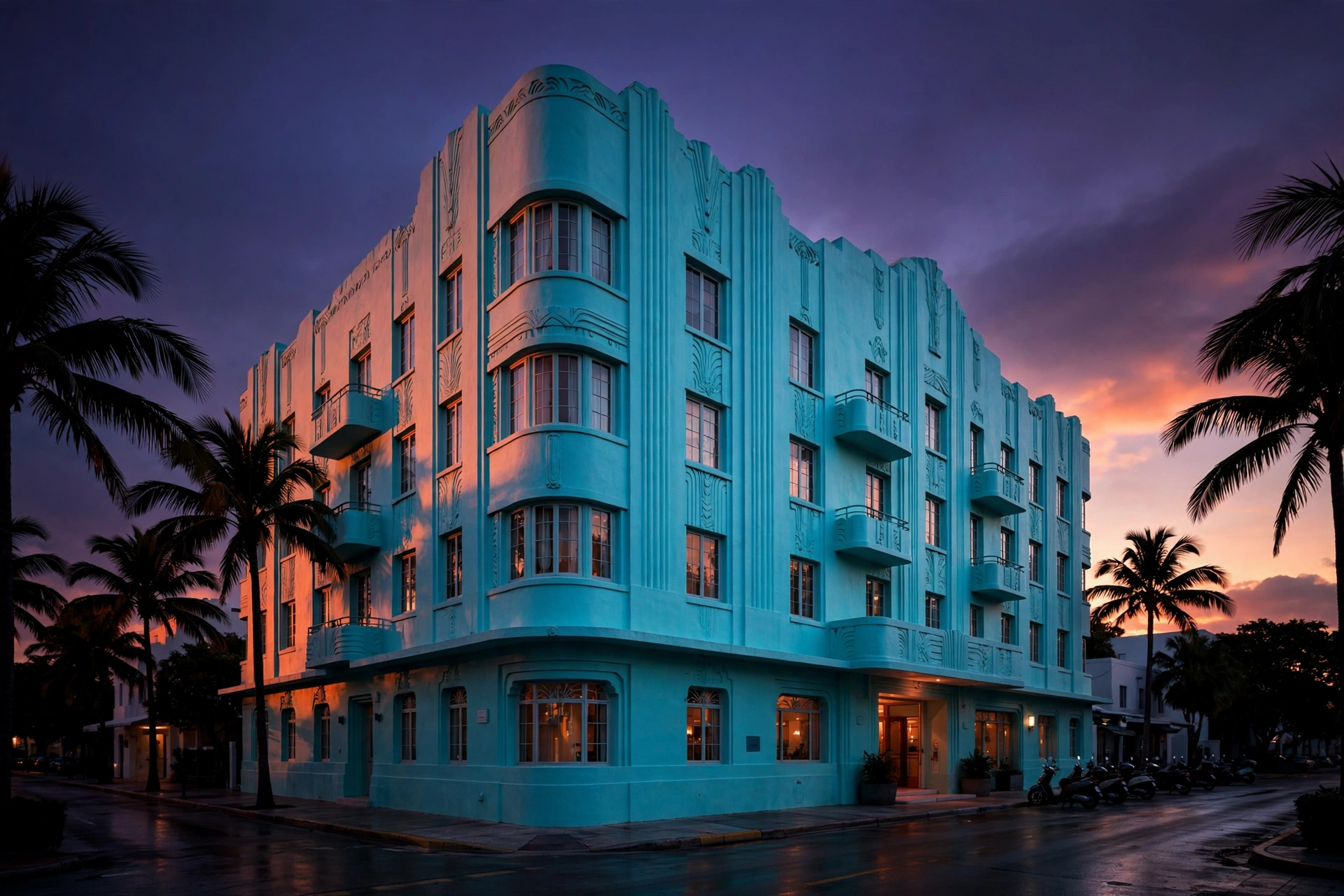
Deco hotel — dusk in Miami
The pool, grown up: a turquoise Deco facade catching the last orange of sunset under a violet sky. A major’s dark end, and one of the classiest frames in the whole overnight set.
Use for: hotels, destinations, architecture, film
Product · Light end
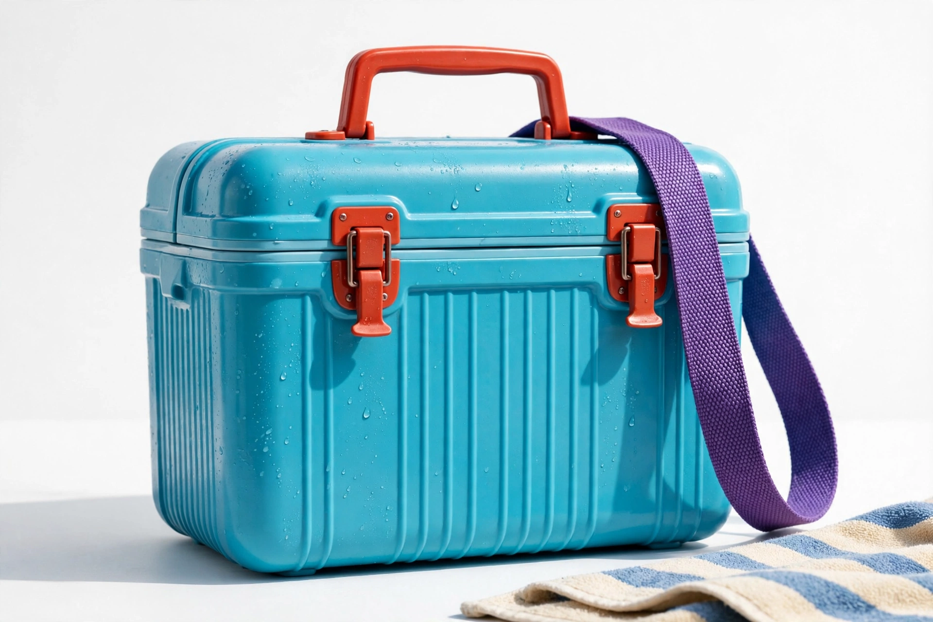
Cooler — the pool party, packed
A cooler in cyan, orange and violet at the light end: the resort palette as the one product every pool day revolves around. A major, insulated.
Use for: outdoor goods, beverages, summer retail
Logo · Light end
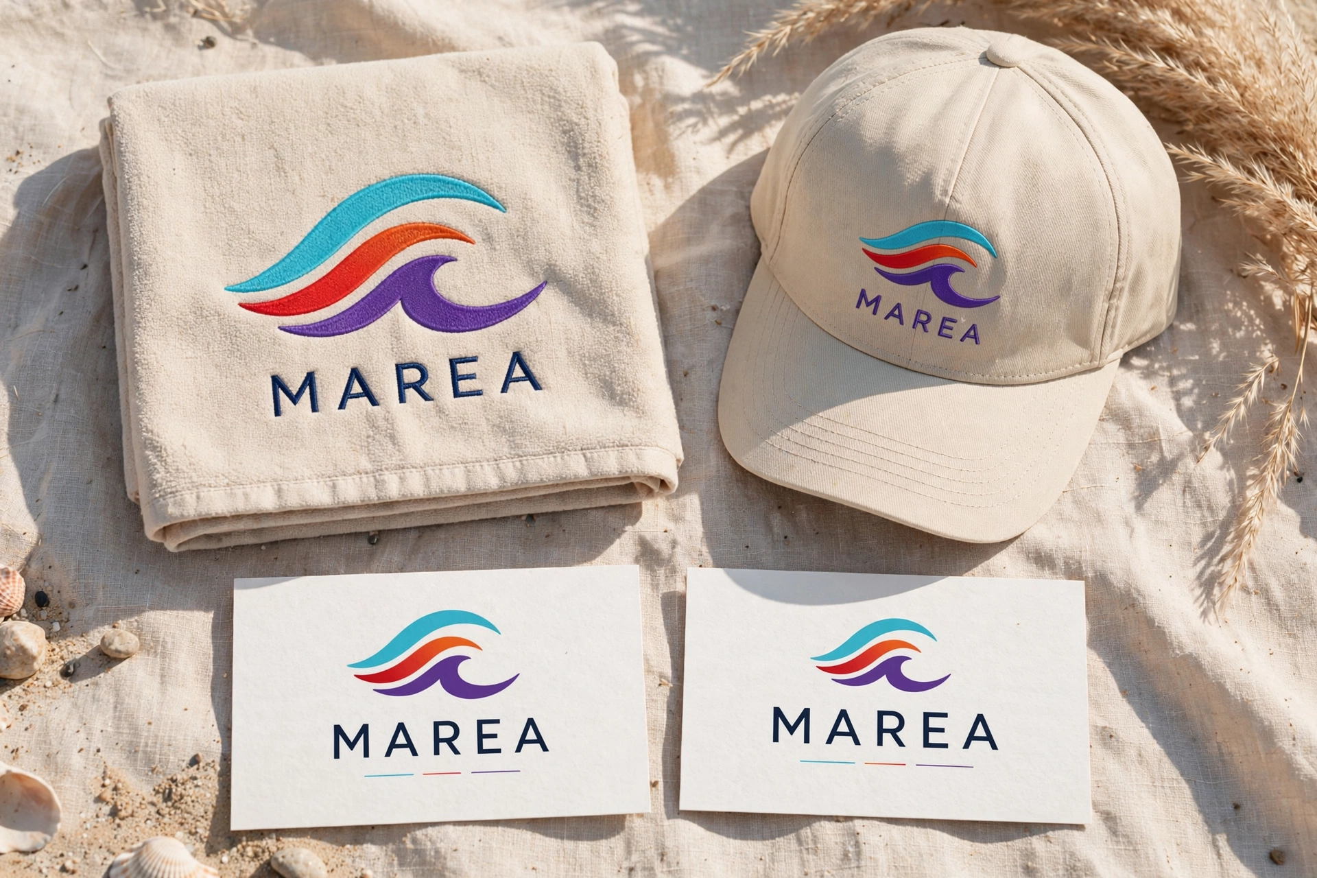
MAREA — tide, branded
A brand board for MAREA — “tide” — in cyan, ember orange and violet. The loudest chord gets a sea name and a board that reads like a resort flag.
Use for: travel, resorts, beverages, identity
Major · The celebration chordE major
E #7900EAG♯ #FF2000B #AAFF00
Violet, scarlet, yellow-green — E minor’s exact palette with the middle note raised, and the garden party replaces the dusk. E major is festive without confetti: roses and geraniums doing the scarlet, petunias the violet, and a lime twist waiting in the evening cocktail.
Best for
Garden parties & celebrations
Cocktails, aperitifs & entertaining
Florists & spring/summer retail
Joyful brands that stay tasteful
The angle
Side-by-side with E minor, this is the other great one-note demo: same garden, happier chord. E major suits brands that celebrate in daylight and toast at dusk — never the reverse.
Light end
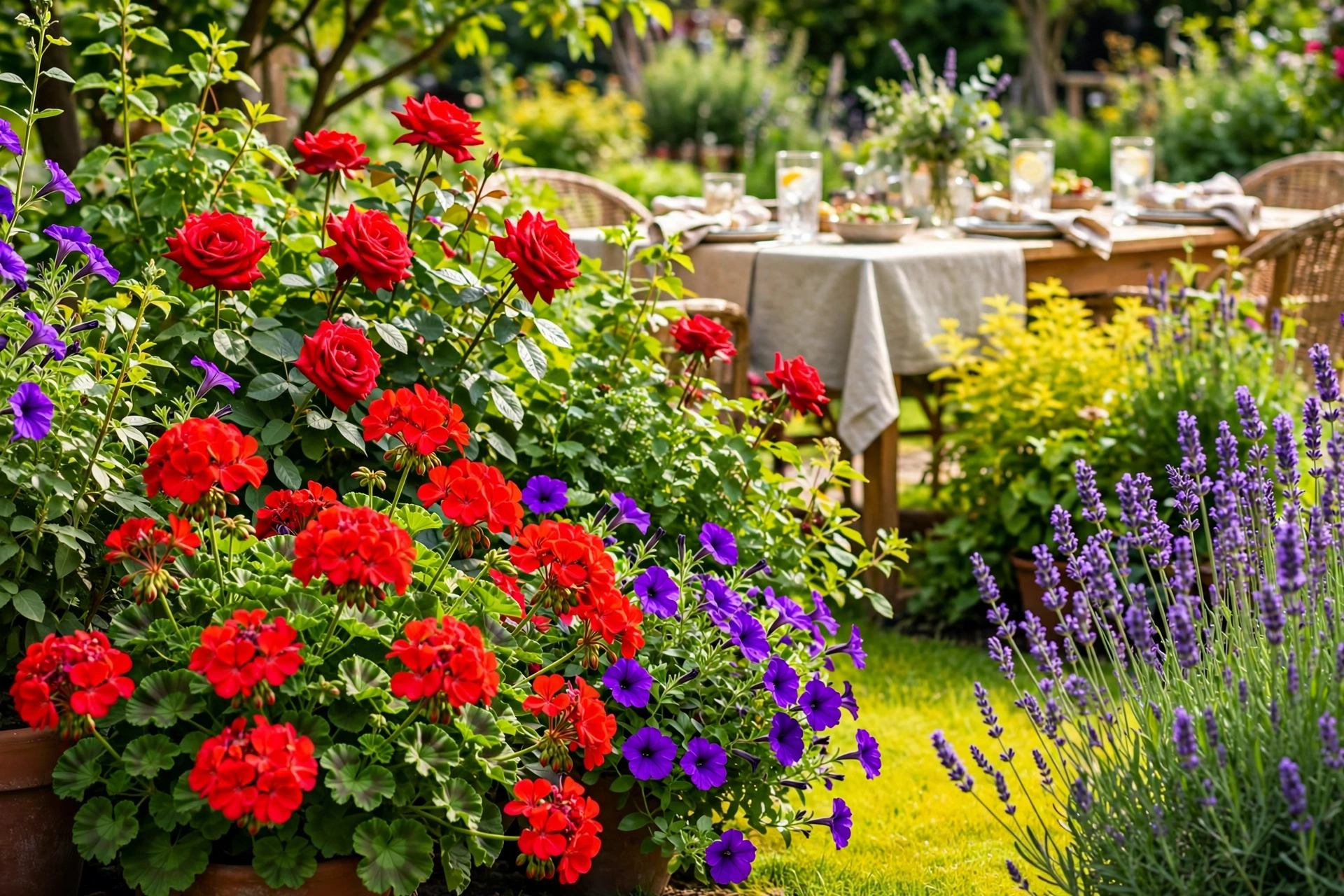
Garden party — roses, geraniums, petunias
A flower bed playing E major at full brightness. Where E minor’s garden was moody, this one is setting out chairs — the raised third, visible from the street.
Use for: garden retail, parties, spring campaigns
Dark end · Classy
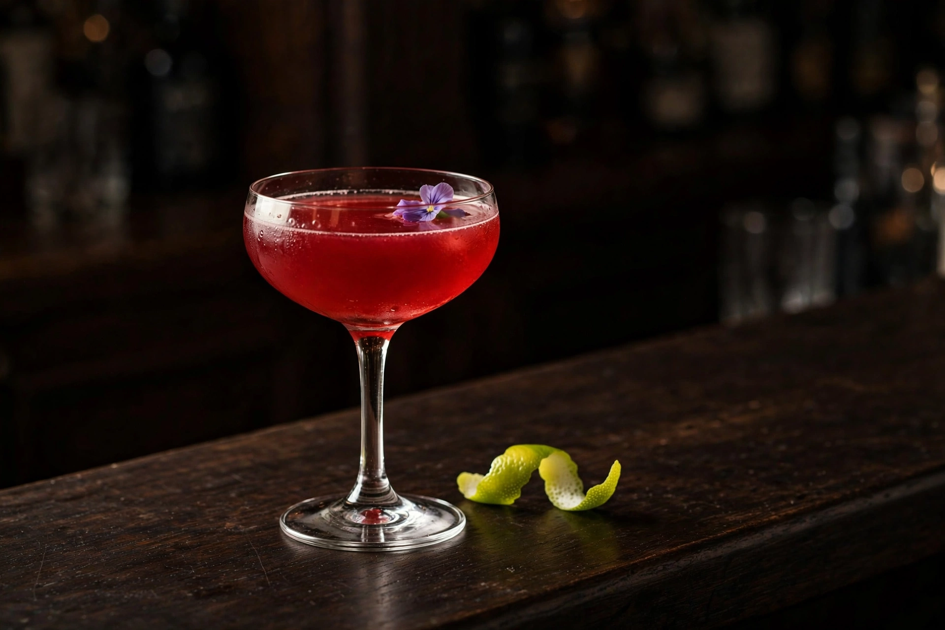
Cocktail hour — the scarlet coupe
The party, poured: a scarlet coupe, a violet garnish, a twist of lime for the B. E major’s dark end stays celebratory — a toast, not a brood.
Use for: spirits, aperitifs, entertaining brands
Product · Dark end
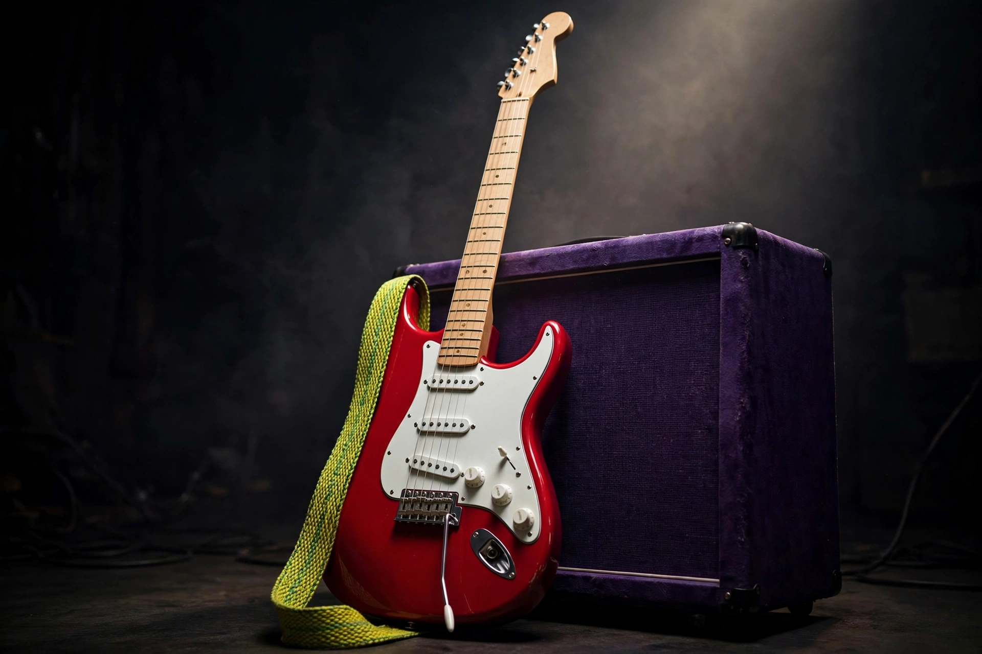
The Strat, again — scarlet this time
A scarlet Strat with a white pickguard and maple neck against a violet amp, a yellow-green strap across the body. The realism rule, word for word — in E major’s colors, the celebration chord gets the instrument it deserves.
Use for: music retail, instruments, lessons
Logo · Dark end
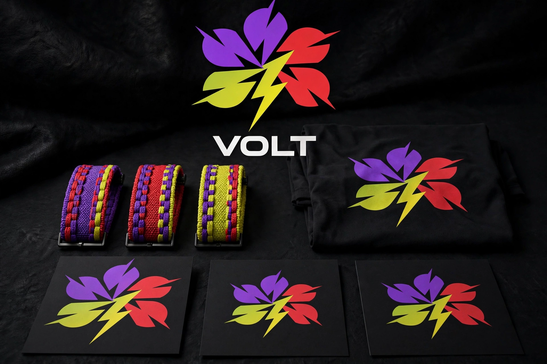
VOLT — electric identity
A dark brand board for VOLT: violet, scarlet and yellow-green under an electric name. The celebration chord with the voltage left in.
Use for: audio, gaming, energy brands, identity
Major · The pastoral chordF major
F #820097A #FF7800C #3AFF00
Deep violet, ember orange, vivid green. F major is the pastoral key — the countryside chord — and it swaps F minor’s scarlet passion for orange warmth: a farmhouse kitchen in the morning, and at the dark end, a huge low sun over violet ranges.
Best for
Farmhouse, kitchen & home brands
Landscapes, national parks & rural travel
Food with a countryside story
Calm, grounded, honest products
The angle
Violet is F major’s surprise: it hides in shadows, distant hills, and dusk, so the orange and green can feel like pure daylight. Let it arrive late in the frame — the ranges at the horizon, the shade under the table.
Light end
Farmhouse kitchen — morning produce
Oranges and leafy greens on a wooden table, and F’s violet carried by the eggplants, front and center. F major at the light end is breakfast in the country — calm you can sell.
Use for: kitchen & home, food, farm brands
Dark end
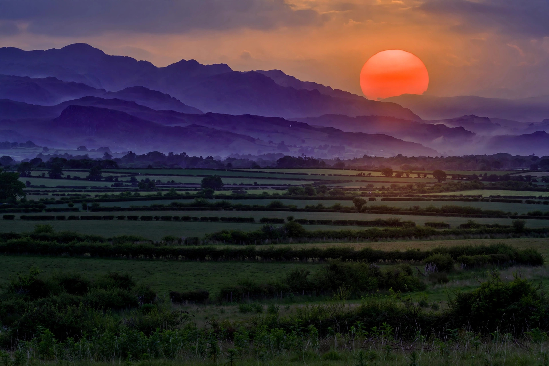
Sunset fields — the big low sun
A telephoto sun, swollen and red-orange, sinking over green fields toward violet ranges. Slightly larger than life — the one stylized frame in the set, and it earns it: this is how sunset feels, if not how it measures.
Use for: travel, parks, rural brands, film
Product · Light end
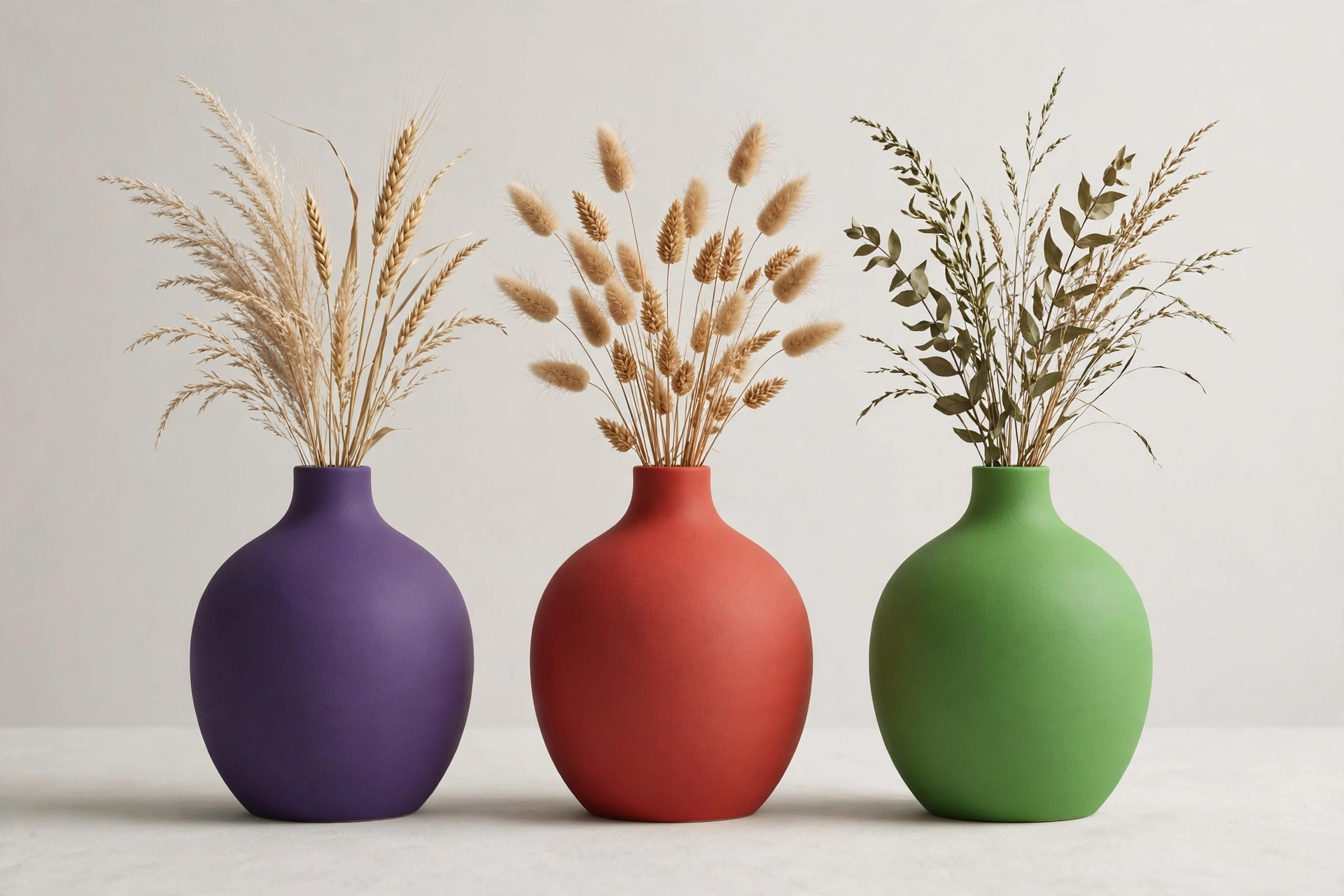
Vases — the pastoral, on a shelf
Ceramic vases at the light end in violet, ember orange and green: F major’s countryside colors as objects for the house. Calm, glazed.
Use for: home goods, ceramics, garden retail
Logo · Light end
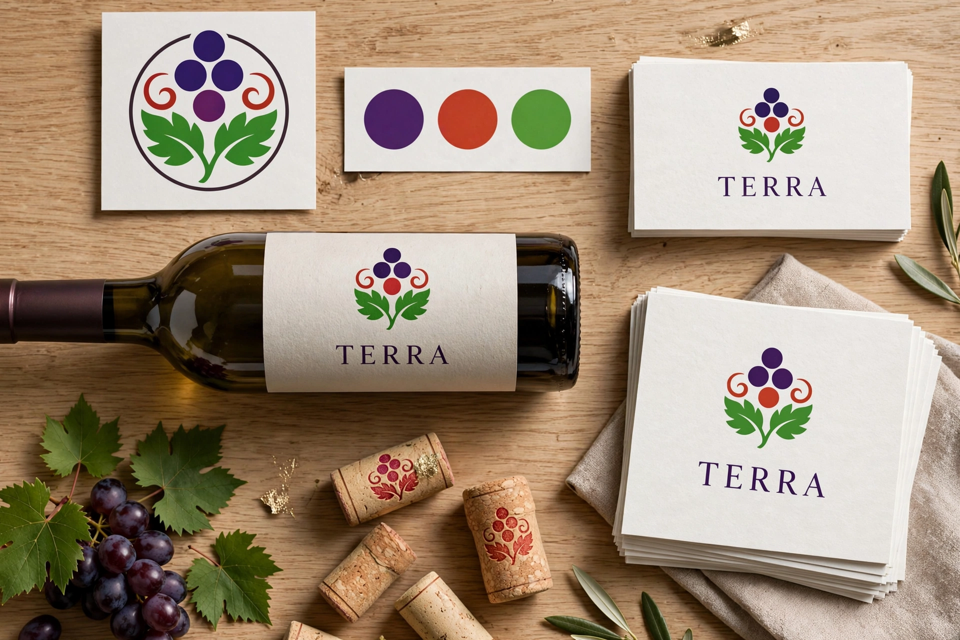
TERRA — earth, branded
A brand board for TERRA in deep violet, orange and vivid green: the pastoral chord with an earth name — the fields, the kitchen and the violet ranges in one identity.
Use for: home brands, food, garden, identity
Dominant 7 · The blues chordC7
C #3AFF00E #7900EAG #D80000B♭ #FFEF00
C major plus one restless note — B♭ yellow — and the palette gets its appetite. Four colors: green, violet, red, and the yellow of stage lights and taxicabs. C7 is the sound of a bar band starting up, and it photographs like one: street café by day, blues club by night.
Best for
Bars, blues & live-music venues
Burgers, diners & hungry brands
Street cafés & city life
Entertainment with grit
The angle
The fourth note is the lesson: a seventh chord’s extra color is what separates a palette from a poster. Give the yellow one job — a taxi, a stage light, a booth lamp — and let the C-major trio hold the room around it.
Light end
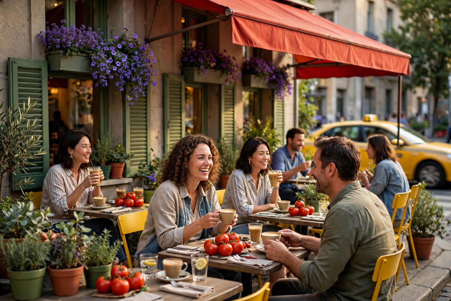
Street café — the yellow taxi walks in
Daylight C7: the trio minds the café while B♭ yellow drives past and steals the frame for exactly one second. Appetite, urban edition.
Use for: cafés, city brands, delivery, transit
Dark end
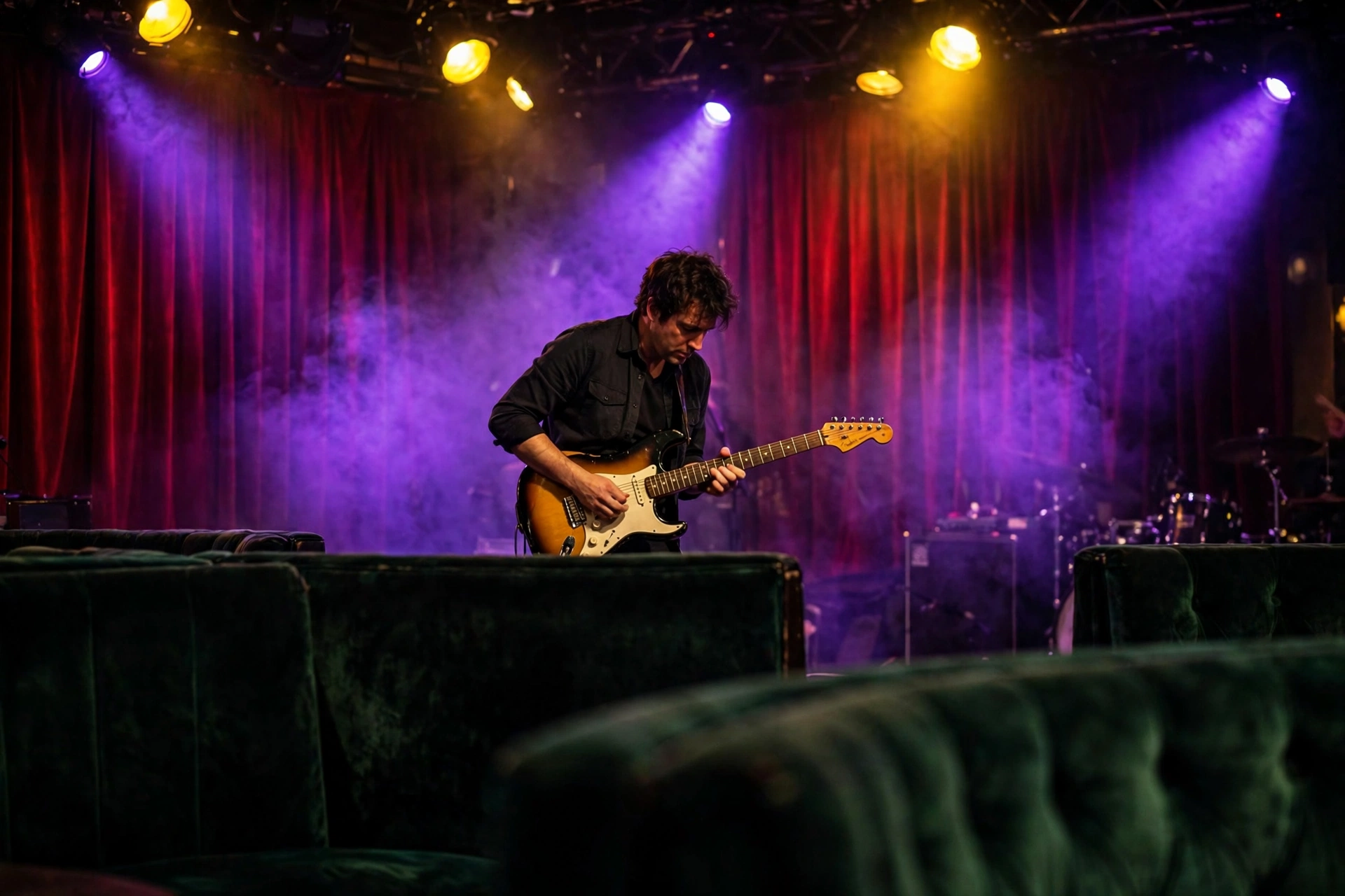
Blues club — the chord, photographed at work
A sunburst Strat under violet and yellow spots, red curtain behind, green booths in front. C7 is the chord that guitar is most likely playing — the palette and the music are literally the same information.
Use for: music venues, instruments, nightlife
Product · Light end
Mugs — four notes, four colors
A set of mugs at the light end carrying all four C7 tones — green, violet, red, and the restless B♭ yellow with a mug of its own. The seventh chord, in the cupboard.
Use for: diners, cafés, merchandise
Logo · Dark end
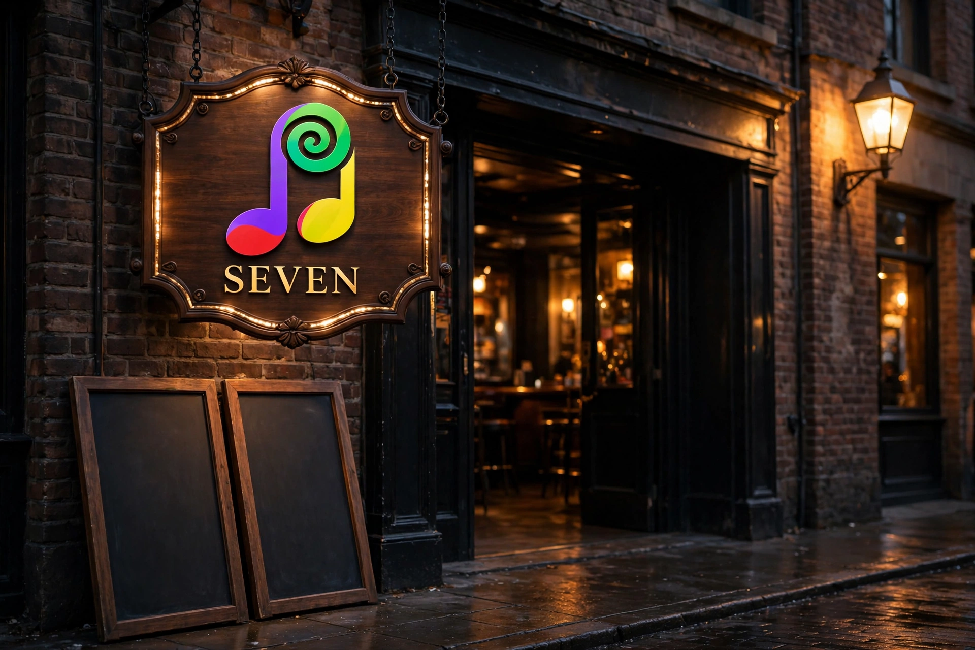
SEVEN — the jazz club sign
A club sign for SEVEN, lit at night in green, violet, red and yellow. Four colors doing the oldest job in advertising — being seen after dark.
Use for: music venues, nightlife, signage
Major 7 · The quiet-luxury chordCmaj7
C #3AFF00E #7900EAG #D80000B #AAFF00
C major softened by B’s yellow-green — where C7’s fourth note shouts, Cmaj7’s whispers. Four close tones for calm, expensive spaces: orchids on a hotel terrace by day, a chartreuse cocktail beside a piano at night. The subtlest palette in the gallery, and the priciest-feeling.
Best for
Boutique hotels & resorts
Skincare, spa & quiet luxury
Jazz lounges & piano bars
Brands that lower their voice
The angle
Keep the fourth color barely there — pale foliage, a champagne glint, one chartreuse drink. Cmaj7 teaches the gallery’s most valuable lesson: the difference between loud luxury and quiet luxury is a single note, played softly.
Light end · Classy
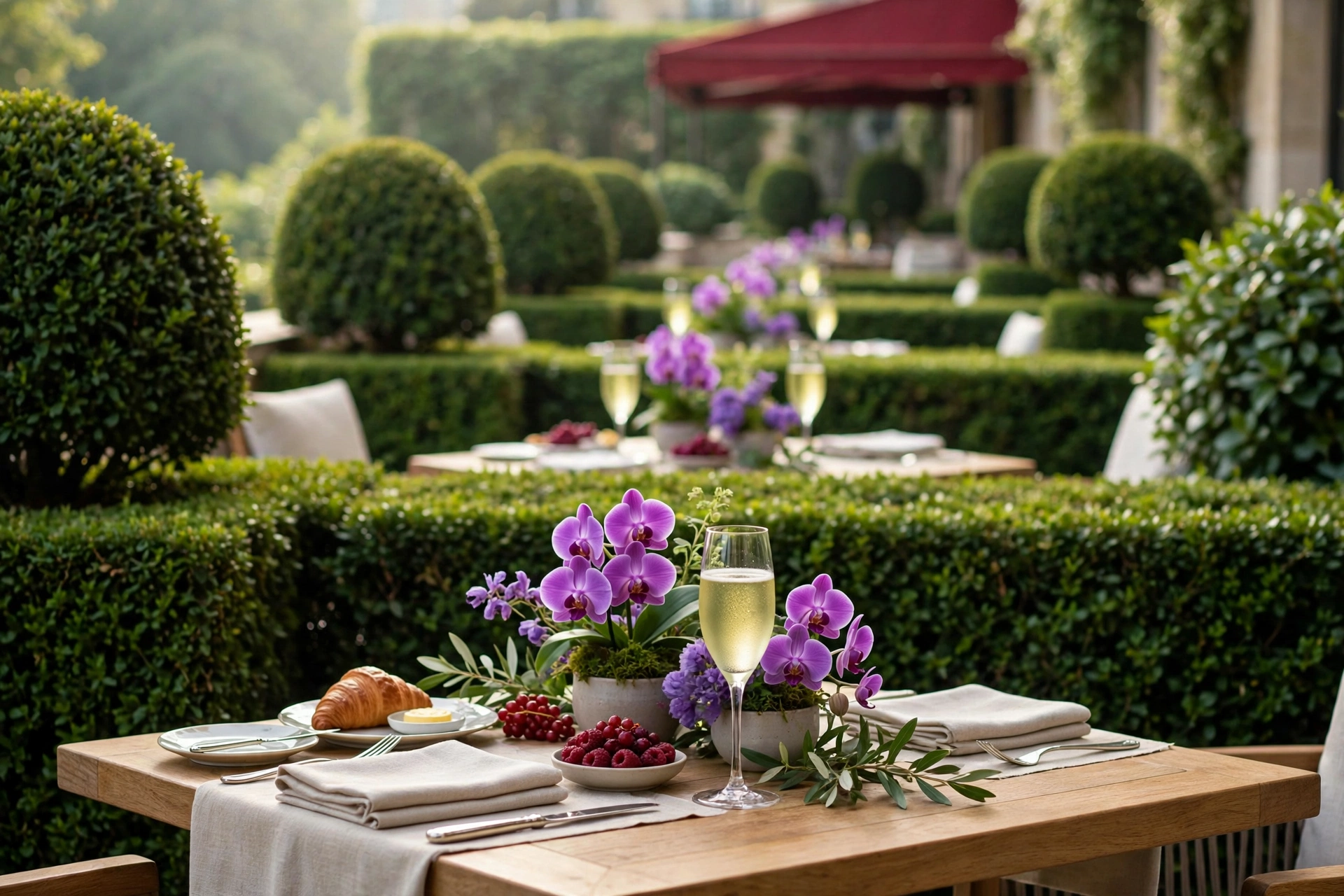
Hotel terrace — brunch, hushed
Orchids, linen, foliage — and B’s yellow-green present only as a pale glint, the subtlest tone in the overnight set. That restraint is the entire brand position.
Use for: boutique hotels, spa, skincare, brunch
Dark end · Classy
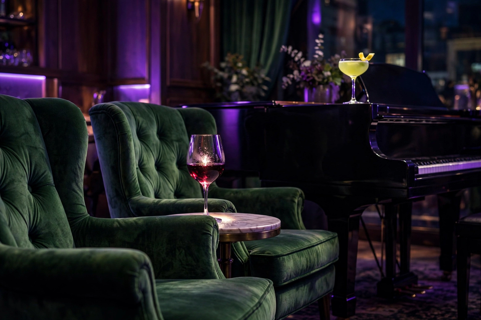
Jazz lounge — the chartreuse cocktail
Night, and the whispering note finally gets a solo: one chartreuse drink on the piano, in a room of green, violet and deep red. Cmaj7 after dark is a lounge that never raises its voice.
Use for: jazz venues, hotels, premium spirits
Product · Light end
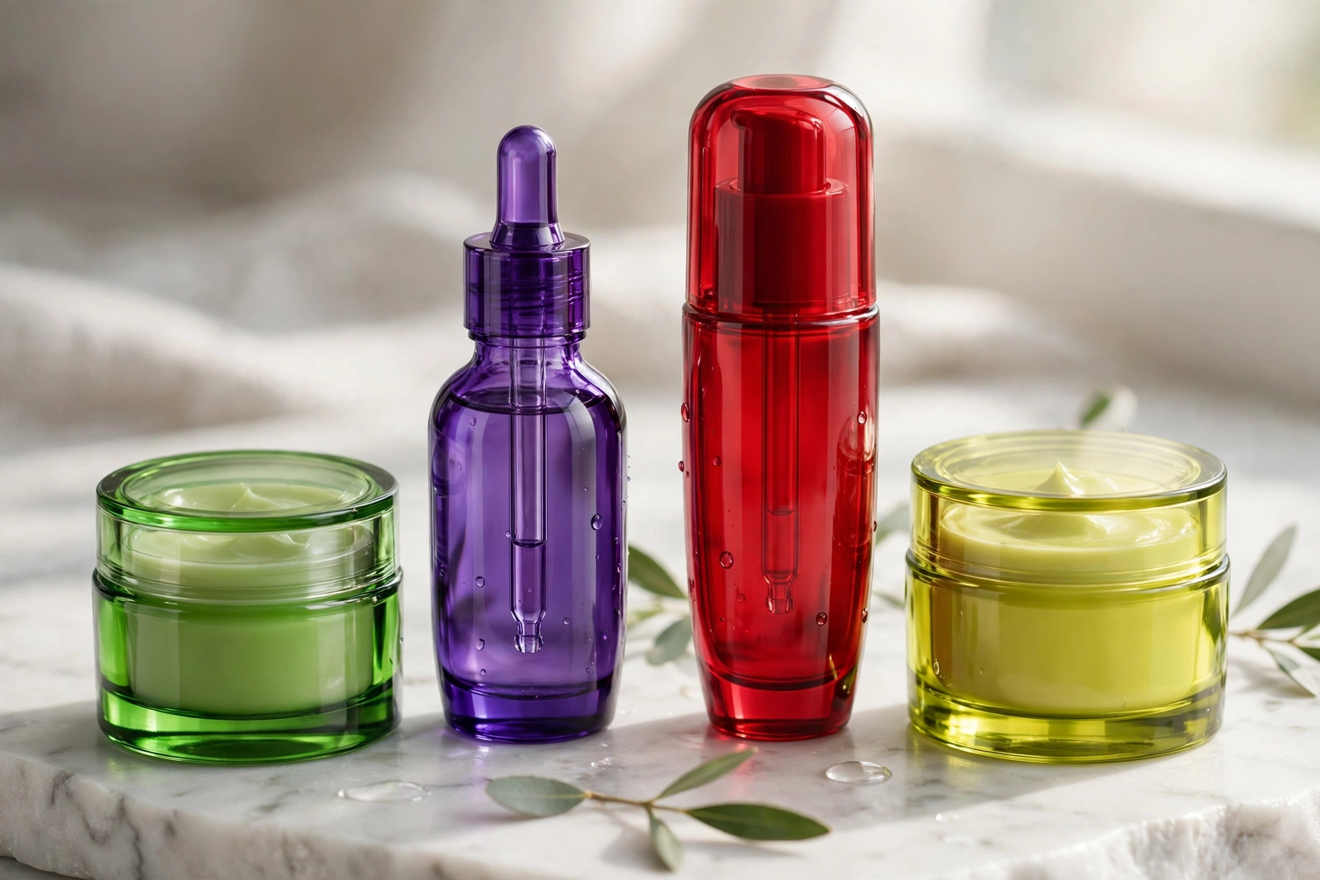
Skincare — quiet luxury, bottled
A skincare line at the light end: green, violet and red hushed down, B’s yellow-green barely there. Cmaj7’s whisper, in jars — the priciest-looking products in the gallery.
Use for: skincare, spa, beauty
Logo · Dark end
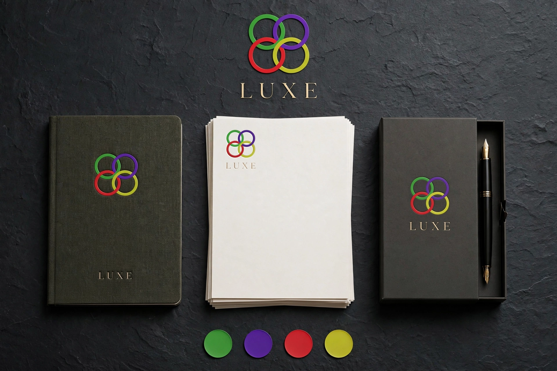
LUXE — the dark board
A dark brand board for LUXE: the quiet-luxury chord’s four tones laid out at night. The name promises nothing the palette doesn’t already say.
Use for: beauty, hotels, identity
Diminished · The held breathC diminished
C #3AFF00E♭ #1000FFF♯ #A80000
Green, indigo, deep red — three notes stacked in perfect, nervous symmetry. Diminished is the raised eyebrow of music, and its palette works the same way: a storm coast under bruised indigo cloud, a candlelit cellar where the green is bottle glass. Tension, sold honestly.
Best for
Wine cellars & dramatic dining
Mystery, horror & thriller launches
Storm-coast & rugged travel
Halloween and limited editions
The angle
Use it rarely and mean it. Diminished can’t carry an everyday brand — it’s the palette of warnings, secrets and weather. Even its “light” example is an overcast coast: with this chord, light end is a relative term.
Overcast · Light end
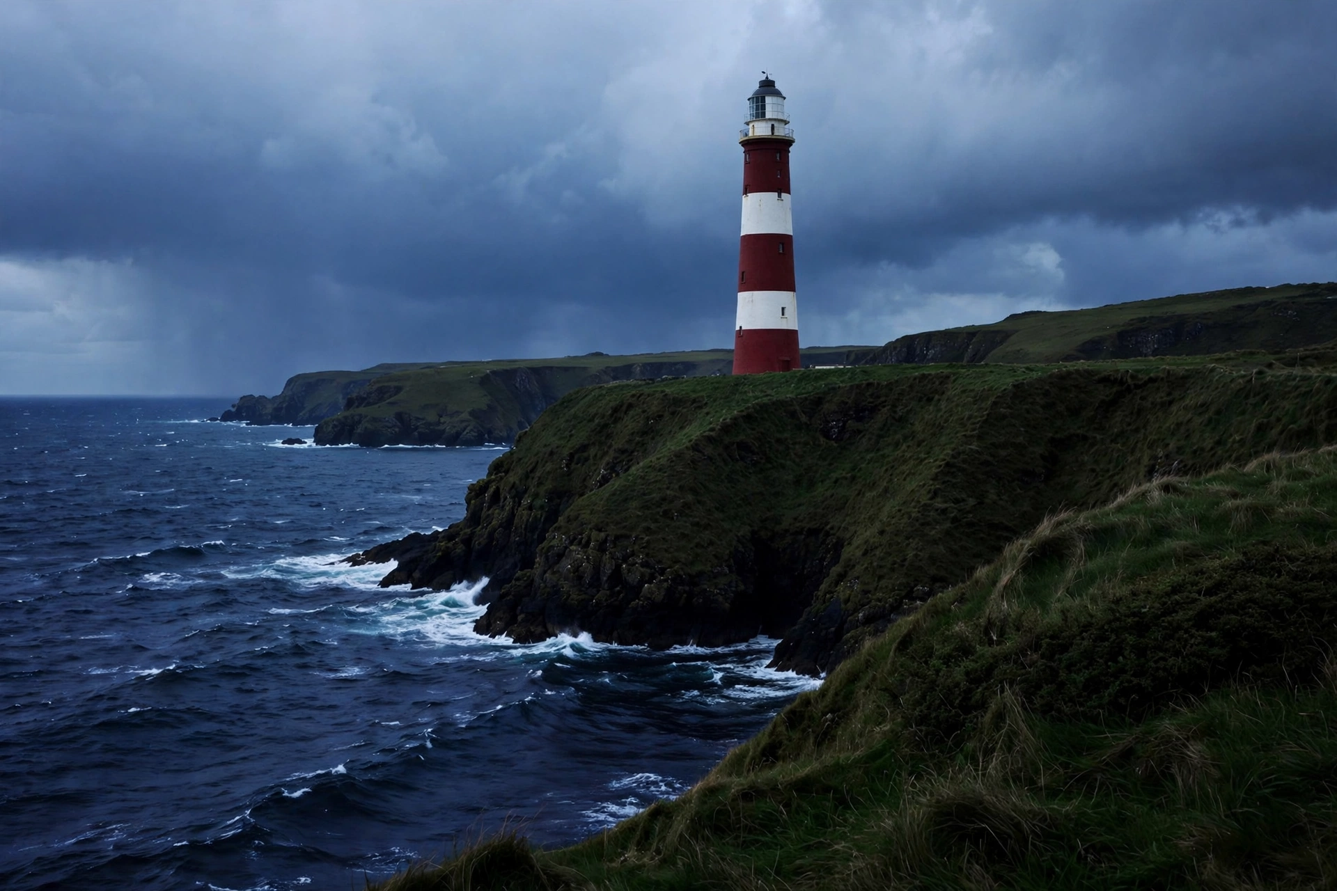
Lighthouse — a warning, painted red
The brightest diminished gets: green cliffs, an indigo sea, storm cloud — and one deep-red lighthouse doing the chord’s real job, which is to say pay attention. Advertising’s oldest tension, color-coded.
Use for: coastal brands, safety, insurance, travel
Dark end
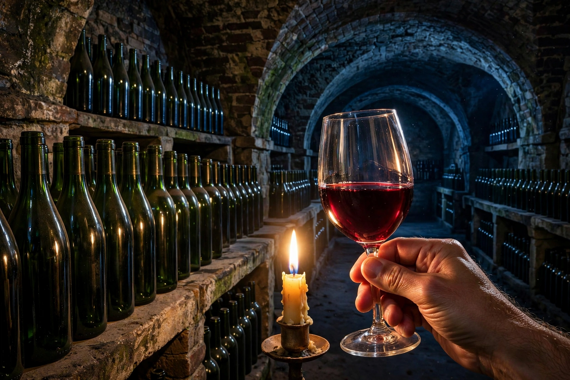
Wine cellar — symmetry by candlelight
Rows of green bottles, red wine, indigo dark. The cellar is diminished at rest — all that symmetry, holding its breath underground, waiting for an occasion.
Use for: wine, cellars, dramatic dining
Product · Dark end
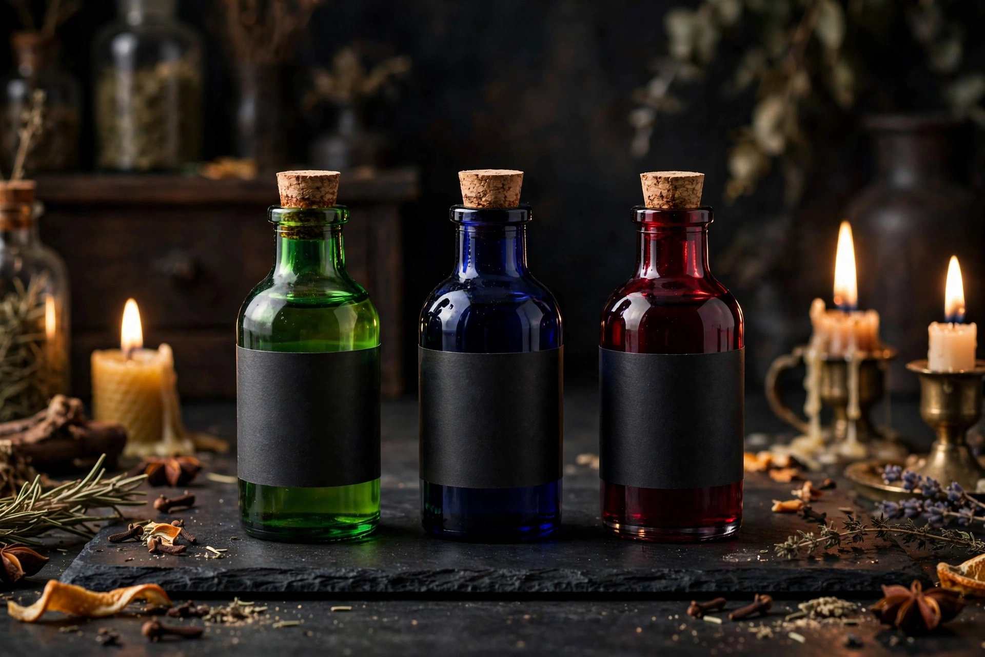
Bitters — tension, in a dropper bottle
A bitters bottle at the dark end: green glass, indigo shadow, deep-red label. Diminished is the bartender’s chord — a few drops change the whole drink.
Use for: spirits, cocktail brands, bars
Logo · Light end
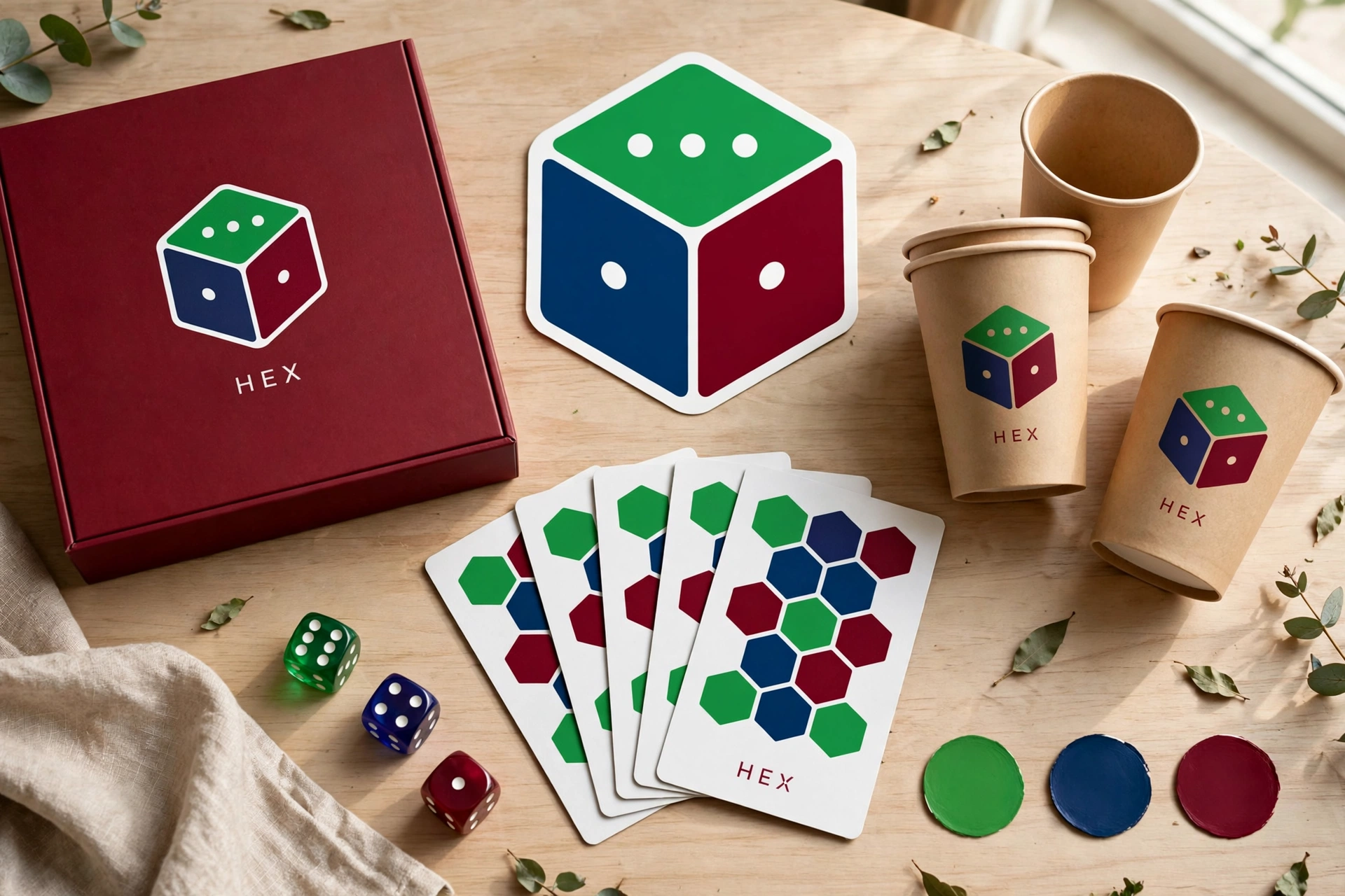
HEX — the bright board
A light brand board for HEX in green, indigo and deep red: a six-sided name for the chord of held breath. Even diminished gets a light end — it just looks like a warning label.
Use for: gaming, spirits, limited editions, identity
Augmented · The floating chordC augmented
C #3AFF00E #7900EAA♭ #FF2000
Green, violet, scarlet — perfectly symmetrical, pleasantly unreal. An augmented chord never quite lands, and its palette floats the same way: balloons at dawn, an aperitif above a violet city. Wonder instead of certainty, for brands selling the future.
Best for
Tech launches & futurist brands
Festivals, events & celebrations
Rooftop bars & destination marketing
Anything dreamlike, on purpose
The angle
Augmented is the specialist: deploy it when the product itself feels slightly impossible — a launch, a reveal, a first flight. The symmetry does the uncanny work; keep the scene itself real so the wonder stays believable.
Light end
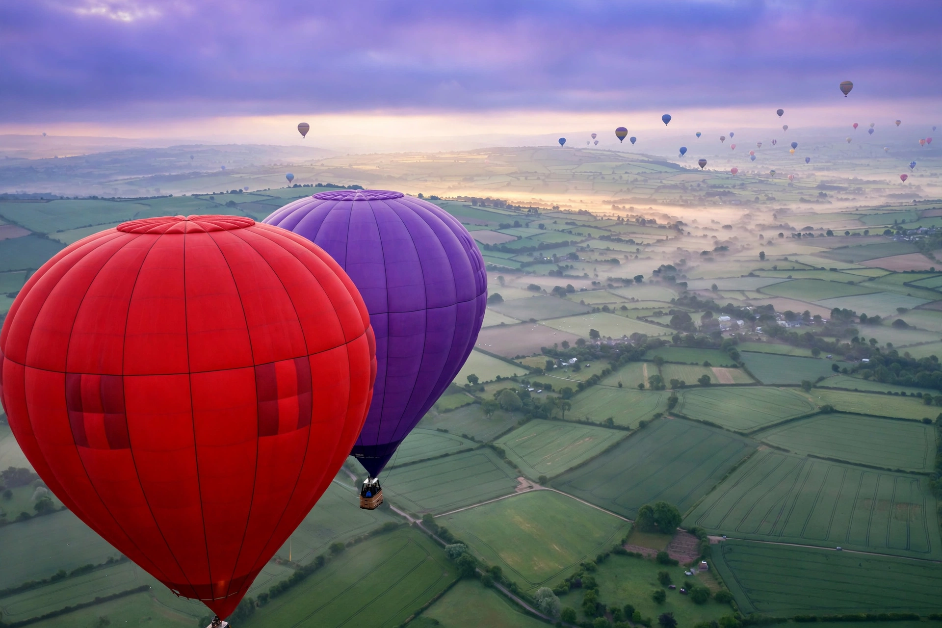
Balloons at dawn — literally unresolved
Scarlet, violet and green, drifting. Nothing in the frame has landed, which is the augmented chord’s whole personality — wonder you can book a ticket for.
Use for: festivals, travel, events, launches
Dark end
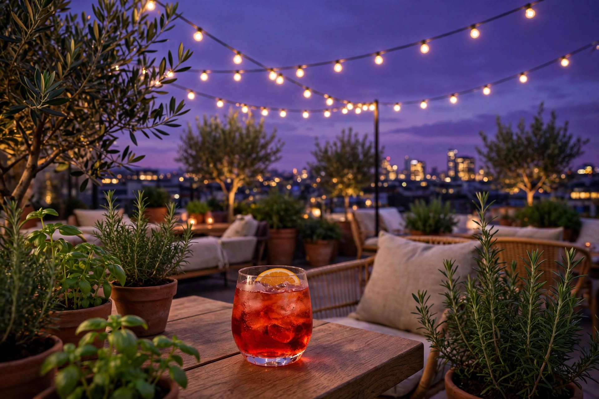
Rooftop dusk — above the resolved world
An aperitif above a violet skyline: the city below has finished its day in major chords, and up here everything is still floating. Augmented’s dark end is elevation, not gloom.
Use for: rooftop bars, hotels, city tourism
Product · Light end
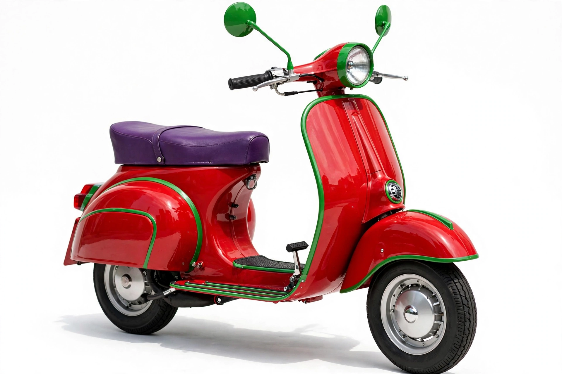
Scooter — floating, with wheels
A scooter at the light end in green, violet and scarlet: the unresolved chord as city transport. Augmented sells the future; a scooter is the future you can park anywhere.
Use for: mobility, EVs, city brands
Logo · Light end
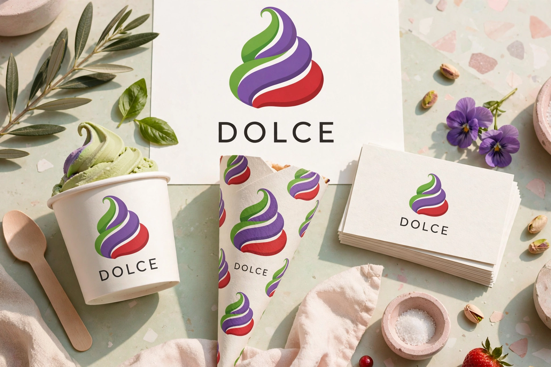
DOLCE — sweet, branded
A brand board for DOLCE in green, violet and scarlet: an Italian-sweet name on the dreamiest chord in the set. Gelato colors, by construction.
Use for: food brands, gelato, lifestyle, identity
Try a chord
Choose any root and quality. PCS-1.0 spells the chord, the palette follows, and the brightness dial runs each color from its light end to its dark end — the same dial used across this gallery. Press play to hear the chord itself, then copy the palette straight into a brief.
Tap a swatch to hear that single note on its own.
Draw on the picture
Markup summary
Nothing marked yet. Turn on Mark up and give the pictures verdicts.
Copy markup — send this to Muse to apply your edits.
 ★ Jeff’s favorite